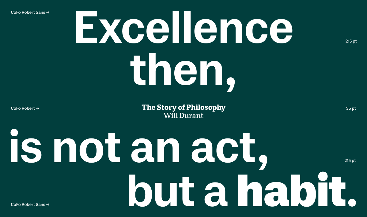
CoFo Robert Sans
A grotesque with a human touch
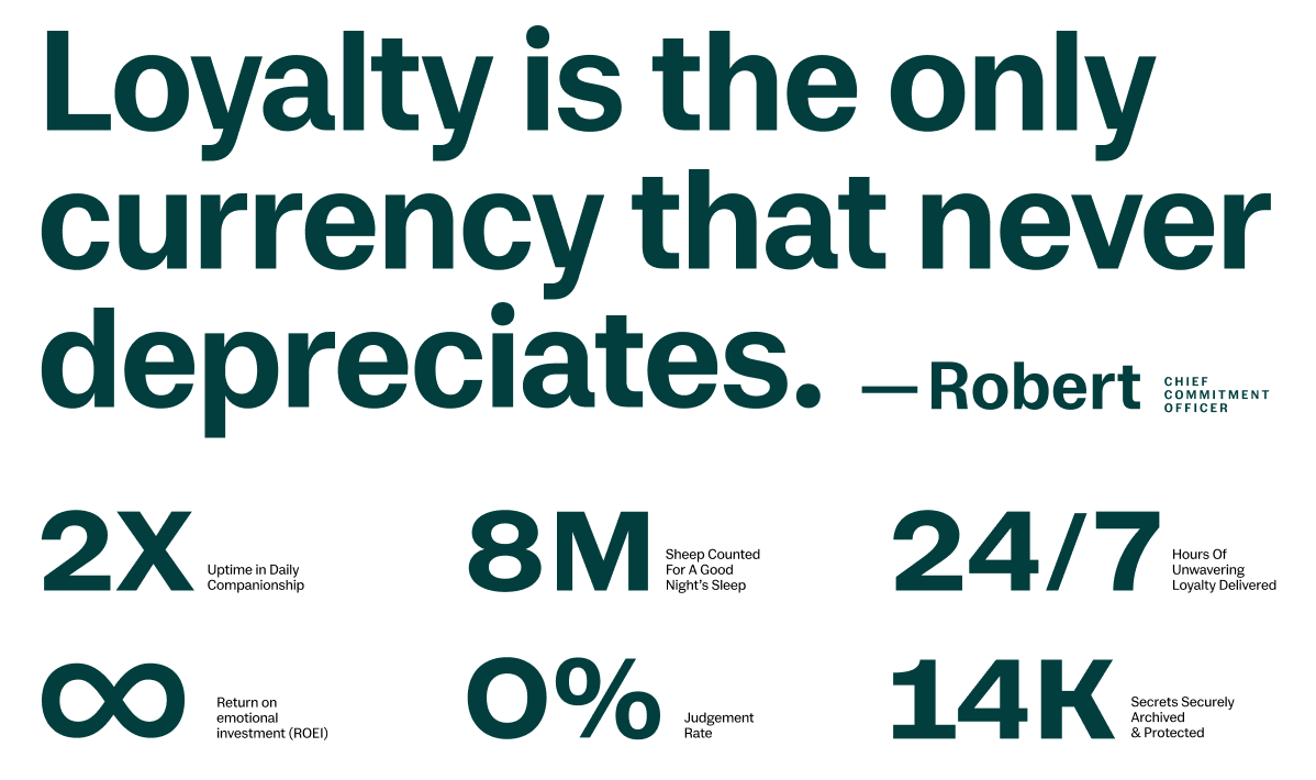
Most sans-serifs conform to the mechanical, oversimplified rationality, which can often feel a bit cold. Serif typefaces, on the other hand, achieve their neutrality through traditional, centuries-old calligraphic forms—which are far from soulless. CoFo Robert Sans redefines the concept of a daily sans-serif by using its slab-serif counterpart, CoFo Robert, as its structural foundation. It takes those traditional, warm proportions and translates them into a modern, clean grotesque with a human touch.
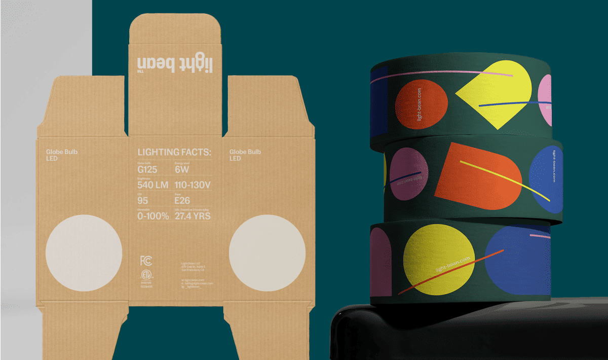
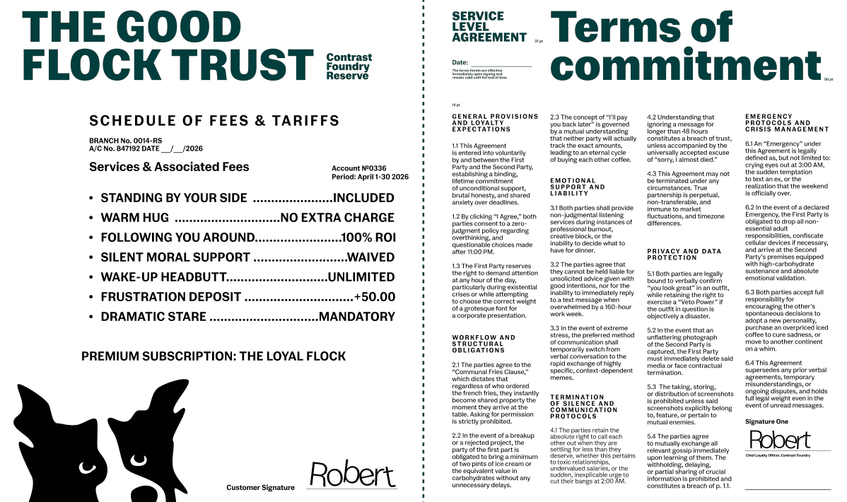
Its special features are subtle but full of energy: a moderately visible contrast, balanced proportions, and a softness in the curves. Spanning from Light to Black, and packed with small caps, superscript, and subscript figures for both Latin and Cyrillic, it’s the friendly sans you always needed.
Learn more about Contrast Foundry here.
Robert Sans
Foundry: Contrast Foundry
Designer: Liza Rasskazova
Year of release: 2026
Version: 1.004
Styles: Light, Regular, Book, Medium, Bold, Heavy, Black