Priori Acute
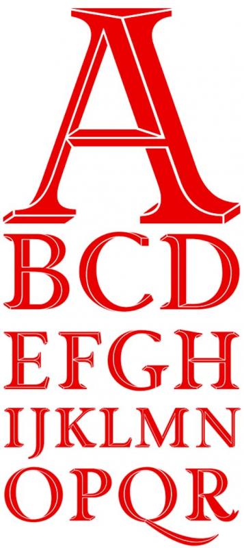
Die Priori Acute von Jonathan Barnbrook ergänzt die Priori Familie um ein weiteres Mitglied. Inspiriert durch Displayschriften des 19. Jahrhunderts entsteht als Resultat einer Serie an Experimenten die Priori Acute. Um Tiefe zu erzeugen bedient sich dieser Font nicht einfach an einem Schlagschatten oder der Optik eines Reliefs...
»The resulting forms are a playful exhibit of incongruous perspectives and twisting shapes that fold into themselves tricking the eye to shift the plane. At first glance and at small sizes the effect is subtle and the original letter forms themselves remain intact, retaining the history of British early 20th century typography, which was an inspiration for the original Priori family. But when blown up, the individual Priori Acute characters become beautifully animated and work well in selective situations such as initial caps, short headlines or logo design.«
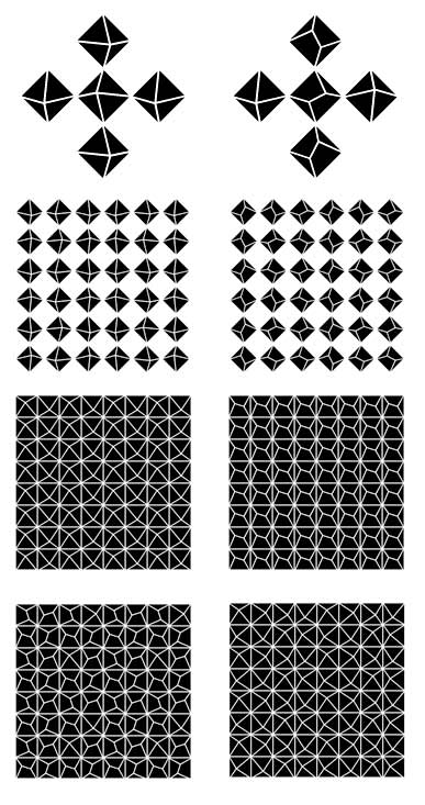
Zusätzlich bringt die Priori Acute eine Sammlung von ornamentalen Elementen mit sich. Diese können unbegrenzt zu Mustern kombiniert werden.
Nochmals begutachten und bestellen könnt ihr die Priori Acute hier.