Trola and Bulo, the design of a serif and a sanserif
Jordi Embodas ist ein Grafikdesigner und Schriftgestalter aus Barcelona. In diesem Artikel erläutert er das Konzept und den Prozess zu seiner Super-Familie, die aus der 2012 veröffentlichten Grotesk-Schrift Bulo und der 2013 veröffentlichten Antiqua-Schrift Trola besteht. Der Artikel wurde von Elena Veguillas und Catherine Dixon redigiert und übersetzt.
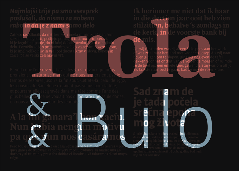
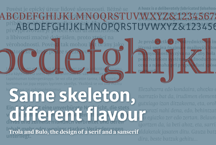
The idea of a typeface family offering both serif and sans serif options is now familiar. It is normally the same basic family idea explored across two or more variants. Belonging to one unique family both serif and sanserif variants share not just a set of underlying formal characteristics but also stylistic attributes of character detailing. In such examples each variant is perfectly balanced with the other to the extent of sharing an equality of appearance as well as importance. Nevertheless, the purpose of this project was to create two quite different typefaces – here I should like to introduce Trola and Bulo – which although sharing an obvious formal correspondence in their skeleton and basic proportions, also maintain their individual personalities and very different flavours.
Built together
Some time ago there was, I remember, a discussion concerning the different methods by which to approach the design of an extended typographical family. Martin Majoor, with his excellent Scala, argued that the process should begin with the design of the serif variant followed by the sanserif. This order seems to have been that followed in the design of the families that followed during the 90s. It was later that Peter Biľak, with his no less genial Fedra, reversed the order and designed first the sanserif before confronting the design of two serif variants. More recently there have been other examples that have successfully followed this method, sometimes over a period of time, such as the impressive Meta Serif.
When it came to the design of Trola and Bulo, neither variant foregrounded the other, rather both evolved simultaneously, through constant comparison and the matching of proportions and skeleton. The process consisted of attempting to bring each variant ever closer to a point of commonality before concluding the design of either.
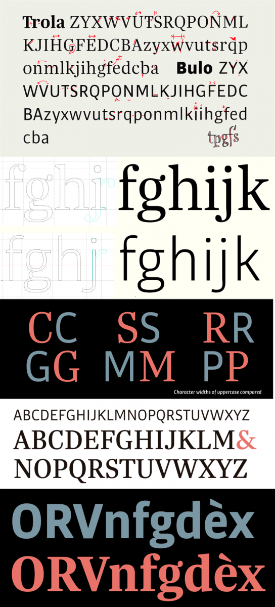
During this process of simultaneous design some interesting and unexpected things happened. As previously mentioned, although the proportions and widths of serif and sanserif typefaces are usually different, I tried to match them somewhere midway between the two. So it can be seen that the proportions of the serif variant have been adapted to a set of proportions more typical of a sanserif alphabet, resulting in Trola’s caps having a more contemporary (far less classic) feel. And while many sanserif variants within extended typeface families are characteristically humanistic given their correspondence with the serif variant it was never my intention for one variant to prevail upon the other in such a way. On the contrary I had wanted to find two typefaces that were different but somehow related – something like the relationship between Clarendon and Helvetica – to determine the basis for a serif and sanserif able to work together, though aiming for stylistic disparity.
Common characteristics
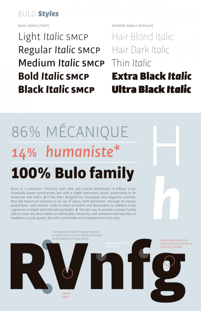
Although both typefaces tend towards the narrow one does not have the feeling of a condensed font. The x-height, the short ascenders and descenders, together with a reduced cap height result in a significant economy in the use of space, a helpful feature for newspapers and magazines. In fact the natural habitat for these fonts is to be found in headlines, subheads, pull-quotes and text columns, while they look good too on book covers or posters. Though, I should not like to define use of these typefaces, as it is for the designer to decide.
If I’m honest, while I worked simultaneously on both typefaces until the design was clearly defined, I did not undertake their final production at the same time. As many of you probably know the process of finalising a typeface design is extremely laborious, with many details needing to be taken care of concerning the technical aspects, particularly in extensive families given the number of styles and characters. First, I finished the sanserif version in May 2012, because I felt it was easier and the more agile of the two designs. I then finished the serif, in February 2013. Finishing each at different points in time was actually very helpful in achieving the necessary stylistic differentiation between them both.
Stylistic differences
Although the two typefaces were derived from the same basic skeleton and set of proportions, I wanted to rid the sanserif variant of any humanistic qualities and so I applied a minimum contrast. Further, I emphasized the simplicity of the letters, paying attention though to opening out the internal spaces of characters where possible to compensate for the condensing effect of the overall form. The serif variant was simpler to work on, as the addition of the lobe terminals effectively reduced the openness of many characters significantly differentiating its forms from those of the sanserif version.
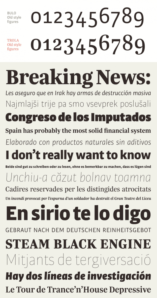
A good way to illustrate just how different both alphabets are in term of style is to take a look at the design of the figures. The sanserif figures are somewhat mechanical in feel though with a humanistic touch, whereas the serif figures are more Scotch in their references, though they are also influenced by vernacular numerals from the streets of Barcelona.
Relationship in the use of serif + sanserif
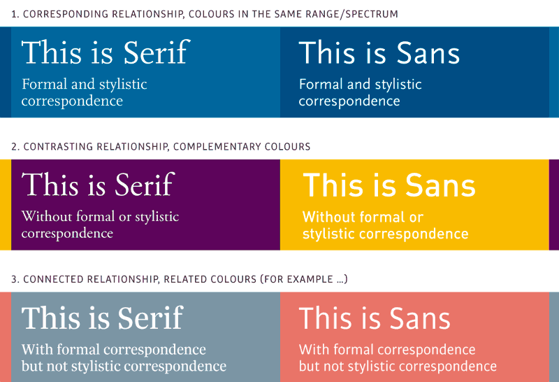
There are many ways to combine serif and sanserif alphabets, but it is possible to distinguish three main kinds of relationship. First, they might be brought together to emphasise a clear correspondence of form and style by using an extended typeface family that includes serif and sanserif variants. Generally this formal and stylistic correspondence is used to give consonance and uniformity to a design, though maintaining the possibility for distinguishing between kinds of content, such us when typesetting different languages in one document. A second possibility for their combination is to emphasize their contrast, by using for example, serif and sanserif typefaces radically different in form and style. It is just this contrast between two different voices, which can add personality to a publication. Lastly, the typefaces might be combined in such a way that a relationship is established based on formal similarity, while also highlighting a contrast of well-differentiated styles.
To help explain further we could make use of a simile based upon the principles of colour contrast:
Bulo
Bulo is a sanserif typeface that offers a clear and concise rendering of its letterforms. It has a mechanical construction with a humanistic touch, particularly in the lowercase and its italic versions. Here I was looking for the simplicity of DIN, the virtues of Amplitude and a pinch of Meta’s warmth.
Because sanserif typefaces are more versatile, I initially designed a basic family with five weights, light to black, although later I added five more extreme weights (from hairlines to ultra-blacks), ending up with a total of ten styles (all of them including italic versions).
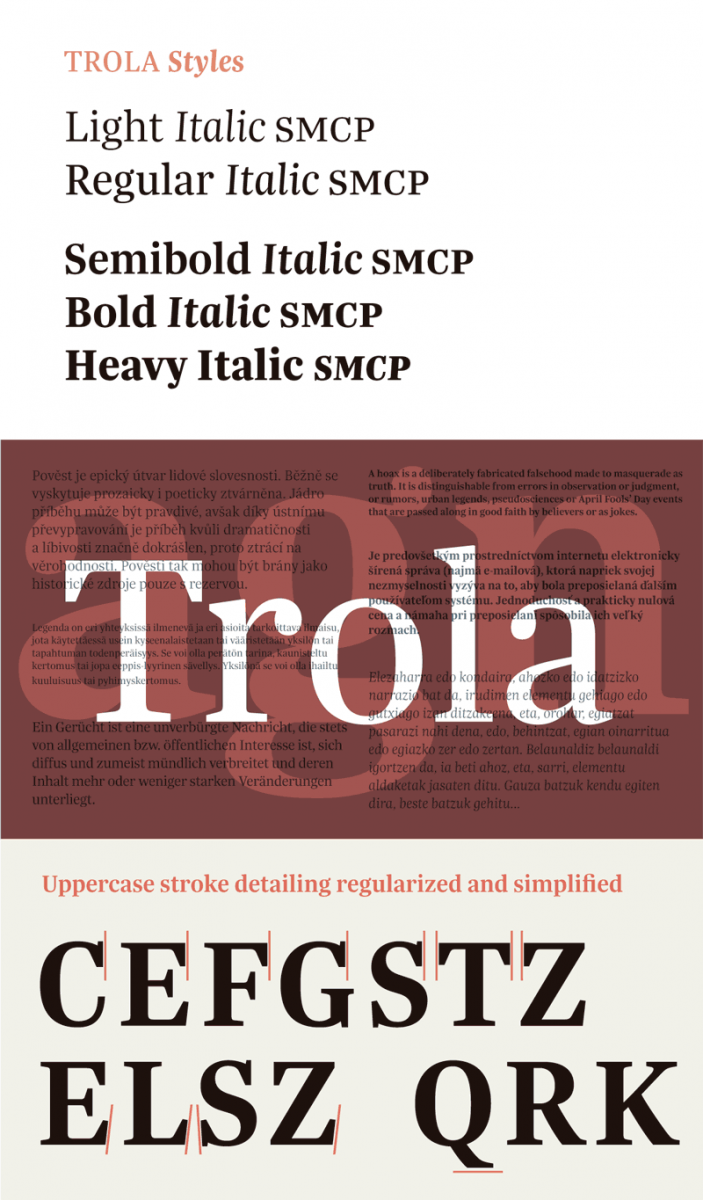
Trola
In terms of style, Trola is a neo-Baroque typeface with hints of the neo-Classical. My intention was to capture the strength of Mercury, the versatility of Arnhem, the simplicity of Swift and the spirit of Georgia.
My initial aim was to draw a unique letterform that could be useful both for headlines and long quantities of text. I came though to realize how very complicated it is to render just one form for such different purposes. In the end, in its display sizes Trola perhaps does not have enough contrast, though this does not worry me, simply because it looks so much more imposing and, in addition, it means a better screen display. In larger quantities of smaller text the narrowness of the letterforms also becomes more obvious, though it is exactly this condensed appearance, which so well suits Trola to use in narrow editorial text columns.
The positive reception to the fonts thus far would in any case seem to suggest that it may be plausible in the future to design versions more particular to specific use: a headline font with softer and more delicate serifs, higher contrast, still more condensed forms and tighter counter apertures; and a text font, a little wider with more rounded letters, improving upon aspects of legibility and contrast particular to use at small sizes.
Though there are 5 separate weights listed, in reality these were envisioned as subtle variations of two main styles, regular for text and bold for headlines. The text styles comprise two weights: a light and then the so-called regular. There is minimum differentiation in the forms themselves, though potential for increasing the overall colour and richness of a text block without resorting to the use of anything as heavy as a bold. Such subtle variation between weights also allows for the designer to select the optimum weight for use either black-on or reversed-out. The three bolds share a similarly close calibration in weight, allowing for greater versatility in differentiating between headlines within one publication, more than the usual bold and extra-bold combination can often allow for.
Italics
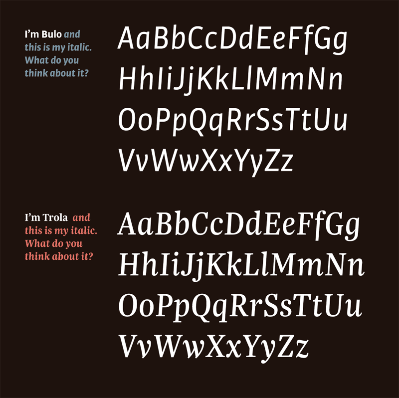
As a graphic designer I have always preferred italics with only a small degree of slope. I believe they are more usable, more legible and they work better in longer texts though they should also be slightly narrower than the regular version, to increase the contrast, when the italic is used as an alternate style for emphasis or textual articulation alongside the regular.
And so, as a type designer I apply what I demand as graphic designer. I built a true italic with a slope of only 4o at 92% the width of the roman. The sanserif italic was much easier and felt more natural to draw. The serif italic, on the other hand, was much harder to integrate with the roman given the slightness of the slope and all the terminal combinations to negotiate.
About the names
Having rejected the idea of applying just one font name to both serif and sanserif variants, I looked for different, though related, names. Considering their appropriateness to the press environment, I found very quickly two synonyms that worked perfectly in Spanish: a masculine word, Bulo, for the sanserif version and a female word, Trola, for the more complex serif typeface. In Spanish these are humorous words which suggest different degrees of ‘lying’, something unfortunately all too prevalent in my country’s press (in other countries too). Bulo refers to a hoax and Trola simply to a ‘whopper’.
I find the concepts of truth and lies very interesting and it seems to me that these terms are well suited as names for these typefaces, their meaning and form emphasising the idea of family and familiarity, and the idea of members that are alike but also different: Trola and Bulo.
Note
There are many times when professional life does not connect especially with one’s personal life. Nevertheless, during the process of designing these typefaces my wife fell pregnant in the end delivering twins, a boy and a girl, such a beautiful coincidence.
Many thanks for your attention!
Trola
Foundry: Tipografies
Designer: Jordi Embodas
Release: Februar 2013
Format: OpenType, TrueType
Weights: 5 weights from Light to Heavy with Italics
Price per weight: 56 €
Price family: 250 €
Bulo
Foundry: Tipografies
Designer: Jordi Embodas
Release: April 2012
Format: OpenType, TrueType
Weights: 10 weights from Hair Blond and Dark to Ultra Black with Italics; 5 Rounded weights from Light to Black with Italics
Price per weight: 46 €
Price family: Bulo 400 €; Bulo Runded 240 €
Buy