TypeCon 2017 Boston / Gastbeitrag von Patrick Gosnell
I have been (not so patiently) awaiting TypeCon ever since Boston was announced as the host city for 2017. Boston—a town full of great bars and American history (much of which played out after a visit to those great bars!), with a superior public transportation system (apologies to NYC and to Massimo!) and ghost signs as far as the Freedom Trail can take you. It’s one of my absolute favorite places to visit! And it was here that TypeCon—the conference that deftly marries some serious type talk with serious amounts of fun—reconvened just in time to bask in some late-August sun reflecting off the Prudential Tower.
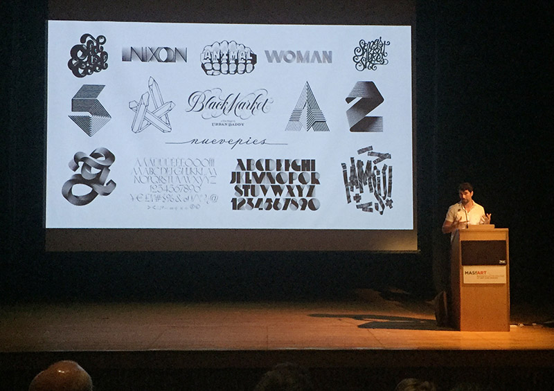
The schedule of events began on Wednesday evening with a quick Green Line jaunt to MassART to hear a lecture by Alex Trochut, presented by the Type Directors Club. Trochut is a phenomenal typographer/designer with a heavyweight client list, and his talk—garnished with a quick portfolio fly-through—preached that style could become the message, even before the text is read. When working for clients like Nike, The Oscars, and Katy Perry, he views design as an actor, and the brand as the script for it to follow. Alex described his process of typographic design by saying it’s “like trying to find the perfect outfit for the occasion. You don’t wear flip-flops to a wedding, and you don’t wear a fur coat to a sunny beach.”
Thursday began with an early morning walk through the sublime Boston Public Gardens, located a block away from this year’s conference hotel—the Park Plaza. As always, a variety of engaging workshops run by the likes of John Downer and Sumner Stone (to name just a couple) were offered before the main programming block. But being a design educator, I could not resist the allure of the Type & Design Education Forum. SOTA’s Vice-Chair, Sharon Oiga, and her team have run this event for several years, and it’s an invigorating kick in the pants preceding the start of every American school year.
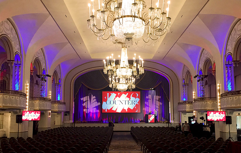
This year’s event was held in the Grand Ballroom of the Park Plaza Hotel—perhaps the most regal setting TypeCon has ever had, with its gilded balconies and voluminous stage. “It’s gorgeous!” says SOTA Chair, Neil Summerour. “The [ballroom has] allowed us more flexibility to make the conference seem that much more special. One of our biggest [points of] focus for the conference is to make the presenters feel special in addition to the attendees.”
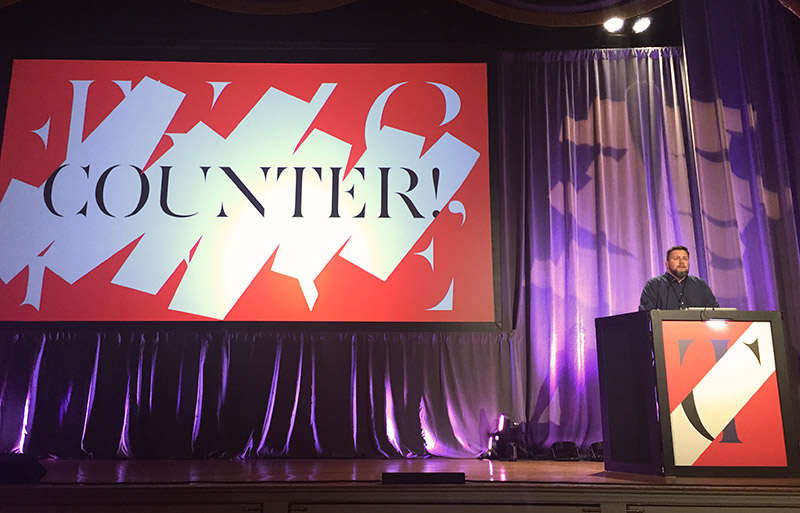
The Education Forum christened the ballroom, and the lineup of speakers predominantly lived up to their grand environs. TypeCon’s theme for 2017 was “Counter”—expanded for the Education Forum with the sub-themes of “Counter-Space,” “Counterpoint,” “Encounter,” and “Recount.” Highlights from the day included Yoon Soo Lee’s recipe for “mud pies,” and her question of whether or not “good design” means beautiful results or what you actually learn through the process, Meta Newhouse’s recounting of her letterpress poster project at Tipoteca Italiana Fondazione in Cornuda, Italy, and Carolina de Bartolo’s case study of her expanded and revised Explorations in Typography typesetting textbook.
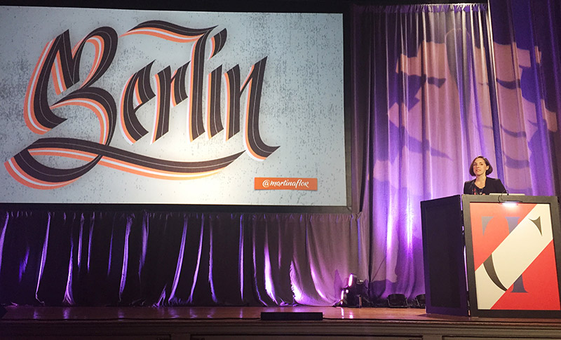
Thursday night was capped with the keynote presentation from the supremely talented, yet loveably down to earth, Martina Flor. The Grand Ballroom was packed to hear this Berlin-based lettering artist share her enigmatic work, as well as her thoughts on the life and responsibilities of a working designer. Martina has matured quickly since I last saw her speak at TYPO Berlin in 2013; her countenance on stage here, as the keynote speaker, showed passion for her craft and resoluteness in her approach.
Flor recognized the communicative power of letterforms during her transition to living in Berlin, saying, “Even when I did not understand the language, the shapes of the letters helped me understand the city.” Flor’s talked about her new book, The Golden Secrets of Lettering, in which she hand-lettered the majority of the content in four different language translations (so far)! “Lately, I’ve found that craft is really about finding a system and polishing it,” said Flor as she wrapped her time on stage and headed to the book signing table.
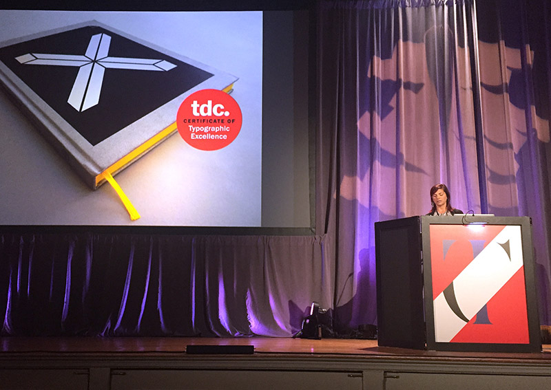
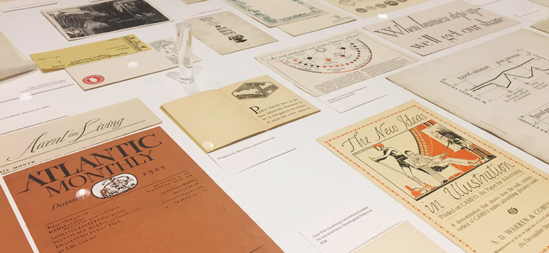
Friday morning saw TypeCon in full swing, with the SOTA Board members setting the tone for the day. “Counter means protest—the exclamation point is important,” said Neil Summerour, referring to the presence of punctuation in this year’s branding. The main program began with a detailed recounting of the career of one of Boston’s finest contributions to design, W. A. Dwiggins, by Bruce Kennett. We learned that Dwiggins’ farcical publications for the (fictional) Society of Calligraphers brought about an age of “fake news” long before the Trump era, and an impressive variety of Dwiggins-designed ephemera was also on display in the SOTA Type Gallery.
A powerful talk from newcomer Tucker McLachlan entitled “Typography Ghost Stories” followed. McLachlan excavated some not-too-pleasant tales from American, Canadian, and British history that showed typography’s role in practices of oppression, racism, and genocide in a hasty but well-researched flurry of typographic “alt-facts.” Another standout presentation from the morning session came from long-time TypeCon photographer, Peter Bella, and his student, Caleb Fairres. Their talk, “Making the Machine Human,” discussed the challenges of creating a 3D-printed letterpress typeface, and shared their beautiful and unexpectedly “human” results.
The run of presentations preceding lunch followed an increasingly common theme at TypeCon, the design and use of non-Latin scripts. Petra Dočekalová discussed her affinity for developing quick lettering styles formed with a single stroke based on Czechoslovakian handwritten scripts. And though both Catherine Leigh Schmidt and Linh O’Briant were a tad flippant in their deliveries, their research into the influence of Devanagari and Origami (respectively) was indeed valuable.
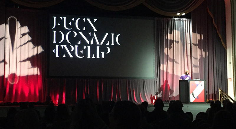
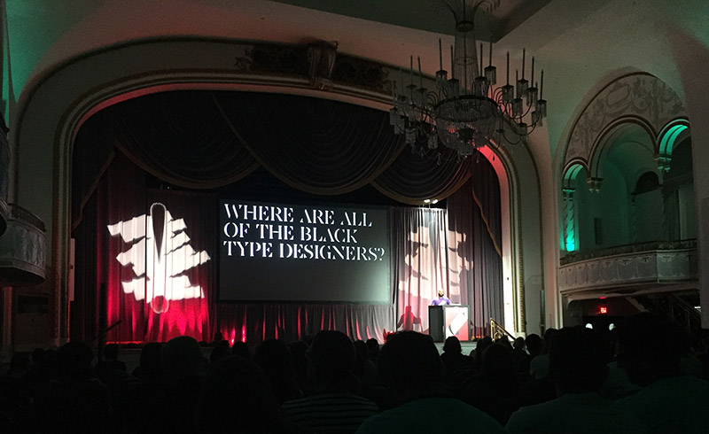
Bobby Martin, from The Original Champions of Design, brought the undercurrent of protest to a boil with his explanation of TypeCon’s branding system for “Counter.” Martin’s process of deconstructing Jean François Porchez’s “AW Conqueror” into legible and illegible versions fostered many opportunities to make the conversation covertly (“F— Donald Trump”) or overtly (“Where are all of the black type designers?”) political.
David Jonathan Ross followed with his review of “typographic maximalism,” explaining that a “typeface is not always just a tool. [Sometimes] it’s more like an instrument … you have to play it … and you might have to practice it a bit.” Judy Safran-Aasen and Mike LaJoie gave the audience a sneak-peek of what’s to come in the newest version of the Microsoft Emoji font. (Spoiler: “Angry” Poop!) Facebook’s Scott Boms waxed poetic about the wonderful world of Risograph printers, and Rachel Elnar elucidated on the benefits of cultivating creative communities like TypeThursday LA and Typography Dojo.
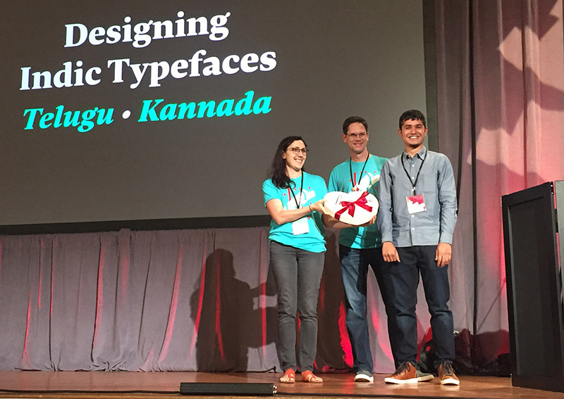
Friday evening’s itinerary was packed as well, with the SOTA Catalyst Award, the Spacebar mixer, and a screening of Briar Levit’s documentary, Graphic Means: A History of Graphic Design Production. Every year, the Catalyst award is presented to a young designer who has created significant original work in the field of type, and the 2017 SOTA Catalyst Award was given to Ramakrishna Saiteja from India. His Indic scripts, developed in collaboration with Indian Type Foundry (ITF), showed a passion for non-Latin script design that is refreshing to see in the younger generation of type designers.
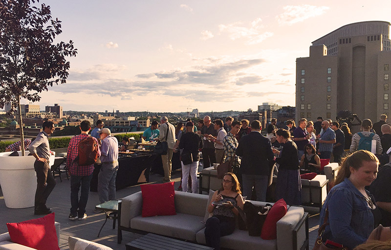
The Spacebar has grown in stature since its inaugural run last year in Seattle. Situated on the rooftop of the nearby Revere Hotel, type nerds could talk shop, chow down, and get to know each other, all while watching the sun set over sweeping vistas of Boston’s downtown and Back Bay. Noting the variety of events at TypeCon, Sharon Oiga said, “It’s really unlike any other conference I’ve been to. There’s a lot of quality information that you can get, but it’s also fun! Sometimes you have to pick and choose because we have so much going on.” This being my third TypeCon, it was obvious that the SOTA Board had worked extra hard to craft a fun and inviting environment for its attendees.
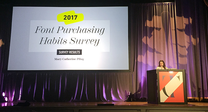
The early morning slots are usually not the most desirable at a conference (especially one that parties as hard as TypeCon), but Saturday’s lead-off presenter, Lucas Czarnecki, energized the audience with his wry sense of humor and pseudo-academic survey of the history of “garbage” fonts. SOTA Treasurer, Mary Catherine Pflug, then shared the results from the second Font Purchasing Habits Survey. Pflug learned a lot from the first iteration of the survey, and made some improvements to acquire an even better data set this year. Among her many filtered observations, Pflug noted that “more education needs to be done about variable fonts before type designers should spend significant amounts of time developing them, at least from a commercial perspective.” Rounding out the morning session, Mark Jamra and Neil Patel returned this year to share more about designing a growing number of typefaces for native African writing systems, and Masataka Hattori discussed the fundamental differences between Japanese and Western glyph metrics.
If Saturday morning seemed a bit academic in tone, the afternoon session shook things up with a bit of style, bling, and surprise! The award for best-dressed presenter would have to go to Elizabeth Carey Smith, whose survey of type in Vogue and other early fashion magazines taught us that “type and fashion can be truly intimate arts.” A typographic drool-fest was cut short, however, when Smith stated, “I don’t like the word ‘sexy’ to describe type anymore than I like hearing someone use the word ‘delicious’ to describe anything other than food. It’s just creepy!” Style stayed in the driver’s seat for the remainder of the session, as Ana Monroe talked about the typography of “bling culture,” and Jess Meoni charted the music industry’s constantly shifting love affair with type. The final talk of the day took an unexpected left turn when Spencer Charles and Frances MacLeod discussed the complex relationship that left-handed designers have with calligraphy.
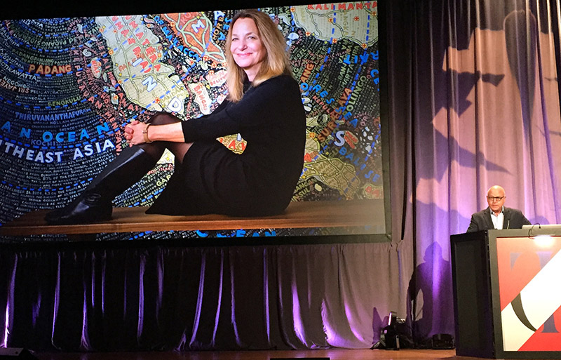
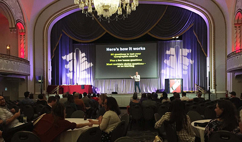
This year’s SOTA Typography Award went to Paula Scher, who, without a doubt, has consistently elevated the role—and public awareness—of type in design. The ceremony was more brief than normal, however, as Scher was unfortunately unable to attend the conference. Saturday evening was brought to a close with the always raucous and never reserved “Infamous Type Quiz and Silent Auction,” hosted once more by Mr. Allan Haley. I’ve finally learned that this event is not about typographic knowledge (of which there is much espoused), nor is it about winning a prize (of which there are many), and least of all is it about pleasing Allan Haley (of which there is no doing)!
Instead, I’ve learned that it’s about rubbing shoulders with fellow type nerds and feeling at home. Grant Hutchinson, who is also on the SOTA Board, puts it this way: “The type community, as odd as it is, isn’t that hard to be welcomed into.” It’s certainly not a huge group, yet it’s full of talented people from all walks of life who are supremely passionate about what they do, and that’s hard to beat.
An early flight on Sunday prevented me from attending most of the final session, but I was able to hear Yves Peters start the day with his proposal for improving the clarity and functionality of OpenType font menus in Adobe software programs, and Jason Pamental’s illuminating talk on variable fonts and “the future of web design.” According to Jason, “the first design consideration for the web is performance. If your users leave, then it doesn’t matter what the design looks like.” It did feel odd leaving the conference at that juncture, but I had to return home and prepare for my semester (which began the next day)!
TypeCon is known for moving around the country, and I’ve always considered that to be one of its biggest strengths. But as I said in the beginning, I was pleased that TypeCon returned to Boston. The first two installments were held in nearby Westborough, Massachusetts in 1998 and 2000. (And in Boston-proper in 2006.) Last year’s conference was also held in Seattle for a second time—so perhaps this signals a shift in ideology towards revision, remembrance, or even reflection. After all, next year marks TypeCon’s twentieth anniversary, and SOTA’s Board is already planning a celebratory trip down memory lane. When casting his vision for next year, Neil Summerour said, “We’re trying to craft something that is respectful to the heritage [of TypeCon]. We want to set a tone that’s going to carry it for the next twenty years. I’m excited to see it all play out.”
I, for one, am too.
Patrick Gosnell
Assistant Professor of Graphic Design at Austin Peay State University in Clarksville, Tennessee, USA
[email protected]
Twitter: @Patrick_Gosnell
patrickgosnell.com