Making of The World’s Best Typography, Typography 46
We’re thrilled to finally share a behind-the-scenes look at a project that’s been quietly in the works over the past year—one that brings together not only the best in typography, but also the best in paper, printing, and bookmaking craftsmanship. Here’s a sneak peek into the making of the upcoming edition of The World’s Best Typography, Typography 46—a book we had the immense honor of producing in partnership with one of the most respected global design institutions. At its core, this publication is about excellence in typography. But equally, it’s about material excellence; how content is elevated through attention to detail, production, and the tactile joy of a well-made book.
To match the level of design, we turned to Fedrigoni—whose papers—manufactured in Italy—bring a remarkable blend of beauty, texture, and performance to the printed page. The book is printed on a carefully curated mix of their finest special papers. Arena is a smooth, natural white surface ideal for crisp typography and image clarity. Tatami Ivory is warm-toned with subtle texture, adding softness and elegance. Sirio Limone is a vivid, punchy yellow that injects energy and contrast. Wrapping it all together, Constellation Snow is used to cover the robust book body, featuring a unique embossed, haptic texture that adds a refined tactile experience to the final object.
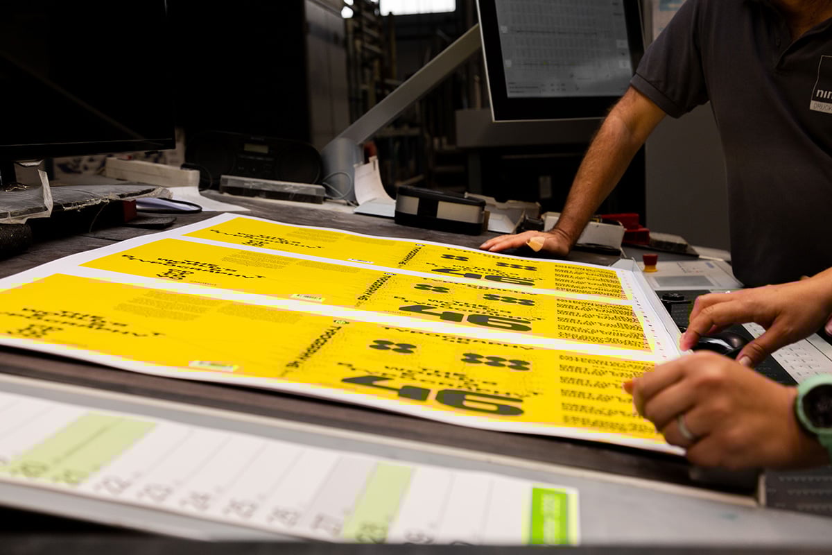
The book was printed in offset at Nino Druck in Neustadt. Their expertise was essential to bringing this book to life. With such a diverse range of visuals (from expressive type and bold color to delicate details and fine lettering) the precision and consistency of the print process had to be flawless. Of course, no book is complete without the final hand of the binder and Buchbinderei Spinner brought everything together with absolute precision. From the open spine (where a specially designed motif is revealed) to the overlapping flaps that wrap and fold into the cover, every detail was executed with care and craft.
This project is a dream collaboration—and yes, if you've guessed it, it involves the Type Directors Club. Typography 46 celebrates the winners of their latest global competition for typographic excellence. We’re honored to play a part in shaping this year’s edition. This is a love letter to the craft of print and the global design community that continues to push typography forward.
The TDC Competition has been a beacon of typographic achievement for over seven decades, recognizing outstanding work across communication design, type design, and lettering. Whether you’re an old-school master technician or a cutting-edge street stylist, we want to celebrate and elevate your work. Enter this year's competition here. Winners will be included in next year's book.
📒 Pre-Order here and be among the first to receive this essential design annual.


