Read more
The project began with my name. In Spanish, mira means “look”. While designing a typeface for my own visual identity, this dual meaning became the foundation for a broader inquiry: before we can speak of form, how does one see?
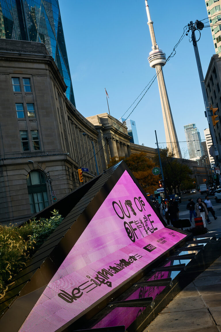
The letterforms draw on optical lenses, optotypes and W. A. Dwiggins’s experiments with perception and expression. Recurring convex and concave cuts focus or disperse attention, interrupting familiar geometric forms. These cuts are structural rather than decorative: they ask the reader to remain with the form slightly longer and allow expression to emerge through the act of looking.
Mira Display
Type foundry: Mira Mayne
Designer: Mira Mayne
Release date: June 2026
Styles/Weights: Regular
File formats: otf, ttf, woff
Prices: 29€ comercial lisence