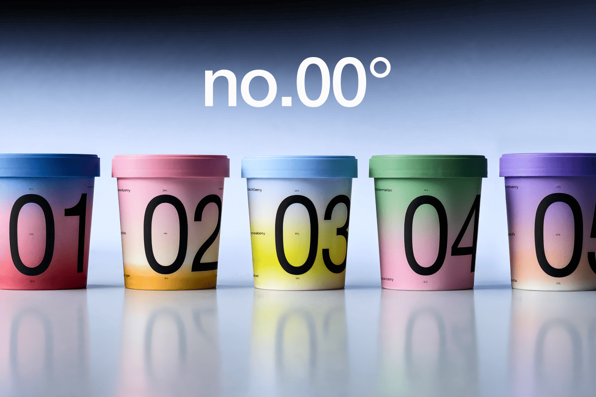
no° | Ice Cream Packaging
Turns Flavor Ratios into a Visual Identity
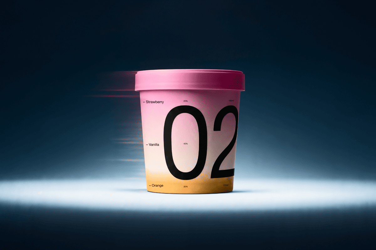
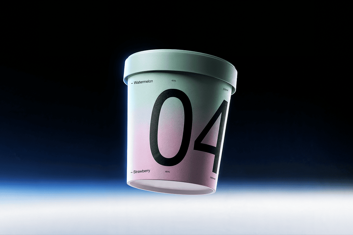
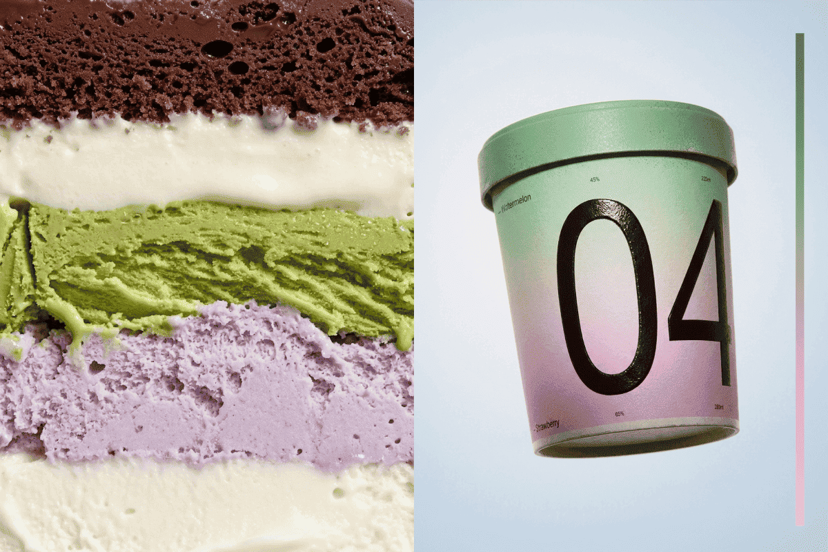
Designed as a composition, no° transforms layered ice cream into a visual identity where the product itself becomes the main design language. Instead of decorative graphics, the packaging visualizes the actual structure of the ice cream, turning its recipe into a clear and memorable system.
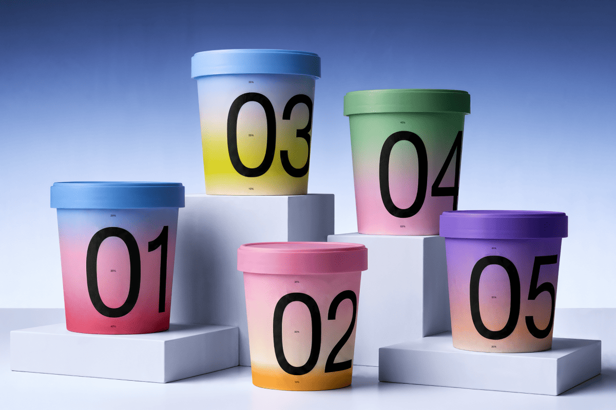
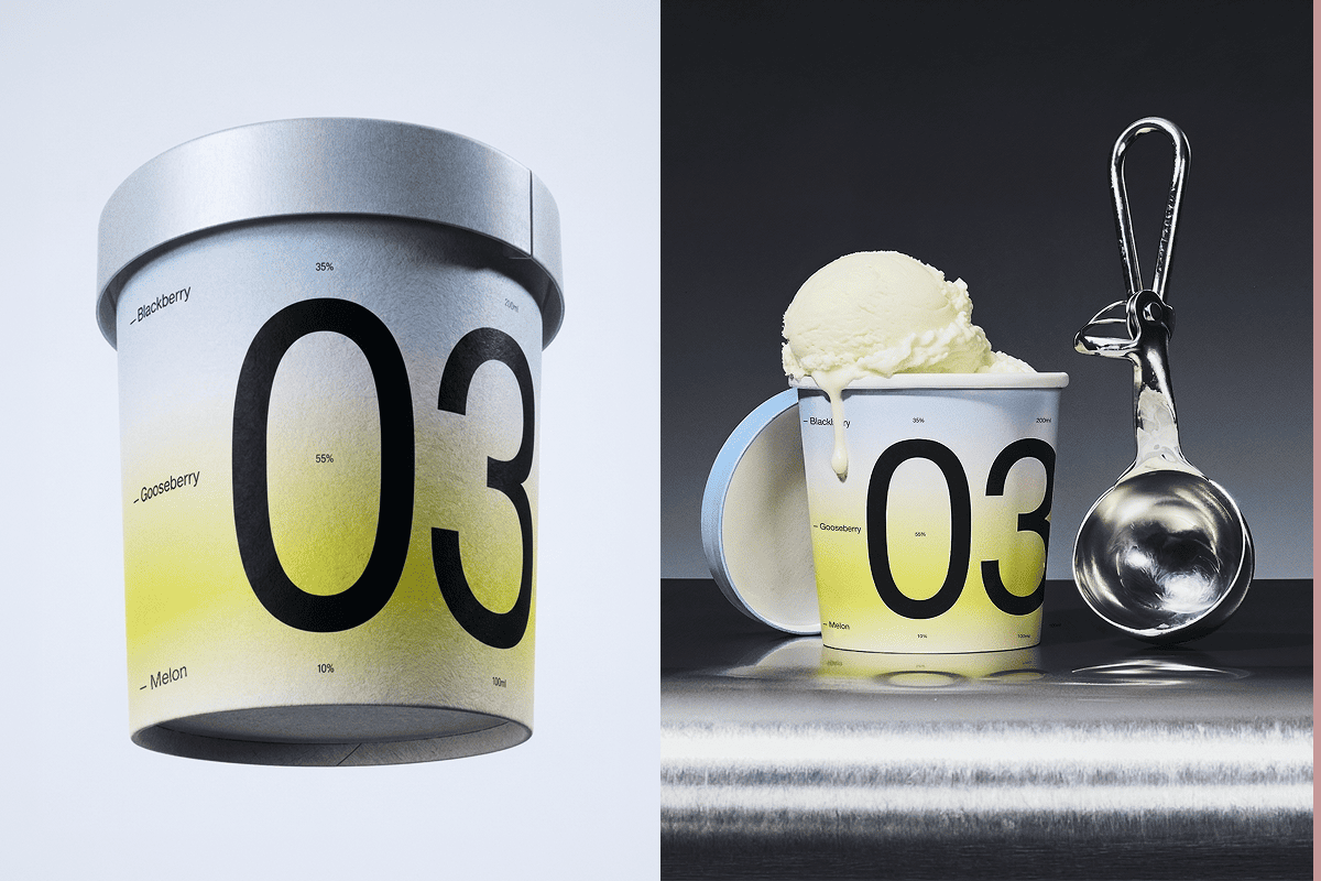
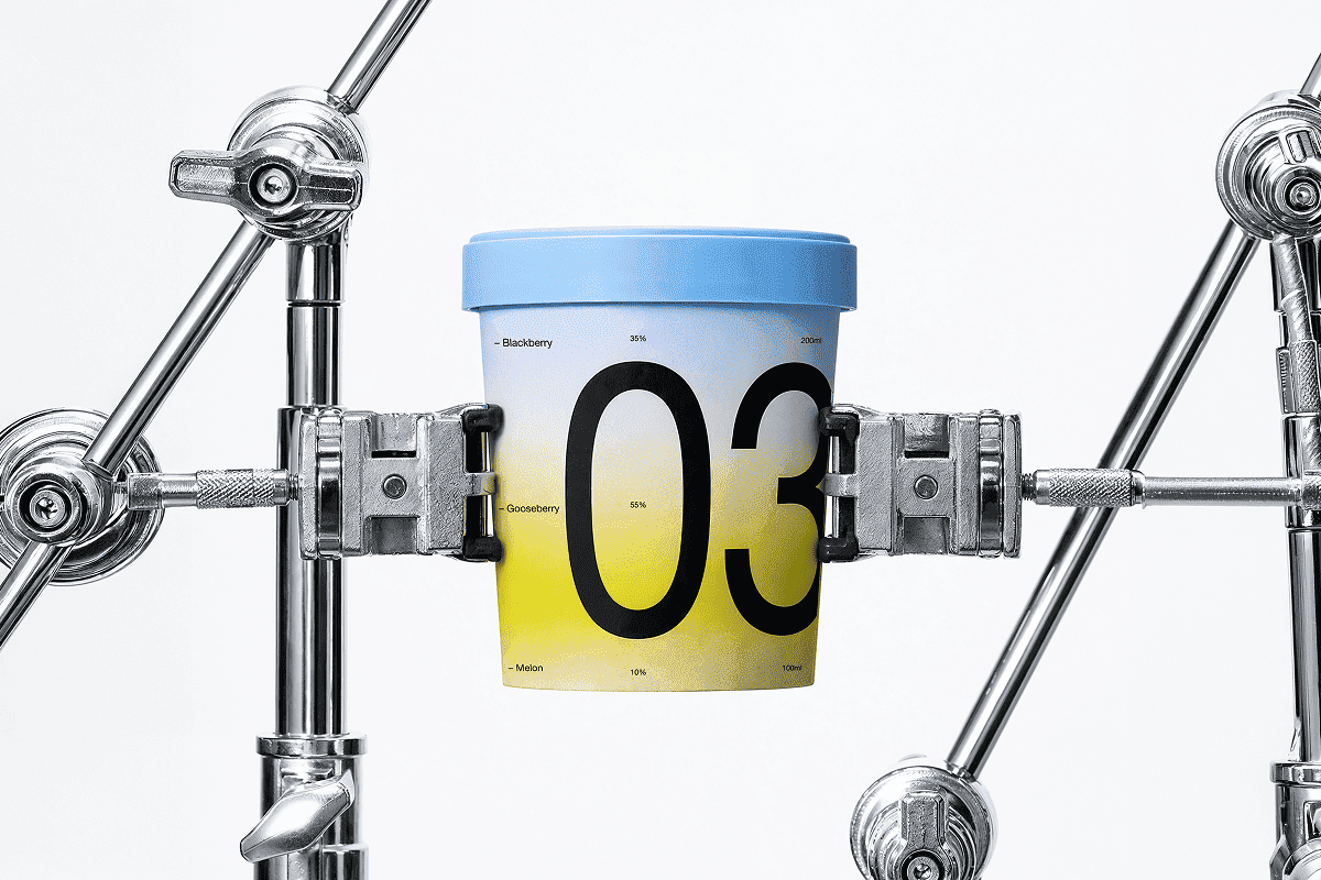
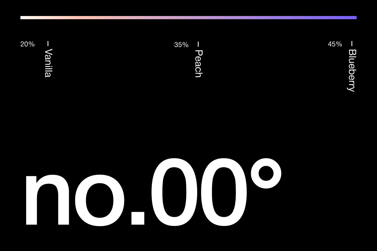
Each ice cream consists of distinct layers, represented by individual gradient bands on the packaging. Printed percentages indicate the exact proportion of each flavor inside every bucket, allowing consumers to understand the product before opening it. Every design decision is based on the recipe itself, making the packaging a direct extension of the product.
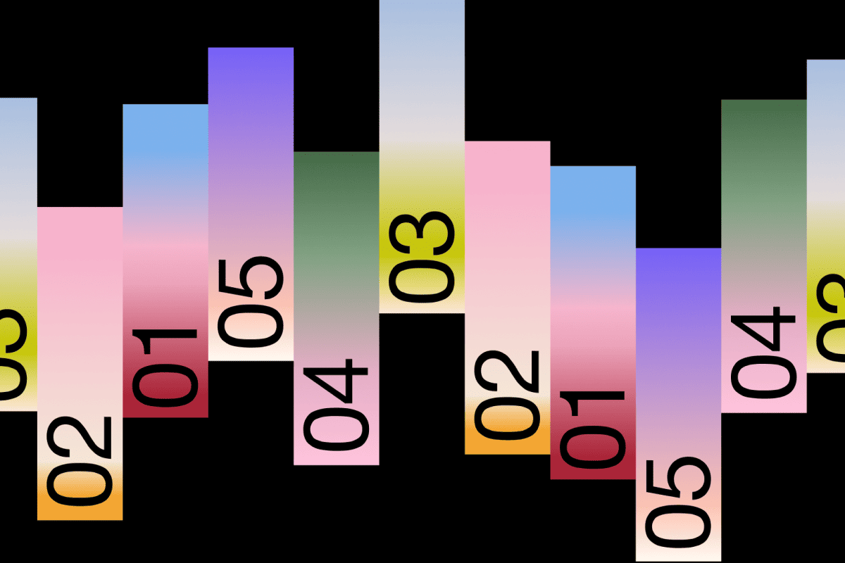
The identity is intentionally minimal. Color, proportion, and structure replace unnecessary visual elements, while different flavor combinations naturally create new compositions without losing consistency. This makes the system flexible and easy to expand across the product range.
By translating the product's composition into a visual language, no° demonstrates how packaging can function as both an information system and a distinctive brand identity, allowing the product to communicate through its own structure, color, and proportions.