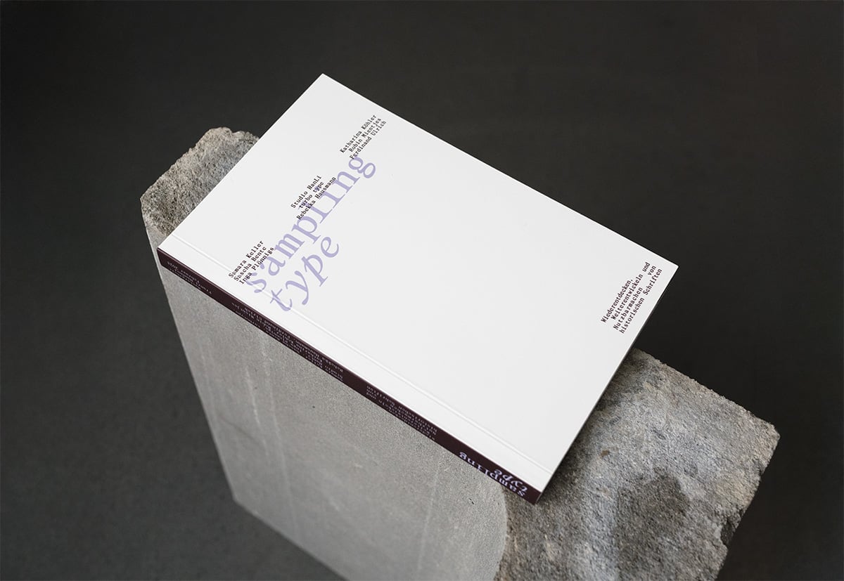
Sampling Type
Type Design with Historical References
Sampling Type is a website and a series of risograph-printed posters by Franzi Häußner that explores how contemporary type design is created through the revival, reinterpretation, or recombination of historical references. The project aims to show different perspectives, create space for debate, and give type design visibility and appreciation.
For many designers, typefaces are mostly a tool. But behind a lot of them lies a story; of craftsmanship, expertise, and historical context. Even today, countless new typefaces are rooted in the past—drawing from old specimens, forgotten ideas, or long-lost designs. As creating typefaces becomes more accessible, it’s important to question sources and use them in a critical way. It’s also about avoiding hero worship and critically examining the design canon. Because type can be a carrier of zeitgeist, feelings, and attitudes.
To showcase diverse perspectives, Franzi Häußner talked with type designers, a typographer and researcher from Oslo, Berlin, Leipzig, Zurich, Lausanne, and Offenbach. The conversations can be read both online and in the form of a poster series, printed in part with risograph. The interviews are set in the designers’ own typefaces and, along with portraits, studio insights, and documentation of their source material, the project offers an inspiring glimpse into their creative process.
Throughout the interviews, type design was often compared to other creative fields—especially music. The idea of sampling fits well, as it describes a playful and experimental way of working with existing material. Historical typefaces are brought into a new context, combined with other elements, and given new meaning. Just like in music sampling, where old or forgotten recordings are reused in a modern way, this approach brings historical type into the present. It’s not only about preserving cultural heritage, but also about developing it further. The name also plays on the word tape, referring to the physical packaging of the posters, which are stored in cassette-like boxes. This links the project to older photo typesetting methods, like the diatronic machine from the 1960s, which used master plates for each typeface—stored in cassettes.
The contributors include:
Samara Keller, Leonie Martin and Laura Brunner (turbo type), Lucas Liccini and Elias Hanzer (Studio HanLi), Ferdinand Ulrich, Katharina Köhler (Camelot Typefaces), Rebekka Hausmann, Inga Plönnigs, Sascha Bente and Robin Mientjes (Tiny Type).
Sampling Type is part of Franzi Häußner’s master's thesis, completed during the winter semester 2024/25 at HTWG Konstanz in Germany, under the supervision of Prof. Valentin Wormbs and Dagmar Korintenberg, and was exhibited at the Werkschau in Konstanz in February 2025.
Sampling Type—Type Design With Historical References
Concept, Design and Photography: Franzi Häußner
Supervised by: Prof. Valentin Wormbs, Dagmar Korintenberg (HTWG Hochschule Konstanz)
Fonts: Neue Kramer Grotesk (turbo type), Ronald and Tempos Mono (Samara Keller), Dunbar (CJ Dunn), Rank (Rebekka Hausmann), HAL Repost (Studio HanLi), Rosart (Katharina Köhler), Messer (Inga Plönnigs), Rhetorik (Sascha Bente), Dover Serif (Robin Mientjes)
Riso-Printing: Drucken3000
Further information here.


