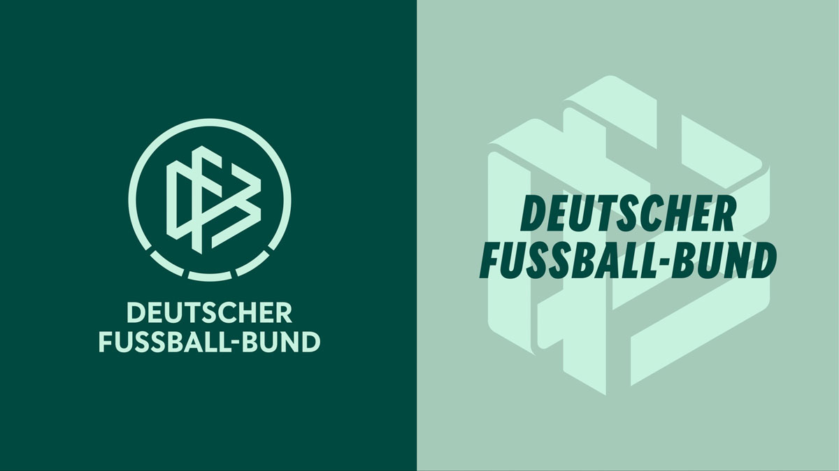
The New DFB Brand Identity
The German Football Association (DFB) has undergone a design transformation. Its new brand identity embraces both heritage and progress—from a fresh color palette to a fully variable typeface that captures the emotion and dynamism of the game. Developed in collaboration with Strichpunkt Design, the redesign connects the past and the future through energy, clarity, and inclusivity.
We spoke with Holger Merk, Head of Brand Department / Staff Unit, DFB GmbH, about how the federation’s new visual identity brings its mission to life and unites a community of millions under one design language.
Julia Kahl: The DFB is the umbrella organization for 26 regional football associations and more than 25,000 clubs—a network that reaches millions of people across the country. How do you even begin to approach a redesign for a brand of that scale and significance, one that touches so many different audiences?
Holger Merk: First, we broke the brand down into its core building blocks to really understand what people inside and outside expect from it. Then, when we put it back together, we shaped a clear profile with three key dimensions where the brand creates the biggest impact through all its projects and initiatives. That process gave us a sharp vision for the rebrand.
The DFB’s work spans three core areas:
Organization—administrative, structural, and management topics
Society—social responsibility and community engagement
Sport—everything that happens on the pitch
Each of these areas now has its own visual expression, while core brand elements like the logo, typeface, color palette, and the characteristic pitch grid remain consistent. How is this visual differentiation achieved in practice, and what defines each area’s look and feel?
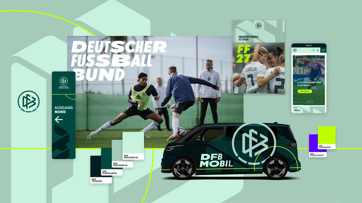
Each dimension highlights a core area of our work and gives the brand its own distinct vibe. Organization focuses on our work with regional divisions, the DFL, UEFA, FIFA—so its look is formal and structured. Sport is where our passion lives: full of energy and emotion, and that’s exactly what the design should express. To make these differences tangible, we tap into our full brand toolkit. In Sport, that means bold neon on deep green, dynamic use of our variable typeface, and a grid-style Supersign for extra movement and impact.
As a platform with a focus on typography, we’re especially intrigued by the new DFB Sans. It’s now a fully variable typeface designed to convey the rhythm and energy of football. Could you tell us more about how the type system was developed and how this new flexibility translates into daily communication?
Originally, DFB Sans was developed in an extended character set and only a few font styles (Condensed, Regular, Bold), mainly as upright and italic. The sans serif geometric design is derived from the visual language of the picturemark and references the pitch lines typically found on a soccer field, which are also part of the visual design repertoire of our design assets.
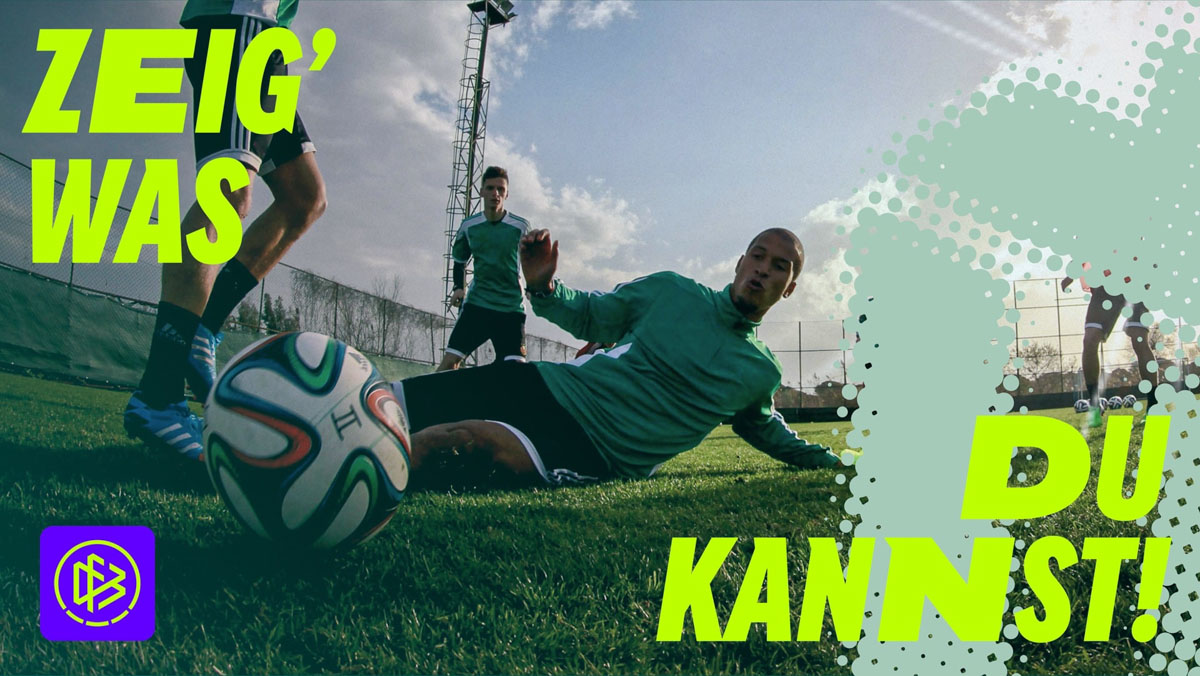
Typography plays a central role in the visual DNA of the DFB, and it probably has the highest recognition value across the entire design language. By developing it into a variable font and pushing the font's borders to Thin and Black, Compressed and Super Extended, we now have the opportunity to reflect the depth of German soccer, convey more emotion, and allow us to create a visual volume ranging from “loud” to “quiet”. Apart from the technical features offered by variable fonts, it can be used to express emotions at the font level, particularly in digital and moving applications, which we previously only had in images.
In addition to the main logo, the DFB introduced a “super sign” as part of its new design system. What’s the story behind this super sign, and how does it interact with the core logo?
Over my 20 years at the DFB, the inner structure of our logo has often been considered as a design element—but for a long time, any attempt to modify it was strictly off-limits. In recent years, we’ve become more flexible. During the rebranding process, we realized the potential of this inner structure—what you could call the ‘soul’ of the logo—as a powerful design feature. That’s why we developed a 3D version. Today, the Supersign allows us to infuse every piece of communication with a touch of the association’s identity. We love that! It’s not about interacting with the logo itself: the Supersign works as a bold, meaningful design element.
A large set of icons and pictograms was created as part of the rebranding. The ones representing diversity and togetherness are particularly striking. How and where are these icons being used across DFB communications and platforms?
Icons, especially those representing diversity and community, play a key role in the Society dimension. This is where we drive projects and initiatives that happen off the pitch. Often, we collaborate with organizations and institutions that bring their expertise to the table. A current example is our Year of Schools project, which aims to connect football and education more closely.
In these projects, we don’t have the usual emotional imagery from the game, and the context is often more educational. That’s why we rely on icons to deliver content clearly and make it easy to understand across all touchpoints.
“Be it an umbrella or sub-brand, foundation or competition—every brand in our team has its own character made up of typography, colour scheme, imagery and graphic elements. And all brands together form and strengthen the big picture like a well-coordinated team: the DFB design language.” This quote perfectly encapsulates the new spirit of the DFB’s identity. What did Strichpunkt Design change or introduce to make the DFB design language more future-oriented and inclusive?
The old look of the umbrella brand was clean, white, and strategically unemotional. It reflected the organisational areas of the DFB and thus communicated little to no emotion. In the redesign, the sub-brand levels were dissolved. All the areas covered by the DFB are now reflected in one umbrella brand identity. Within the brand, a distinction is made between the three main areas of activity: organisation, society, and sport. Therefore, the brand's visual implementation must also enable this balancing act. The new supersign symbolises the association's work, which ranges from amateurs and children to professional sports. In other words, all facets of football. All in all, the new design elements create a more open, accessible, and approachable brand. This is exactly how the DFB will be positioned in the future.
The DFB’s rebrand is more than a visual update—it’s a cultural statement about what football represents in Germany today: diversity, movement, and belonging. Through color, form, and type, the new identity celebrates both the grassroots and the grand stage, reflecting football’s power to unite. It’s a design language that feels unmistakably DFB—and unmistakably alive. Good work!
