Vanguard is a project inspired by the anti-gentrification protest. It serves as a visual statement, amplifying the voices of those affected by…
Poster designed for the 50th anniversary of Bursa Uludag University.
Poster design for the exhibition 'In Pieces', curated by Neriman Polat and featuring the artworks of Hilal Balcı, Defne Parman and Doğa…
I designed this catalog for the Echoes of Kathmandu Valley show at the Waterloo Center for the Arts, featuring 100 watercolor and…
Kharkiv vibes inspired by Mirror Stream (Dzerkal'nyy Strumin') fountain.
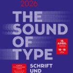
Final presentations Lucerne University of Applied Sciences and Arts Design & Art
Client Michelin House London (UK). Poster for the 100th anniversary of the Michelin House in London. The entire poster was designed using…
Poster for a book by Sandra de Matos, Illustrator from France. Poster that also functions as book cover.
In this project, I explored writing within a precise three-dimensional grid in a flat digital space, incorporating time. With Korean animator Choi…
GEO is an experimental font pushing the limits of how many anchor points a font file can store. This font is inspired…
This typographic work is based on a hand-drawn experiment inspired by the idea of an alien flora from another planet. Each letter…
Kado is a typeface inspired by the traditional Japanese art of ikebana, embodying its essence of balance, harmony, and natural beauty. Each…
The visual identity and typographic intervention respond to this complexity by adopting a method of iterative displacement—collaging typographic strata, bending formal hierarchies,…
For Positioned Realities, Can Yang developed a visual identity that accompanies curators, artists, and audiences navigating the exhibition’s transnational and decolonial questions.…
This work explores the Arabizi writing system in relation to Mahraganat, an Egyptian genre of rap. Arabizi is a system of writing…
'There is no backwards or forward' is a typographic experiment that explores the geological connections between language and culture. Using molten aluminium…
"Memory Cards" is a series of works reflecting on the materiality of the digital form of memory. Memory transitions from the perceptible…
Fueled with love for design, I created four image-based works that each one had different textures. And then I found some interesting…
A hybrid alphabet blends upper- and lowercase letterforms into one continuous stroke, creating a fluid, expressive system where contrast and consistency coexist…
Design for the solo live performance of the string ensemble “Kurotowa,” based in Fukuoka and Tagawa City. Held at OVERGROUND in Minoshima…
Fountain Installations is a fictional art event in Näfels, Switzerland, inviting artists to reinterpret local drinkable fountains. The letterpress poster, printed in…
This project investigates how typography can become spatial and interactive. Using projection, motion tracking and real-time software, it explores how letterforms can…