These experimental posters are part of a larger collection of my work titled “Tuned In With Type”. This is a project that…
X_1 is a typographic study of the placeholder state in digital design software. This pale blue X represents absence and negation before…
This series of drawings and paintings explores playful typographic form as spatial structure, investigating the intersection of art, design, and architecture. Inspired…
For the year 2025, I have created a calendar that shows a different optical illusion poster every month. Some of these experiments…
To create this poster, Hester combines new and "dead" technologies. Each letterform is made in the darkroom using photo-sensitive paper and physical…
Poster for the 60 years of Esdi – Escola Superior de Desenho Industrial, Rio de Janeiro.
Caltrop explores typography as a defensive form. Built natively in 3D modeling software, the typeface draws from natural and man-made defense mechanism—sea…
Rottura is a broken, dramatic typeface that instantly captures attention through its distinctive form and strong visual impact. Its sharp angles, abrupt…
The Mindpuzzling typeface was created to capture the feeling of having thousands of thoughts at once, intertwining into one larger picture, like…
This is a work in progress in which oil in a frying pan was photographed over a period of more than a…
To create this poster, Hester combines new and "dead" technologies. Each letterform is made in the darkroom using photo-sensitive paper and physical…
The project explores living typography found on gravestones where carved letters are gradually overtaken by moss. Originally rigid, human-made forms are transformed…
This work showcases "Blob", a typeface I designed for my typography class last year. The concept behind Blob is rooted in the…
“Waxperients” focuses on abstract wax forms created through accidental processes during candle destruction. The material develops flat, bubbly and broken structures that…
HvyColumn Slice draws inspiration from unearthed archaeological architecture. Derived from a cross-section of a 20-fluted Roman Doric column, the typeface follows a…
Experiment 1.8 focuses on curatorial generation of a typographic composition in Midjourney. Earlier personal generations were used as stylistic anchors via the…
The project explores typography created by an educational toy robot that draws using simple programmed commands: up, down, left, right. The restricted…
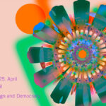
Poster for music concert at Quintavant/Audio Rebel, Rio de Janeiro.
Trigon Grotesk is a font family with nine styles. In addition, the Trigon Angular style was created, which consists of triangles that…
To create this poster, Hester combines new and "dead" technologies. Each letterform is made in the darkroom using photo-sensitive paper and physical…
Experiment 1.7 focuses on constructing a lowercase alphabet based on a single letter. A lowercase “m” from Midjourney generations was chosen as…
Poster for music concert at Audio Rebel, Rio de Janeiro.
Excidenz-Grotesk is the identity-shaping typeface for “About Repetition”, a non-profit organisation concerned with transdisciplinary projects in art and design. Its core element…
Inspired by Lumby Space Princess from the Adventure Time series, the typeface is a result of confidently experiment with pen drawing techniques,…