A typeface designed to be stretched.
Dot.Font is a futuristic animated-gif typeface for the generation that doesn’t read. It’s letters are reduced to as little elements as possible, rapidly…
We Are Family is an interactive, typographic installation that make use of unsettling images and fragments from found on-line political, brutal, pornographic…
Art vs. Design is a typographic installation that make use of certain elements from known artworks to form letterforms. This work addresses the…
The Acrobat is a series of posters experimenting with space, letterforms and feelings, in lockdown times.
Middle E. is a series of screen-printed works of the letter ‘E’ that has absorbed the spirit of a beaten and murderous…
Veining is a design fiction comprised of a 3d text surgically implanted, integrated into the body’s circulatory system and enhanced via a…
The challenge of this experiment was to generate random compositions using six craft sticks painted in the colors red and white; black…
Creation of visual compositions that presented the word “pandemonium” from the juxtaposition of letters and symbols identified on posters, leaflets, packaging and…
The adidas brand department asked for an analog letter set inspired by handwritten notes. They wanted a letters for a brand communication…
Palinopsia (Greek [pælɪˈnəʊpɪə]: palin = again and opsia = seeing) is an animated typography experiment that challenges commonly held notions of legibility.…
To develop the letters of the word “pandemonium” using the collection of bar codes. Letters were made manually, from a scanned page,…
Egon Schiele believed that hands had the power to express feelings more effectively than the face; hence, the wide variety of highly…
An audio-visual installation where a projection on the wall is displaying a variable typeface which reacts to the volume (from a simple…
The initial problem was to manually produce, with a black marker, different designs for the letters that make up the word “pandemonium”,…
This is a series of screenprints titled “Character Count”. They are the result of continuing visual research exploring combinations of technological and…
This video is part of an extended research project exploring visual rhetoric through motion design, print design, typography, photography, and videography.
This recent motion work is the product of an exploration and dialogue focusing on the contradictory nature of race relations on a…
Poster series for Chelsea Thompto's Transcode Manifesto, Produced by CODELab (KT Duffy + alejandro t. acierto), and designed by Jonathan Sangster. “Transcode…
These pieces were designed as visual commentary regarding the continued and pervasive state-sponsored violence against BIPOC people in the United States.
Largely informed by typography, my work often deconstructs letterforms with the intent to reconsider the relationship between message and viewer, encouraging a…
Largely informed by typography, my work often deconstructs letterforms with the intent to reconsider the relationship between message and viewer, encouraging a…
Poster utilising my own experimental script font fshine.
Upcoming Events

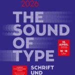
17.04.2026 –
19.04.2026
30. Leipziger Typotage 2026
Leipzig

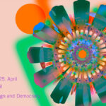
25.04.2026 –
25.04.2026
see-Conference 2026
Kulturzentrum Schlachthof, Wiesbaden, Germany

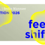
29.05.2026 –
31.05.2026
re_CREATION 2026
WANNSEEFORUM, Hohenzollernstraße 14, 14109 Berlin

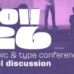
30.05.2026 –
31.05.2026
TypeParis Now26
Novotel Paris Vaugirard Montparnasse, 257 rue de Vaugirard , 75015 Paris, France