Due to my great admiration for the Olympic Games, not only for the sporting event itself, but also for the strong graphic…
The Alpium logos represents a forward motion set in the heart of a spectacular setting. Its design creates a sense of depth,…
Letha’s visual identity explores movement as a language of control, balance and body composition. Inspired by Pilates and Contrology, a system of…
Letha’s visual identity explores movement as a language of control, balance and body composition. Inspired by Pilates and Contrology, a system of…
The project began as a way to rethink how physical activity is usually represented. Instead of another dashboard centred around pace, distance…
The project began as a way to rethink how physical activity is usually represented. Instead of another dashboard centred around pace, distance…
Goalkeepers are the very best team players! They also stand a bit outside the team, on their own. They are reliable, stubborn…
UsMeCa typography is a commemorative work made in honor of the World Cup in 2026, and follows a sequence of projects that…
Camiseta is a Graphic Design thesis supervised by Davide Luccini. It investigates the football jersey beyond the pitch, tracing its transformation from…
Driven by a passion for football culture and design, these custom jerseys bridge the gap between the pitch and the streets. Through…
Originally used to hand food and supplies to riders during road races, the musette bag remains an icon of cycling culture.
Designed,…
Originally used to hand food and supplies to riders during road races, the musette bag remains an icon of cycling culture. Designed,…
Ping. Pong. This is what happens when you ask type to stop describing a sport and start performing it. The letters don't…
Crack is a typeface developed since November 2025 at HEAD–Geneva, alongside CrackHead Football Collectif, a self-initiated, amateur and mixed student football collective.…
Kill Bill and the football schwalbe seem worlds apart, yet both stage exaggerated drama for effect. This project explores that unexpected common…
Waddesdon Manor Wild Wood Adventure Playground poster announcing the new playground, encouraging children to play, explore and get active.
A simple twist on the traditional game of Dominoes - replacing the dots with coloured squares. We wanted to engage designers with…
Beijing 2022 was a proposal for the visual identity of the Winter Olympic and Paralympic Games, exploring the energy and movement of…
8×8 is a typographic project exploring how a familiar system can be reconfigured through type, structure and play. Using the 64-square chessboard…
ABRAZO is a film about an amateur tango club in Folkestone, exploring connection, duality and the relationships formed through movement. The identity…
Studio Sutherl& began playing chess over Zoom during the Covid-19 lockdown using chess notation, which describes the name of the piece being…
Studio Sutherl& began playing chess over Zoom during the Covid-19 lockdown using chess notation, which describes the name of the piece being…
A limited edition of 50 typographic chess sets, inspired by text notation.
Bikedot sells and curates bikes, parts, and clothing. They have 30 years of experience with many of the world’s leading bike builders.…
Upcoming Events
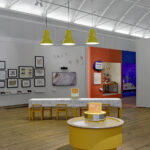
15.11.2026
Inside Aardman: Wallace & Gromit and Friends
Young V&A, London

11.11.2026 –
14.11.2026
Design Policy Day
Frankfurt, Offenbach, Wiesbaden
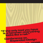
12.11.2026 –
13.11.2026
Conference on Expanded Design
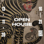
13.11.2026 –
13.11.2026
Slanted Open House / Seoul Release Party
Slanted Publishers, Nördliche Uferstraße 6, 76189 Karlsruhe, Germany