FC Sans Pauli features a distinctive back-slant that reflects the club’s left-wing attitude, inspired by the graffiti and tape art of Hamburg’s…
At the 2014 World Cup, Nike used the Samba font, by Tony de Marco & Caio de Marco, to write on the…
LOKE JUDO is a local judo club in the Basque Country with 230 members ranging in age from 5 to 45. The…
BOULDERING SUCKS ist eine typografische Provokation mit einem Augenzwinkern. Die handgezeichneten Lettern erinnern an grobe Holzschnitte und historische Letterpress-Drucke – roh und…
The design of this poster is directly inspired by the origin of the race itself, which owes its name to the Belgian…
This poster started as a typographic experiment. I wanted to capture the rawness and weight of Paris–Roubaix and its rugged surroundings by…
The fine line between being celebrated and ignored often comes down to a few milliseconds or millimeters. Using a typeface associated with…
The biggest enemy of sport is every excuse not to show up, keep going, or simply give up. For Dynamic Squad, a…
The BETON campaign captures Red Star FC's transformation by celebrating imperfection instead of hiding construction. Built around raw concrete textures, hand-cut typography…
The campaign captures the unique spirit of Wiener Sport-Club by celebrating its history, humor and strong sense of community instead of relying…
The poster transforms Olympic sports including badminton, table tennis, tennis, basketball, and volleyball into images composed of dense characters and symbols. Type…
The poster was originally created for the 2026 Chinese Year of the Horse. A horse in motion is captured through deliberate blur,…
The poster transforms the Chinese zodiac horse and the characters “放马过来 2026” into a visual language of speed and competition. The geometric…
FC Sans Pauli features a distinctive back-slant that reflects the club’s left-wing attitude, inspired by the graffiti and tape art of Hamburg’s…
Combining the colors and patterns present in the refereeing instruments to different types of balls used in the various "soccers" around the…
For ARQUIBANCADA magazine's visual identity and graphic design, a typographic system was developed, highlighting the magazine's dialogic nature and exploring the unpredictable…
Original Czech magazine Sport in Art designed by Milan Nedvěd from issue 1 to 9 (2024–2025). It explores the intersection of sport…
Dynamic key visual, digital assets, thumbnails, as well as a poster and ticket for the premiere of Canyons’ documentary on the ‘Challenge…
Melville Brand Design translated the adidas DNA into a custom typographic signage system for the "Podium" campus building. Typography serves as an…
Upcoming Events

15.11.2026
Inside Aardman: Wallace & Gromit and Friends
Young V&A, London

11.11.2026 –
14.11.2026
Design Policy Day
Frankfurt, Offenbach, Wiesbaden
12.11.2026 –
13.11.2026
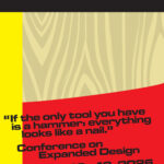
Conference on Expanded Design
13.11.2026 –
13.11.2026
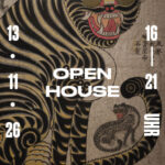
Slanted Open House / Seoul Release Party
Slanted Publishers, Nördliche Uferstraße 6, 76189 Karlsruhe, Germany