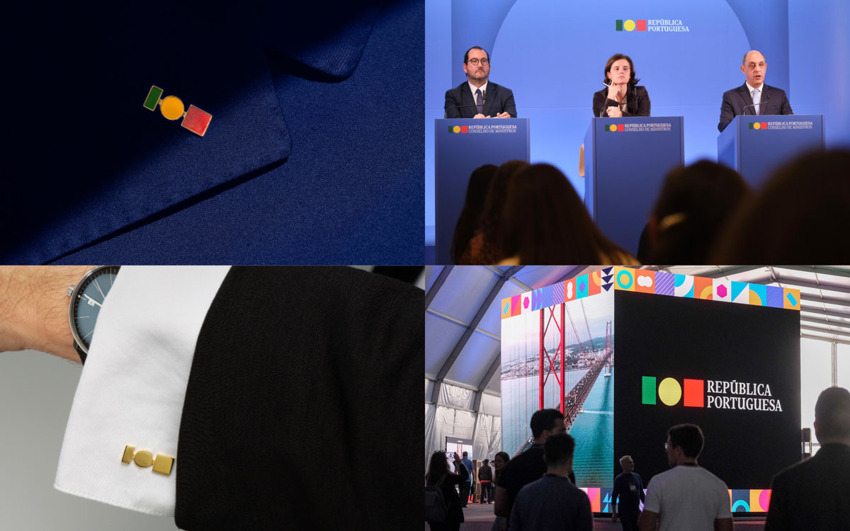
When Government Branding Becomes a Battleground
A Conversation With Eduardo Aires on the Visual Identity of Portugal’s XXIII Government
We first met Eduardo Aires in 2016, in his studio in Porto, while working on the Slanted Portugal issue. At that time, Aires was already internationally recognized for the City of Porto’s visual identity system (launched in 2014), a project widely discussed as a benchmark for contemporary municipal branding and flexible identity systems. That early encounter framed our understanding of Aires as a designer concerned less with stylistic authorship and more with institutions, territory, and the long-term role of design in public life.
Nearly a decade later, our conversation returned to these themes under far more charged circumstances: the aborted visual identity of Portugal’s XXIII Government designed between 2022 and 2023, implemented throughout 2023, and politically dismantled in 2024. From the outset, it was clear that this was not simply a discussion about a logo, but about the limits of design in democratic institutions, and the risks designers face when political conflict absorbs visual systems.
Why a government identity became a national controversy
In many democracies, changes to government identity systems are treated as administrative infrastructure. They are tools that help citizens recognize official communication across websites, documents, press conferences, and public services. In Portugal, however, this redesign became a symbolic battleground.
Aires was explicit about the original intent: “This was never about redesigning the country. The country already has a flag. What we were doing was designing how the government speaks with its citizens.” The distinction is fundamental, yet it was repeatedly collapsed in public debate.
As later reported by Reuters, the simplified identity was criticized by political opponents for removing historic heraldic elements, and was reinstated by the incoming conservative government as its first official act (Reuters, 3 April 2024).
But let us jump back and have a closer look at this identity project that was commissioned under Prime Minister António Costa, leader of the Partido Socialista (PS), a center-left socialist government that held office from 2015 until late 2023. The XXIII Government, formed in March 2022 following a Socialist majority victory, initiated the redesign as part of a broader effort to modernize state communication.
The redesign therefore originated neither under a right-wing administration nor as a nationalist gesture. It was conceived within a socialist-led government and framed explicitly as an administrative and communicative update for the digital era.
The brief: government communication in the digital era
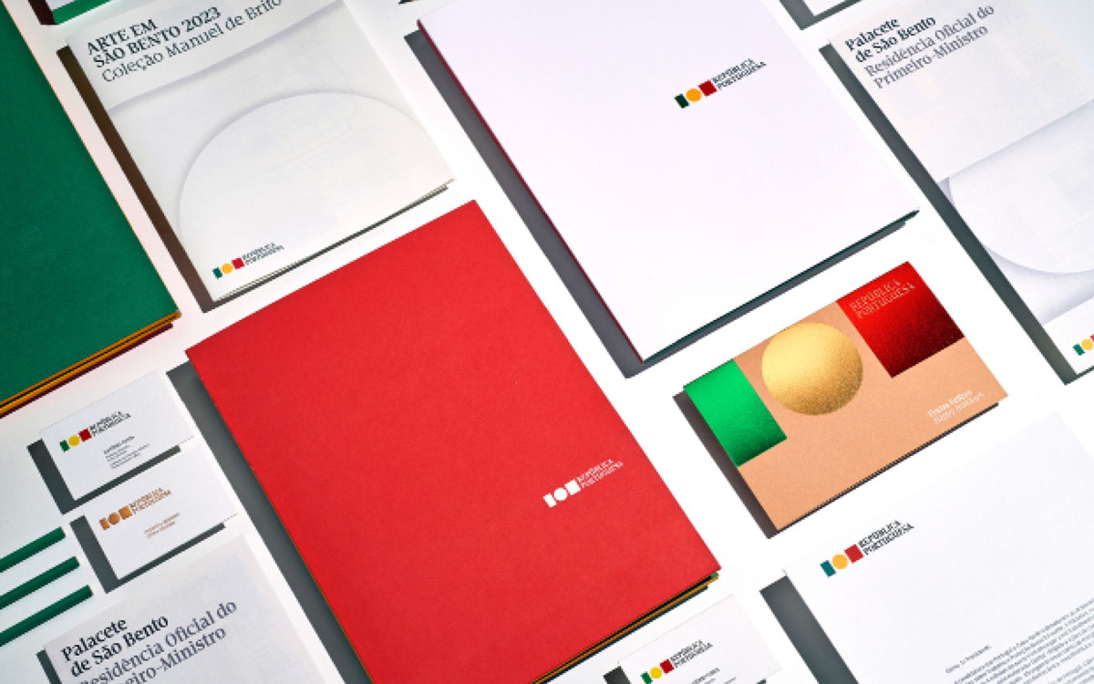
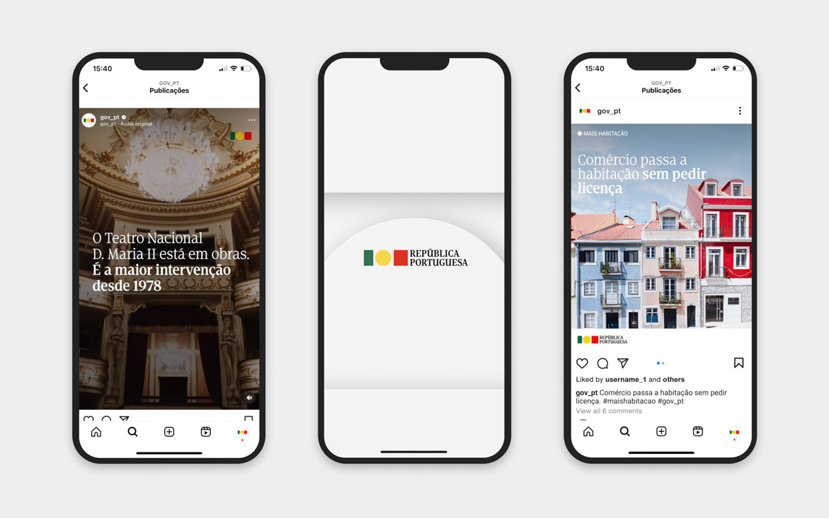
According to Aires, the brief was unusually precise. “They asked for something contemporary, something that would really work in a digital era, not something decorative, not something nostalgic.” The task was to clarify how the government communicates with citizens across websites, interfaces, documents, press conferences, and public information systems.
Commissioning, duration, and resources
The project emerged from a competitive pitch and was developed over approximately eighteen months, between early 2022 and mid-2023, on a publicly reported budget of €74,000. Aires addressed persistent misconceptions directly: “I was accused of earning huge amounts of money. In reality, half of the budget went straight to the digital team. The rest had to cover the studio work for a year and a half.”
Method and rationale: territory, not style
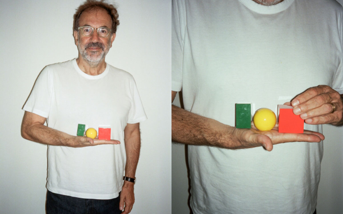
Aires’ methodology centres on what he calls ‘territory’. “I always search my answers in the territory, never in style,” he explained. In this case, the Portuguese flag became the conceptual source. Not as an object to be replaced, but as material to be translated. The resulting synthesis deliberately removed small heraldic details. “If you reduce those elements for digital use, they disappear. My responsibility was to make sure nothing is lost in translation.”
The Guardian later summarised this approach by noting that the redesign aimed at clarity and adaptability rather than symbolism, while the backlash framed it as an ideological gesture (The Guardian, 10 April 2024).
The ‘soft launch’: visibility without explanation
One of the most consequential decisions was the absence of a formal public launch. Prime Minister Costa, according to Aires, believed that “communication is not news,” and therefore preferred a gradual, almost invisible rollout.
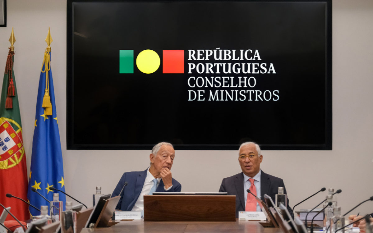
In practice, this meant that the identity entered public life through use rather than announcement. “We started with the government website,” Aires explained. “Then the Pope came to Portugal, and suddenly the identity was everywhere—television, newspapers, billboards. It was incredible.”
Throughout the summer and early autumn of 2023, the system appeared continuously: weekly press conferences, official statements, and the highly visible presentation of the national budget in September and October. Yet, as Aires recalled, “No one was asking, ‘What is this?’ No one called the communication department. We were wondering among ourselves: is it so well accepted, or so smooth, that nobody notices?”
This silence proved deceptive. “At the same time, we were suspicious,” Aires added. “Because when nobody asks questions, it can also mean that something is waiting to explode.”
November 2023: political rupture
In November 2023, Portugal entered a period of political crisis. Following statements by the Attorney General referencing an investigation in which António Costa’s name was mentioned, the Prime Minister resigned. Although he was not charged, the resignation triggered the dissolution of parliament and the calling of early elections.
From this moment onward, the identity project became politically exposed. “That was when everything changed,” Aires said. As the political climate shifted, the project was weaponised. “From November onwards, I received threats you cannot imagine,” Aires said. “I went to the police. They told me to remove my address from my website.”
This personal exposure was widely reported. Monocle described how the controversy escalated during the election campaign, turning a functional design system into a proxy for broader ideological conflict (Monocle, 13 May 2024).
Election campaign and weaponisation
The snap legislative elections took place on 10 March 2024. During the campaign, the government identity was repeatedly instrumentalised as a symbol of alleged ‘wokeness’ and disrespect for national tradition. Luís Montenegro publicly promised that removing the identity would be among his first actions in power. The most aggressive attacks came from the far-right party Chega and its leader André Ventura.
Aires described the dynamic bluntly: “They were not discussing design. They were discussing ideology through design.”
Change of government and dismantling of the project
Following the elections, a centre-right minority government led by Luís Montenegro (Aliança Democrática) took office on 2 April 2024, with parliamentary support from Chega. The very first official act was the removal of the new visual identity and the reinstatement of the traditional heraldic emblem.
International reporting framed this decision explicitly as political symbolism rather than administrative necessity (Reuters, 3 April 2024; The Guardian, 10 April 2024).
Aires’ core insight: brand the government, not the country
The experience sharpened Aires’ theoretical position. “A country already has a flag. What needs to be branded is the government—the machine that communicates with citizens about tax, justice, and social security.”
This distinction reframes the conflict. The identity was conceived as an infrastructural tool of democratic clarity, but was publicly reframed as a symbolic intervention into national identity.
What this case teaches about design in democracy
First, design timelines and political timelines rarely align. A system built through research and dialogue can be dismantled overnight for symbolic reasons.
Second, technical decisions are easily moralised. As Aires observed, “They were not discussing design. They were discussing ideology through design.”
Finally, the case reveals a gap in how societies value institutional design. Citizens benefit from clarity and coherence, but these benefits are diffuse while outrage is immediate and politically profitable
The Portuguese case demonstrates how institutional design operates within fragile political ecosystems. Design systems require continuity, explanation, and trust. Electoral politics rewards rupture, symbolism, and antagonism.
Aires’ project ultimately failed not on design grounds, but because it entered a political moment in which clarity was less valuable than conflict. As a case study, it reveals the limits of design when institutional responsibility gives way to ideological theatre.
© Pictures by Eduardo Aires, Thomas Mandl
Further reading
Studio Eduardo Aires—XXIII Governo da República Portuguesa
Studio Eduardo Aires—Porto City Identity (2014)
Reuters — “Portugal’s new government restores traditional coat of arms” (3 April 2024).
The Guardian — “Portugal government logo row” (10 April 2024).
Monocle — Feature on the Portuguese government identity controversy (13 May 2024).
