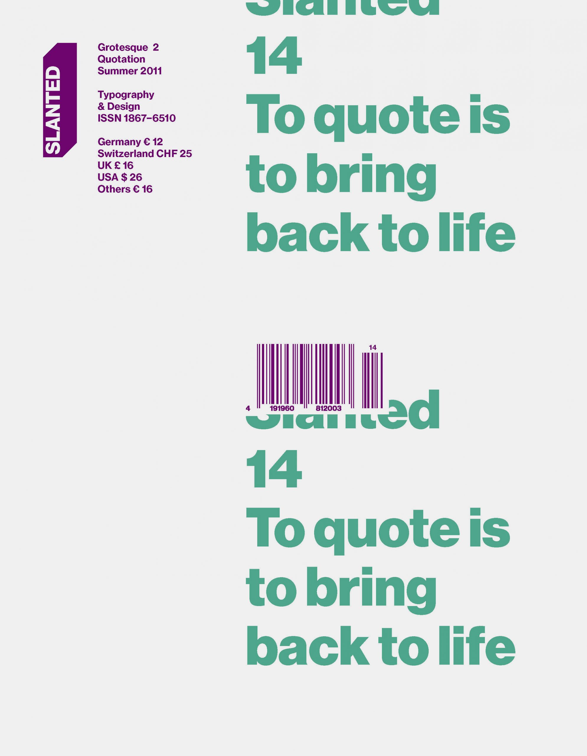
Slanted Magazine #14 – Grotesque 2
While Slanted #13 dealt with contemporary and historical humanist grotesque fonts, Slanted Magazine #14 – Grotesque 2 focuses on current fonts that are in tradition of Lineal, Neo- or Geometric Grotesque.
They mainly have their origins in the time of the turn of 19th to 20th century. In 1880 Ferdinand Theinhardt designed the Royal Grotesque with four weights for the Königlich-Preußische Akademie zu Berlin, from which developed the Akzidenz Grotesque in 1918. Simultaneously, from 1905 to 1930, Morris Fuller Benton created fonts on the basis of Lineal Neogrotesque: the Lineal Grotesque. Nowadays there can be observed different procedures of designing fonts, which can be named as quotations. A variety of fonts bear on historical models.
With great pleasure we present a huge number of these corresponding and related grotesque fonts, illustrations and projects. The type essays by Flo Gaertner (Karlsruhe), Robert Schumann (Berlin) and Anna Sinofzik (London) deal with them. Worth seeing photos stories are “Almost Europe” by Miguel Hahn and Jan-Christoph Hartung (Frankfurt am Main) who visualize the situation of refugees in the Spanish enclave Melilla, as well as »Ein Abend auf der Wiesn – Pictures taken during the great beer rush« by Volker Derlath (München). Numerous interviews with Lizá Defossez Ramalho and Artur Rebelo (Porto), Edwin van Gelder (Amsterdam), Marta Podkowinska and Karol Gadzala (Krakow) and Hans Gremmen (Amsterdam) as well as an article about Kiyoshi Awazu as well as the 4th part of the Tokyo Report, both by Ian Lynam (Tokyo) and a musical travelogue by Frank Wiedemann (Berlin) round up the stuff to read.
MAGMA Brand Design
June 2011
148 pages
21 × 27 cm
English, German