Glyphs and the Evolving Practice of Multiscript and Variable Type Design
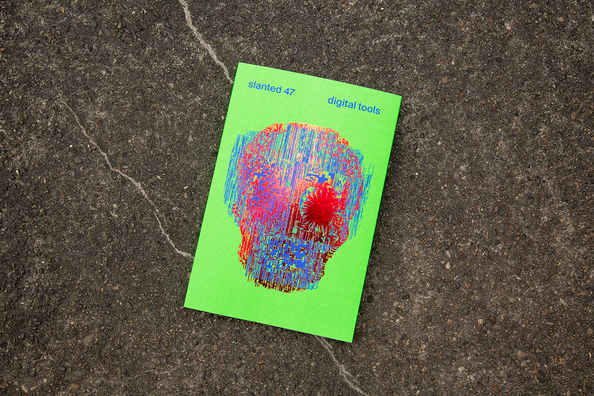
Slanted Magazine #47—Digital Tools
Slanted Magazine #47—Digital Tools explores the instruments shaping contemporary creative practice. Through interviews, articles, and numerous examples from graphic and type design, illustration, 3D, web, generative design, and creative coding, the issue looks at how digital tools are used to create, question, and rethink design itself.
Perspectives from Azza Alameddine, Amélie Bonet with Sol Matas, and Marianna Paszkowska were collected during interviews in February 2026 by Lars Harmsen, Slanted Publishers. Featured in Slanted Magazine #47—Digital Tools. Get your copy here.
In recent years, digital font production has undergone a profound transformation driven by specialized software. One of the most influential tools in this shift is Glyphs, a professional type design application used worldwide to create, edit, and engineer fonts across multiple writing systems. Its growing relevance reflects a central tension in contemporary typography: while automation, scripting, and variable font technologies drastically expand technical possibilities, designers are simultaneously confronted with the responsibility to preserve cultural specificity, design integrity, and critical authorship within increasingly automated workflows. The three interviews with Azza Alameddine, Amélie Bonet and Sol Matas, and Marianna Paszkowska reveal how this tension is negotiated in everyday professional practice rather than in abstract theory.
From Technical Barrier to Creative Enabler
Across all three conversations, a recurring theme is the transition from technical
struggle to creative focus. Arabic type designer Azza Alameddine
describes her education at the University of Reading as the “last year of FontLab,” a period characterized by opaque interfaces and labor-intensive technical setups. When asked about programming Arabic OpenType features, she recalls that a single tutorial “took days” to implement and felt almost unreadable at the time. The difficulty was not limited to design
decisions but extended to engineering knowledge that was scarcely
documented and highly fragmented.
In contrast, Glyphs introduced a level of automation that fundamentally shifted her workflow. “Now it’s just one click and everything works,” she explains. The importance of this statement lies less in convenience than in the redistribution of cognitive resources: instead of fighting the software, designers can focus on drawing, spacing, and conceptual refinement. Azza observes that this shift is particularly visible in educational environments, where students are now able to complete entire alphabets and still have time to revisit details. “Time plays a big role,” she states, emphasizing that the tool did not change the ambition of designers but altered the feasibility of achieving it within realistic deadlines.
Community as Infrastructure
A second central aspect emerging from all interviews is the role of community in shaping the software itself. Glyphs is repeatedly described not as a static product but as a living ecosystem that evolves through constant exchange between users and developers. Azza characterizes the early development phase as “very community-based and user-based,” highlighting how feature
requests, bug reports, and forum discussions directly influenced the
direction of the application. Reflecting on developer responsiveness, she notes, “You would never expect this from software developers … the next day they would have the feature.”
This immediacy stands in contrast to larger software corporations where feedback channels are often indirect or slow. In the Glyphs environment, community contributions extend beyond discussion into tangible technical additions. External Python scripts, frequently shared freely among users, automate repetitive tasks such as anchor positioning or batch modifications. Azza remarks that with the assistance of AI she now formulates her own scripts: “I ask for specific things, and I get a script in Python, and it works.” The statement illustrates not only increased efficiency but a subtle shift in agency—designers who are not programmers gain partial access to programming logic without formal training.
For Amélie Bonet and Sol Matas, the community dimension becomes particularly visible in collaborative production. During the redesign of Noto Sans OdiaOriya, their work unfolded in parallel with the ongoing development of Glyphs itself. Amélie describes the experience as “a back and forth throughout pre-production and production … we were building and debugging the typeface, while Georg and Rainer were simultaneously working on the Odia framework within Glyphs.” Sol adds that this reciprocity was necessary because “we didn’t find much activity around Odia at that time” meaning the project effectively contributed to building the script framework inside the tool. In this context, community does not merely provide support; it becomes a structural layer shaping both the software and the typeface that emerges from it.
Multiscript Complexity and Integrated Workflows
The increasing demand for multilingual type families forms another shared concern.
Earlier digital type tools were primarily conceived for Latin alphabets, whereas contemporary commissions often require superfamilies spanning
multiple scripts, weights, and widths. Bonet and Matas underline the
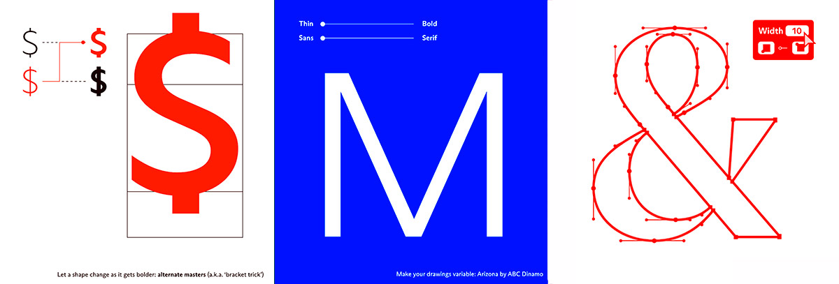
importance of integrated environments in managing this complexity. Glyphs is described as a “powerful, integrated tool” that unifies drawing, interpolation, testing, and export within one interface. Amélie highlights the master view as a decisive advantage: “Switching from a master to
another makes so much sense … you have everything in one window.” The integration reduces fragmentation and allows designers to maintain a holistic overview of large projects.
Nevertheless, both designers emphasize that automation has boundaries. Sol notes that while Glyphs is “a very good starting point,” advanced production for complex scripts may still require manual OpenType coding. The software provides structure and acceleration but does not replace technical literacy. Their work on Odia further demonstrates the necessity of cultural validation. Designing a script that one cannot read demands external consultation and humility. Sol recounts collaboration with native speakers, including a medical doctor who assisted in clarifying character sets. Amélie articulates the ethical dimension of this process: “When you design for shapes that you’re not native to, you proceed with caution and an awareness of your limitations’ would make my quote more precise.” Presets and automation serve as scaffolding, yet authenticity emerges through dialog with script communities and comparative analysis with related writing systems.
Branding, Globalization, and Script Identity
Azza Alameddine’s professional trajectory bridges branding and type design, revealing another dimension of Glyphs’ impact: the globalization of visual identity. International corporations increasingly require consistent typo-
graphic systems across languages, leading to projects such as Arabic
adaptations of historically Latin typefaces. Asked whether an “Arabic Futura” makes sense, Azza responds pragmatically: “Of course … now they can do it in just one single font.” Her answer reflects the economic and communicative logic of global branding, where typographic coherence supports recognition across markets.
At the same time, she articulates a personal preference for culturally rooted Arabic originals, underscoring a tension between global uniformity and local specificity. Glyphs does not prescribe an aesthetic direction; rather, it provides the technical flexibility to pursue both strategies. The software becomes a mediator between branding demands and cultural responsibility. Azza also points to the widespread issue of poorly executed bilingual signage, where Arabic letterforms are sometimes constructed by simply modifying Latin shapes. In this context, improved tools and wider access to professional workflows contribute not only to efficiency but to qualitative and cultural accuracy.
Variable Fonts, Systems Thinking, and Tool Responsibility
The perspective of Marianna Paszkowska extends the discussion from individual design practice to systemic production environments. With a background in font engineering and project management on large-scale families such as Google Sans and Google Sans Flex, she conceptualizes typography as a network of interdependent cultural systems. Her projects frequently involve “mega-merges” combining multiple scripts and multi-axis variable fonts containing hundreds of masters. Within such contexts, tools need to extend beyond font editors: they become coordination infrastructures that support fast prototyping, planning, and quality assurance across distributed teams.
Paszkowska repeatedly stresses that accessibility must be balanced with trust. The increasing availability of AI-assisted scripting and automated tooling lowers entry barriers, yet simultaneously heightens the necessity for validation and critical thinking. “You really need to be sure what you’re doing,” she states, warning that convenience must not replace comprehension. For her, tool literacy is not simply operational competence but the capacity to question outputs, verify processes, and understand limitations.
Her reflections on variable fonts further illustrate this systemic viewpoint. Contrary to the common perception that variable technology overwhelms clients with excessive options, she advocates strategic curation and automation. “Variable fonts offer a wide range of possibilities, but that flexibility doesn’t have to be exposed to the end user,” she explains. By defining recommended instances and embedding decision logic—such as automatic optical size adjustments—designers can provide flexibility while maintaining clarity and brand consistency. Paszkowska also emphasizes that contemporary type design is “not an addition of masters,” but rather the design of interpolation itself, where small changes may trigger a “butterfly effect” across the entire system. This observation reframes font creation as continuous spatial negotiation rather than static drawing.
Beyond workflow considerations, Paszkowska highlights a structural industry challenge: the historical Latin-centric orientation of font standards. Many technical conventions were originally developed with English and Latin script in mind, creating persistent difficulties for Arabic, Indic, and other complex writing systems. From her perspective, responsive and community- driven development models are therefore not merely efficient but necessary to reflect linguistic diversity and avoid technological bias. Glyphs’ iterative evolution, shaped through direct user dialog, exemplifies such an adaptive model.
Tool, Practice, and Responsibility
Taken together, the interviews portray Glyphs not as a singular solution but as a catalyst within a broader transformation of type design practice. It reduces technical barriers, supports community-driven innovation, and provides a flexible environment for multiscript and variable projects. Yet all participants emphasize that tools do not replace expertise, cultural awareness, or critical judgment. Automation accelerates production, but meaningful results remain dependent on informed human intervention.
Azza’s remark that one feels “part of you is also making the software,” Amélie’s description of co-development, Sol Matas’ insistence on native validation, and Marianna Paszkowska’s systemic perspective converge on a shared conclusion: contemporary type design is increasingly collaborative, iterative, and interdisciplinary. Glyphs operates as a central node in this network—an instrument shaped by its users as much as it shapes their work, and a reminder that technological progress in typography remains inseparable from human authorship, cultural sensitivity, and the continuous negotiation between possibility and responsibility.