Aerobik
By Lift Type
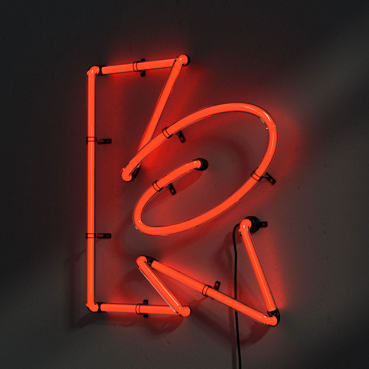
Here comes Lift Type’s new Aerobik display typeface! With its unique bouncing aesthetics made out of outlines, it does not match any existing typographic style. It refers as much to graffiti in some aspects as to the way motion and speed are represented in comic books.
Conceived to be used with regular case or capital letters, it turns out to be surprisingly readable in both ways.
As flexible as it is intense, Aerobik is a characterful font that borrows its forms from both graffiti and comics to unfold its expressiveness.
A mix of movement lines, bubbles, cartoonish explosion, which gives a unique personality to each letter. From a large number of drawings and experiments Image Format gave birth to the design of this font. The studio focused on the harmony, overall rhythm, and dynamism of each letter, while maintaining legibility.
The loops and breaks give a volume effect to this titling font that draws towards abstraction. This single weight font is available for purchase for print and web exclusively from Lift Type.
Aerobik
Type foundry: Lift Type
Designers: Image Format
Release date: January 2021
Weights: Regular
File formats: OTF, WOFF
Test version: Trial available on lift-type.fr
Price: € 50.–
BUY


