Behind the Letters: Type By
Type Foundries in Focus
Who are the designers behind the typefaces we see? What is the approach and attitude behind a label? Behind the Letters is a new format that will regularly introduce you to the creators behind the letters through an interview and give you an insight into their work. We are very excited to start right away with a—relatively new—label whose founders can also be described as pioneers in the development of small foundries selling a limited selection of quality types. Let us introduce Type By!
Type By, a type label and type boutique, was established in 2018 and launched in 2019, and is lead by Corina Cotorobai and Fred Smeijers. For those who are now wondering: yes, Corina and Fred were also the co-founders of the OurType foundry, a project they have withdrawn from in 2017. Their latest font-publishing label kept the basic idea of a “Small but Big” foundry, but grew to a next level: Type By offers author-based collections of fonts—by Smeijers himself, Thomas Thiemich, Hendrik Weber, Merel Wagner, Maurice Göldner, and Pierre Pané-Farré—that are, without a doubt, of a very high level of character, craftsmanship, quality, and intelligence.
Fred Smeijers is a stranger to very few in our trade: Dutch type designer, researcher, educator, and author. Well-known for his typefaces, such as Quadraat (1992, 2011) and Arnhem (2002) or his books, such as Counterpunch—Fred examines and reflects on the techniques of the sixteenth-century type production from our contemporary point of view. Thomas Thiemich is the type designer of the successful Fakt family and Head of Font Development at Type By. Thomas joined the new label with a complete and diverse collection of designs.
We are very pleased that both Fred and Thomas answered our questions:
What makes a good typeface?
Thomas The short answer would be: a coherent interplay of their sub-facets—not only one single aspect that makes a typeface truly good. Other factors, such as the idea, the precision of the final drawing, the relationship between the various glyph groups (such as capital letters, small letters, numbers, etc.), as well as the justification and kerning, determine the quality of a typeface. To me, the idea, spacing and kerning, have more impact on the value of a typeface than, say, a well-executed final drawing.
Fred Of course, next to that, market aspects such as trends and accessibility—distribution and, of course, pricing—can propel a good design to the ranks of a financially successful font, but that area is becoming increasingly blurred: if we look at the myriad of typefaces that are now on the market, some brilliant designs out there remain unexplainably undervalued, while others, frankly unremarkable, can and do conquer the market at fast pace.
When designing a new typeface which letters do you like to start with?
Thomas When the idea for a typeface is clear, the lowercase letter “n” is always the start, as it defines the proportions, stem width, and spaces that are most important for the further process. In most cases, I continue with “o” followed by “a.” In the next step “h, m, u / b, d, p, q, and i, j” follow next. With these glyphs one can write simple words and properly test the rhythm. I then design “f, t, r.” And, finally, I add all characters with diagonals: “k, v, w, y, z.” I tend to work on letter “s” between the other characters because I go back and forth again and again until I’m satisfied with its shape!
Fred and, “s” is a notoriously challenging glyph!
Designing text typefaces is maybe the most difficult exercise—how much character may a text typeface have? What are the difficulties?
Thomas In my opinion, expressivity is not what makes a typeface a text typeface. To me, suitability for text is rather defined by the glyphs’ proportions, counters, and overall space distribution. One can draw a typeface with fairly limited character and it will still not be suitable for text and, the other way around: it is possible to draw a typeface with a strong character that, despite all odds, will be suitable for longer text. Of course, the character of a typeface certainly influences its suitability for text, but it is not always the most decisive factor.
Fred Although the Type By collection is well known for its strong text typefaces, to me, all stylistic categories may present a creative challenge—type designs for text are not per se the most difficult exercise. Of course, each of these stylistic categories are challenging in their own, particular, way. How much character a text typeface might ideally have (or is perceived to have), is entirely up to both, the type designer and the type user. Let’s look at the text typefaces of Matthew Carter and the late Gerard Unger, for example.
Gerard is known for text typefaces that carry a very particular character—our eye does not need much training to recognize his typefaces. But they do function very well in text and share a beauty that can be defined almost as Calvinistic. There is no unnecessary fat, or better—detail.
Matthew designed Georgia, a design known to all of us. It’s easy on the eye and it allows effortless reading, without second thoughts. But also when used in big sizes it keeps it quaint character—we see nothing special and yet we are not really bored by it: a lot is happening in those outlines. These are also very important qualities. Now the most important question, which of these routes is better? Both, if you ask me.
Do you need a profound knowledge and understanding of culturehistorical contexts to create a good typeface
Thomas This is a question that might divide opinions. Traditionally-oriented typeface designers would certainly say that this is absolutely necessary. For my part, I see it a little more loosely: understanding these relationships and their history certainly helps when designing a typeface, but it is not 100% necessary. It even can lead you to a point where this knowledge blocks you from trying novel things. I recall the times—quite a long time, actually—I believed that only text typefaces were reputable type design and that display typefaces were only a side kick that should not be taken too seriously. My perspective has changed over time and a big part in that played the Pyte Foundry’s project by Ellmar Stefan. It opened my eyes. One year long Stefan released a new display typeface per week! At first, I didn’t take his project that seriously, but looking back I can surely say it encouraged me to experiment more. And, without these experiments, my typeface Gustella and Felka would not exist.
Fred A good question. Theoretically—No. But only in theory. If you wish to excel, it helps to be aware of the culture your typefaces are to be used in. We, in the West, are still somewhat arrogant about it and it’s true that we do our best not to be. But we still are.
What is so magic about the immersion in real objects?
Thomas The actual use of a typeface, a tool in which a lot of time and effort has been invested, is one of the main motivations for me to design typefaces at all. As a type designer, I see myself as a kind of toolmaker who makes these tools available to designers. When you see the typeface in use, it means that a designer has found my tool to be good enough to create something new and bigger. It is always a happy surprise when I stumble over portfolios, catalogs, or any other project that I do admire and also use one of my type designs. As someone who has a strong interest in architecture and industrial design, it was most gratifying for me to find out that (the architect) Tadao Ando used Fakt for one of the most important schools for art, design, and architecture of Latin America—Centro Roberto Garza Sada. The lettering on, as well as the navigation inside the building are designed in 3D letterforms of Fakt.
Fred In my studio you’ll see three big screens in one corner—that’s the digital part. Behind there is a table with a light box. And right next to that there is another world: anvils, vices, hammers, gauges, drills, machines, acid for etching, files, burins, chisels for wood and metal—punch-cutting stuff. There is also a small cylinder press and a corner for casting. I like doing things by hand, and I can only say to anyone—whether you’re a designer or not—don’t be afraid of it, it is enriching. Doing things with my hands gives me great pleasure and can also yield results you would never have got if you had stayed behind the screen, because these are truly different worlds.
You have a long history in designing custom typefaces for brands across the globe. Is the process of designing custom type different from retail fonts?
Fred Over the past twenty-five or so years, just as in general with graphic design, commissioned work, and the field of custom, proprietary fonts has clearly expanded. We see this evolution through various lenses: for example, budgets—that are getting tighter and tighter. Or briefs that may not be challenging or interesting enough. Then, also the opposite is happening: a number of clients go against the grain: they seek letter shapes that are of high quality but that is not all. They equally seek letters that result from another—not-mainstream—mentality. Such clients are not afraid to work with small teams, if you can show a proven expertise time after time—and that’s who we are. I love to solve problems and I love to roll my sleeves and deliver a meaningful, long lasting typographic solution. It is no secret that custom fonts is work within the constraints of a brief. There is nearly always a time-pressure factor, and this pressure requires us—me, Corina, Thomas, Hendrik, Pierre, Maurice, and everyone else—to offer the best we can—at that moment. In these circumstances the typefaces rarely, if at all, have the time to mature. So the result is always a “creative autopilot”: where our talent, the design vocabulary and style, and the experience we have built over the past thirty years, pretty much shape the result.
Our latest custom project—which was not publicly shown yet—had the most outstanding brief. One of the requirements (that made it particularly rare) was the client’s: “We want the best quality. Take as much time as you need.”
What’s the best piece of advice you received and repeated to others?
Thomas The first one: “As a designer, do not take yourself and your work too seriously.” Second: “If you get stuck in the creative process, allow yourself to take a break.” And the last: my favorite quote from Fred during my studies was always: “Being a 100% consequent probably ends up in shaking hands with the devil.”
Fred There are a couple of interesting things that Winston Churchill says in his small book Painting as a Pastime. One of them—and this thought became my life motto—“It’s no use doing what you like, you have to like what you do.”
Picture Credits
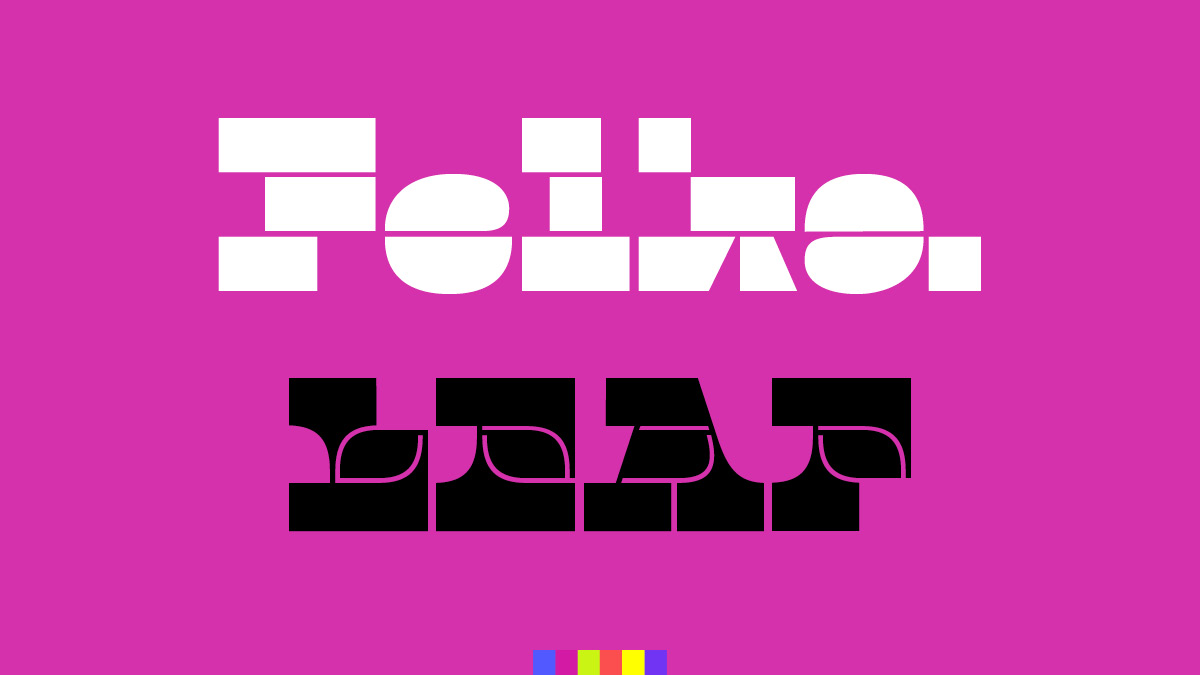
1. Felka Brick and Felka Leaf, by Thomas Thiemich.
2. Bery Script and Bery Tuscan, by Fred Smeijers.
3. Lirico, by Hendrik Weber.
4. Stan, by Maurice Göldner.
5. Klub, by Pierre Pané-Farré.
6. Gustella Solid and Gustella Stripes, by Thomas Thiemich.
7. & 8. Porsche Next custom fonts for Porsche AG. Design by Type Tailors: Hendrik Weber, Fred Smeijers, Corina Cotorobai, and Thomas Thiemich.
9. & 10. Brand Identity for IcA: Institute of Contemporary Art/Boston by Pentagram NY, Abbott Miller. Typefaces: Remo and Remo Stencil, by Thomas Thiemich.
11. & 12. Signage and Environmental graphics for Centro Roberto Garza Sada, Universidad de Monterrey by Pentagram NY, Abbott Miller. Typeface: Fakt, by Thomas Thiemich.
13. & 14. Book design “René Redzepi: A Journal” by Pentagram London, Astrid Stavro. Typefaces: Arnhem and Arnhem Fine, by Fred Smeijers.
15. & 16. Book design “Uptake” by Pentagram NY, Eddie Opara. Typeface: Fakt, by Thomas Thiemich.
17. Brand Identity for the Dutch National Opera and Ballet, by Lesley Moore, Amsterdam. Typefaces: Edward, by Hendrik Weber, Fakt, by Thomas Thiemich.


