Claymore
By Jeremy Tankard
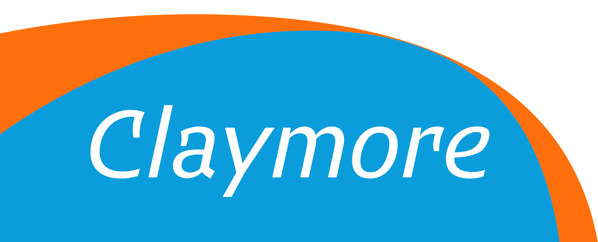
The English Typographer Jeremy Tankard just published his typeface Claymore on June 21st, 2021. The typeface is a subtly modulated sans serif with an equally subtle hint of Gothic inspiration. Its striking image performs exceptionally well across the family’s range of weights. The many details have been crafted to deliver an engaging and clear image in text, with a strong individual personality when used at display sizes.
Claymore takes inspiration from the shaping and playfulness of medieval letters. During the eleventh to twelfth centuries the classical Roman letter was radically experimented with, this eventually resulted in a new style of capital letter, the round Gothic, often referred to as Lombardic. We strongly associate these letters with the Middle Ages, an association that is perhaps enforced as a result of their popularity through the Gothic Revival and Arts & Crafts movements. One of the most striking features of the Lombardic capital are the serifs, which extend so much that they join together and close the letter shape. Claymore reinterprets the idea of an extended serif as an additional stroke; forming one of the core features of the typeface. These additional strokes are applied to capital C, E, F, G, L, T, Z, and lowercase a, c, and r. Another core idea was to give some of the italic capitals their own shape. This is hinted at in the Lombardic letter which shows a flowing movement to its structure. In many typefaces the italic capitals are simply sloped versions of the roman ones. To give Claymore’s italic caps a little more individuality, a branching arch is used; in much the same way as seen in the lowercase, where an arch springs from a stem. This detail is found on B, D, E, F, P, R, and the effect it achieves is mirrored in the curved bases of E, and L. The result creates visually engaging word shapes and textures as well as an immensely readable text face.
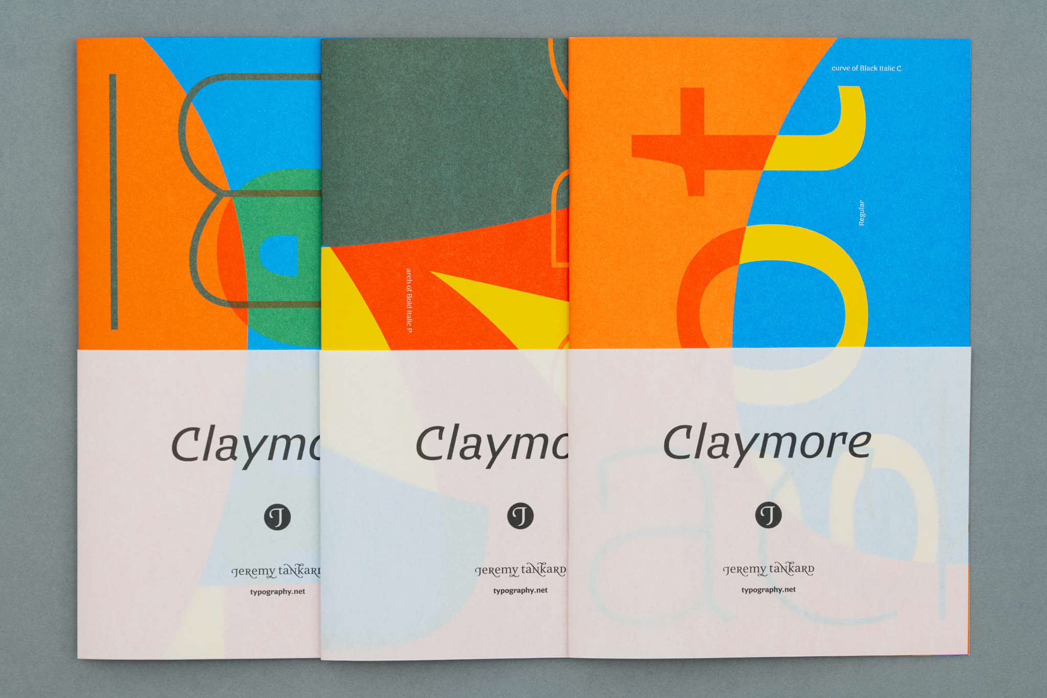
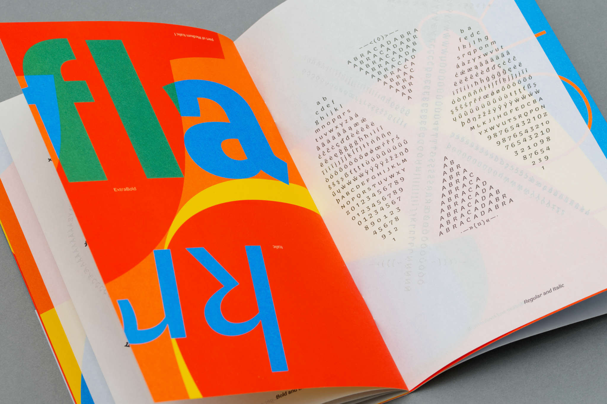
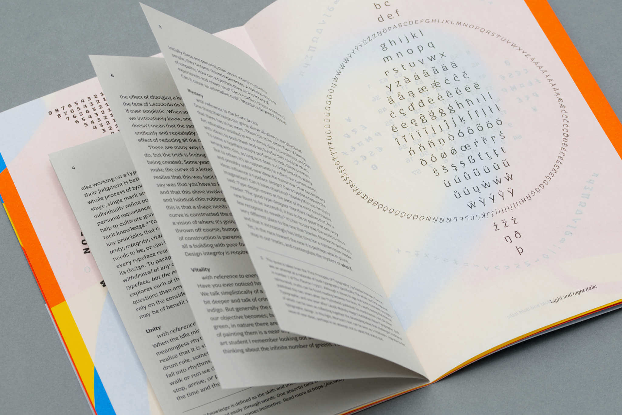
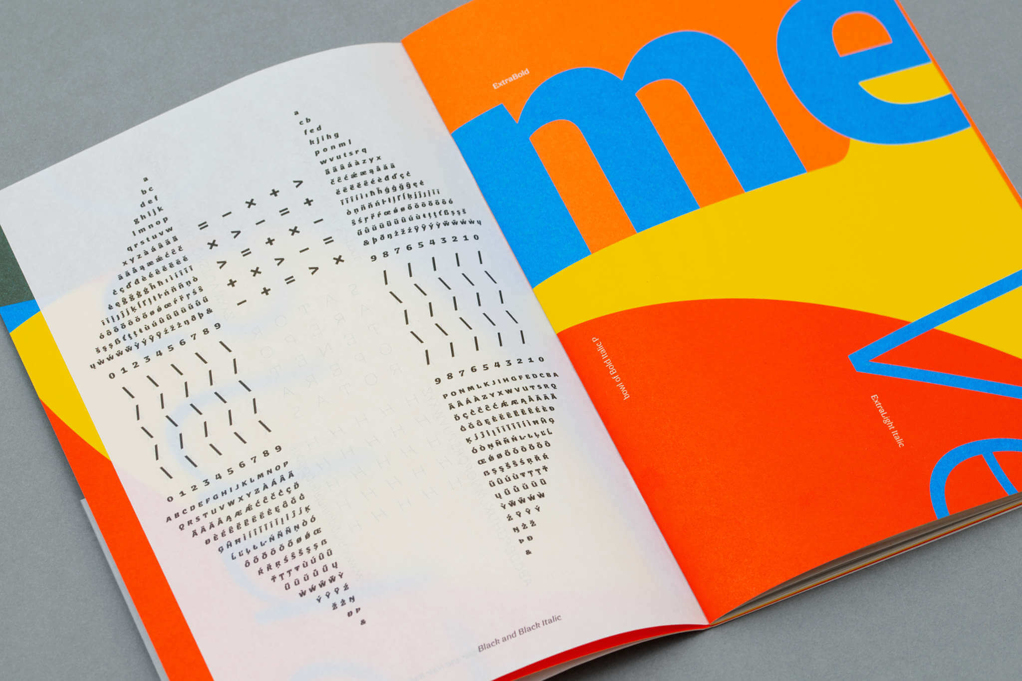
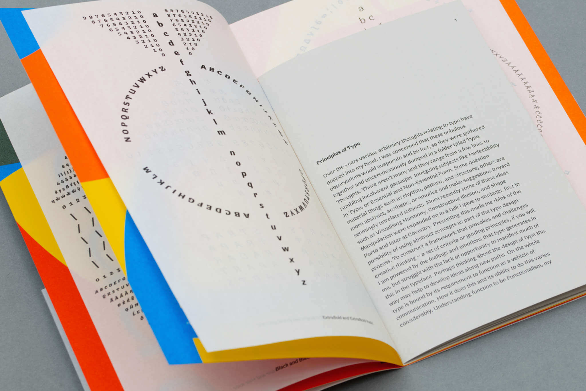
The Claymore specimen is a little different to some of our previous ones; it’s split between showing the individual fonts and presenting a short text, titled Principles of Type. This comprises a collection of thoughts gathered over several years, and offered as a possible approach to the design thinking of a typeface. As a physical item, the specimen uses different paper stocks, color and sizes to engage the reader. The three colors were chosen to not only bounce off each other, but to also make suitable additional colors when overprinted. Illuminated manuscripts and stained glass provided the inspiration for the color pages, and the visual patterning of figured verse and calligrams for the text which appears on translucent paper. In contrast to this, Principles of Type is set cleanly on grey stock and inserted as a booklet in the centre. Printed in three specials plus black by KMS Litho Ltd on various uncoated stocks supplied by Fenner Paper. The specimen has been designed to allow a degree of randomness in its assembly, making the final item more individual and unique.
Jeremy Tankard established his type foundry in 1998 after working in corporate design for several years. His typefaces have gained a reputation for their originality and quality. In addition to his own foundry, Tankard has produced designs for Microsoft and Adobe as well as many bespoke corporate designs. Information about the design stories behind each of them, together with commissioned work, can be seen at StudioType.com
Claymore — By Jeremy Tankard
Foundry: Jeremy Tankard Typography Ltd
Designer: Jeremy Tankard
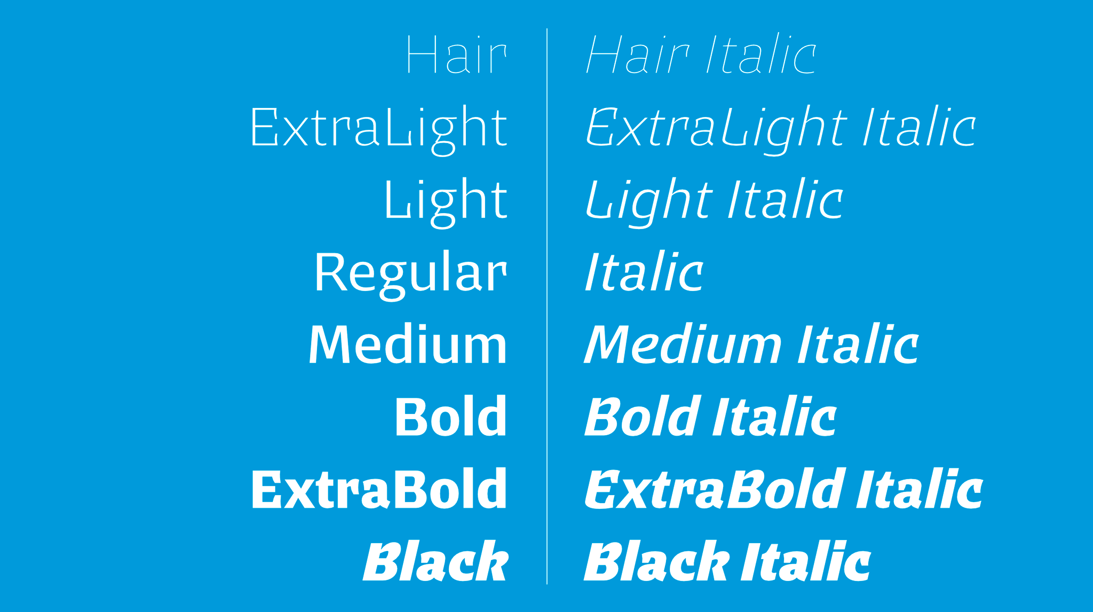
Styles and Weights (16 fonts; 8 roman and 8 italic): Claymore Hair, Claymore ExtraLight, Claymore Light, Claymore Regular, Claymore Medium, Claymore Bold, Claymore ExtraBold, Claymore Black, Claymore Hair Italic, Claymore ExtraLight Italic, Claymore Light Italic, Claymore Italic, Claymore Medium Italic, Claymore Bold Italic, Claymore ExtraBold Italic, Claymore Black Italic
Volume Specimen: 28 pages
Format Specimen: 15.2 × 23 cm
Price Single Style: £ 40.– GBP
Price Full Family: £ 640.– GBP
The specimen is free, but postage will be applied at checkout
More detailed information about the design of Claymore can be read at StudioType.com.
The Claymore fonts can be viewed, tested and licensed here and also be seen in use on the dedicated Explorer page here or on the Gallery page
