Extraset
New Independent Swiss Type Foundry
We are pleased to introduce you to Extraset, an independent Swiss type foundry established in Geneva, jointly led by Alex Dujet, Xavier Erni, Roger Gaillard, and David Mamie.
The four partner’s are all Geneva based graphic designers, and have been working in the cultural field for more than ten years. They share a deep interest for typography and they all developed typefaces through different projects. In 2016 they decided to join forces to work on a common catalogue of fonts and to distribute them themselves. They took time to sharpen their characters, to test them and to create a concept and an identity for their platform. Finally they launched Extraset’s website in June 2020.
Extraset’s concept: “We believe that open-type formats offers numerous possibilities to contemporary graphic designer’s nowadays. Extraset’s fonts offers a lot of alternative character sets to provide more “customizable” fonts to their user’s. That way they can create their own combinations with different glyphs selected from a variety of stylistic sets. Each of the first six fonts that we recently published contains at least ten alternate characters. We always have an extra set for you!”
Extraset’s Fonts
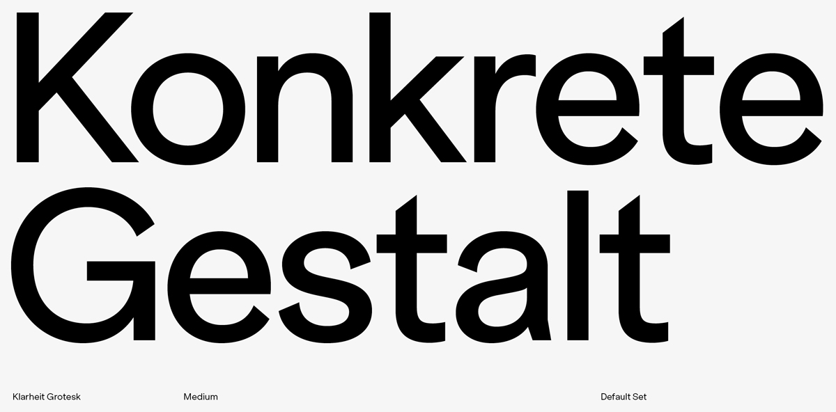
Klarheit Grotesk
Oscillating between two major standards, Klarheit Grotesk seeks to meet the requirements of a more contemporary form of modernism. The project features a formula that revisits geometrical solutions drawn from the Bauhaus movement as well as key typographic standards used in 1960s Swiss modernism. Several frameworks have thus been defined combining consistent historical periods with great readability and glyph precision when using this font for text as well as headlines. With this in mind, the OpenType possibilities include twelve versatile stylistic sets that feature a variety of finishes. The many possible combinations through the use of this palette allow for progressive design choices oscillating between neutral and more assertive graphic positioning.
Klarheit Kurrent
Right after the Klarheit Grotesk experiment, Klarheit Kurrent emerged as an instinctive decision revolving around Alex Dujet’s graphic and typographic work. Developed based on the structures of its parent Klarheit Grotesk, this variant seeks to meet the necessary demands of a powerful and original tool. The aim of the project enhances the authenticity of headlines and provides an atypical atmosphere when using this font for work tasks. Also designed to echo modernism and geometrical standards, Klarheit Kurrent nevertheless does not include a stylistic set. The project only focuses on a single decision in opposition to the manifold possibilities of the flagship Klarheit Grotesk project, a radical choice that features extreme cuts in the finishes of some of the components of the basic alphabet, in order to outline an authentic approach when developing communication projects of all types.
Nein
Nein is a project that reinterprets certain characteristics drawn from the heritage of wood types. The first components of this extra-bold, highly condensed beta version were developed a few years ago by Alex Dujet. Nein offers two stylistic sets which add diversity to the details. The default set clearly refers to the style of wood type thanks to some impressive diagonal features, whereas the ink traps stylistic set offers a lighter contrast with regards to the very black components of the basic set. The relatively large development of the typeface (Latin Extended-A) has driven the designer to decide to launch this beta version in order to enable the possibility of composing assertive subjects. Extraset will provide developments of this typeface at a discounted price to people who have already purchased it.
Peak and Peak Rounded
Peak is a linear typeface with sharp and pointed detail that blends together geometric and calligraphic curves. It was initiated in 2013 by Xavier Erni (Neo Neo), with the aim of offering a contemporary vision of humanist fonts. Its large range of alternative glyphs enables the designers who use it to focus their aesthetics on geometry or calligraphy, at their discretion. It is very readable both on paper and on screen while also carrying a strong identity thanks to its sharp detail. Peak was tested over several years before being developed into a complete family of eight weights, from thin to Extrabold, including italics. Peak Rounded complements the family with rounder, softer details and an organic aesthetic.
Rebond Grotesque
Rebond Grotesque is a typeface that is both strict and flexible. An assertive movement, expressed through curves and links, adds a French-Swiss impetus to the Germanic Grotesque. The overall effect is designed to express a certain sense of neutrality when the details carry a strong identity. Rebond Grotesque offers a palette of glyphs that enable graphic artists to solve their design problems. Thanks to its alternative sets, graphic designers will be able to elegantly vary the aesthetics of a text, going from a classic form to a bolder one. Offering an elegant and flexible alternative to existing Grotesque styles, Rebond Grotesque is a balanced and contemporary text typeface.
Extraset
Founders and Designers: Alex Dujet, Xavier Erni, Roger Gaillard, and David Mamie
Visit the Extraset website and the Extraset shop


