Ferro
A type family shaped by obsolescence and information loss
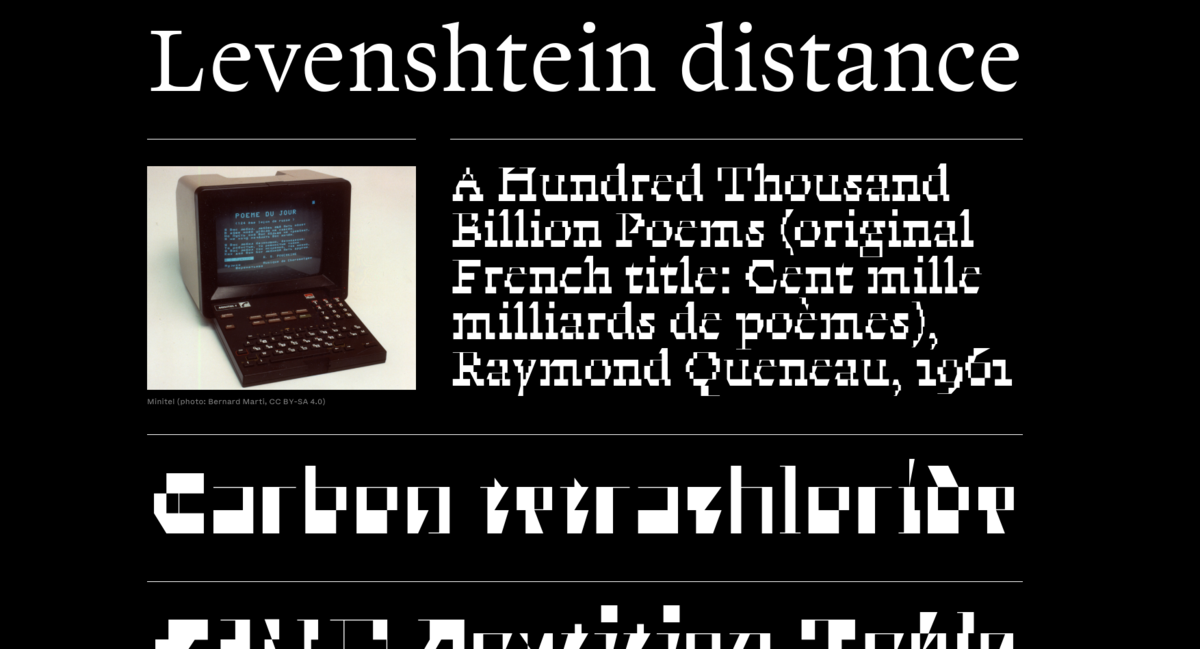
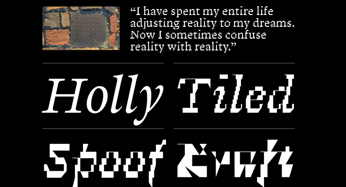
Ferro is a type family that turns information loss into a design principle, bridging Renaissance metal type and the early computer age. It began as a display face for CodeX, an editorial project on digital cultures whose second issue, designed by the collective Bonjour Monde, explored media archaeology and the French Minitel, asking how medium-specific works can survive once the technologies that produced them disappear.wide
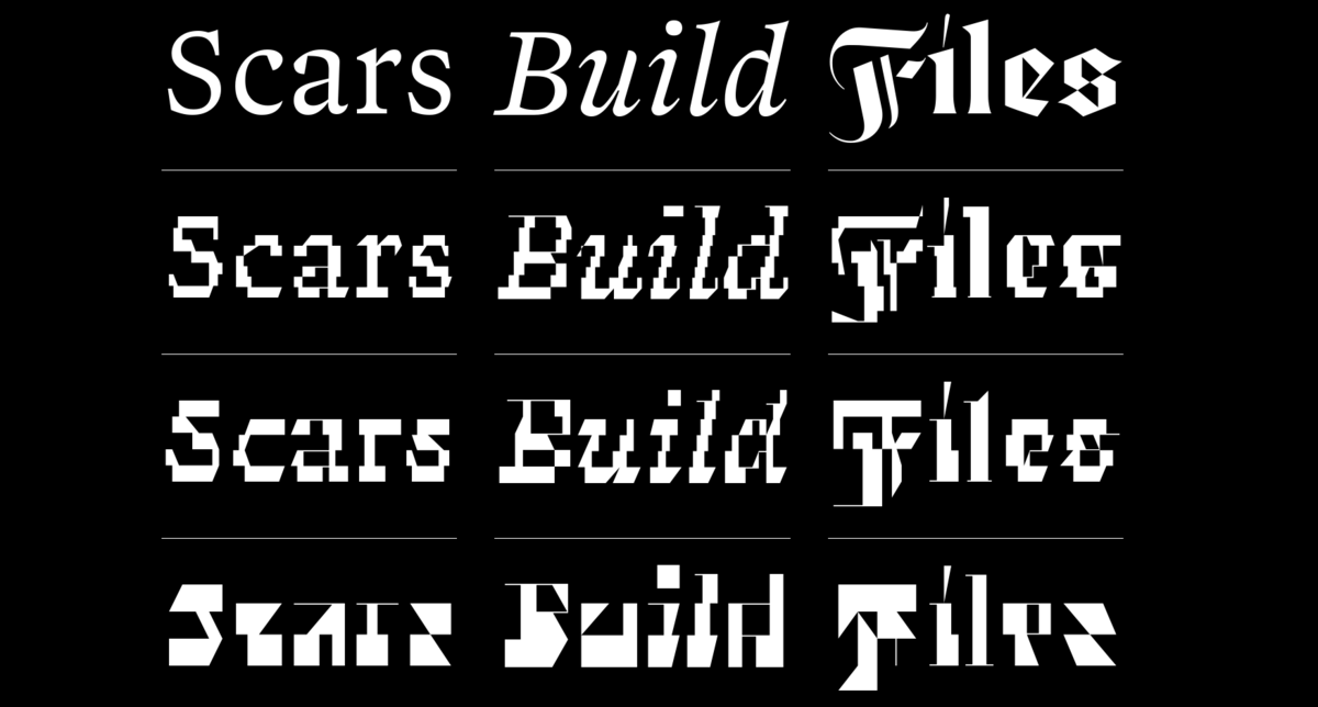
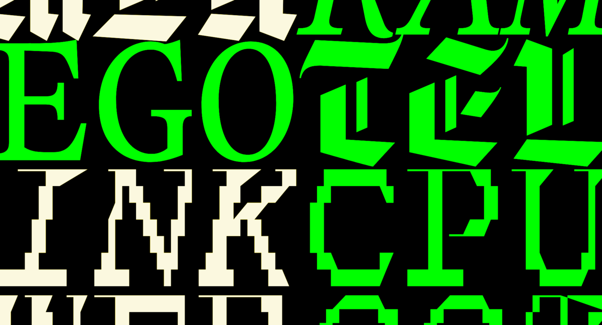
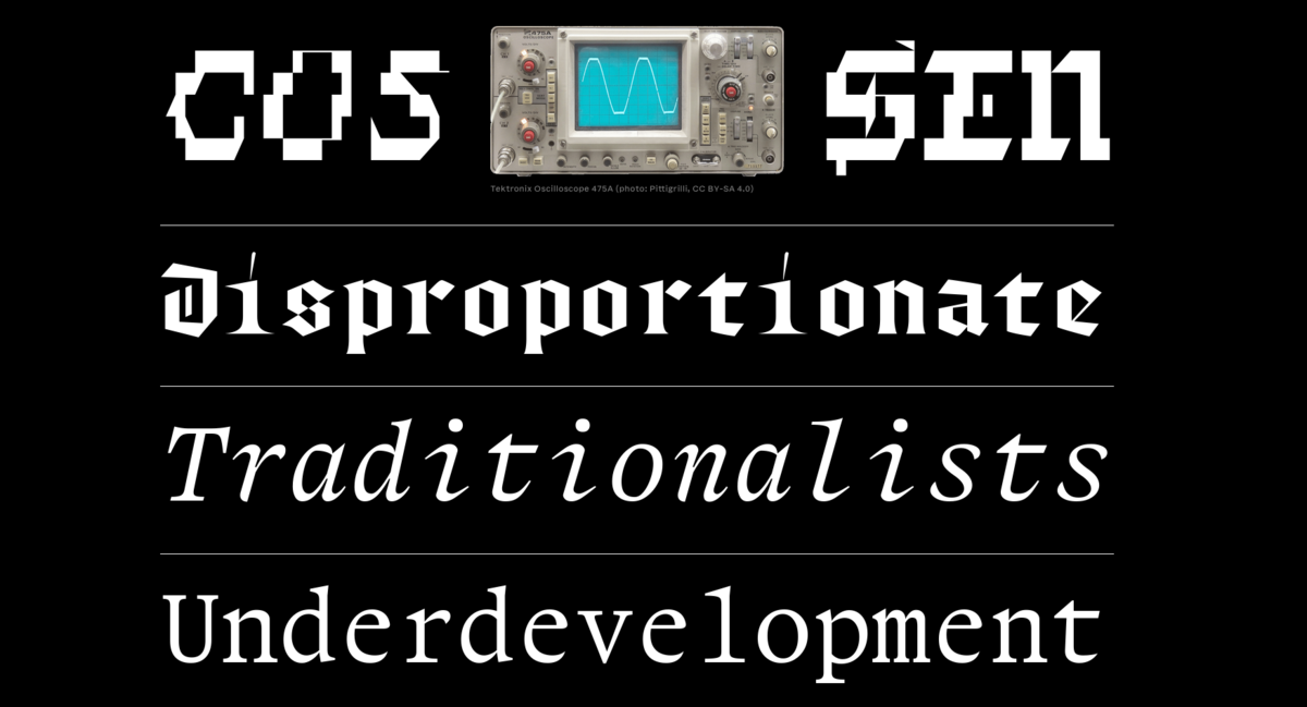
Its source is the Annales Suevici, printed in 1595, whose roman, italic, and blackletter Ferro reinterprets rather than restores. A custom set of scripts, derived from Arman Mohtadji's vector distortion tool Magnet Mike, repeatedly forces the letterforms through grids of varying resolutions, producing unstable shapes that oscillate between preservation and collapse.
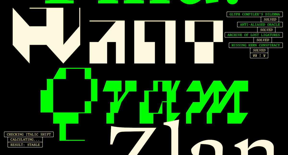
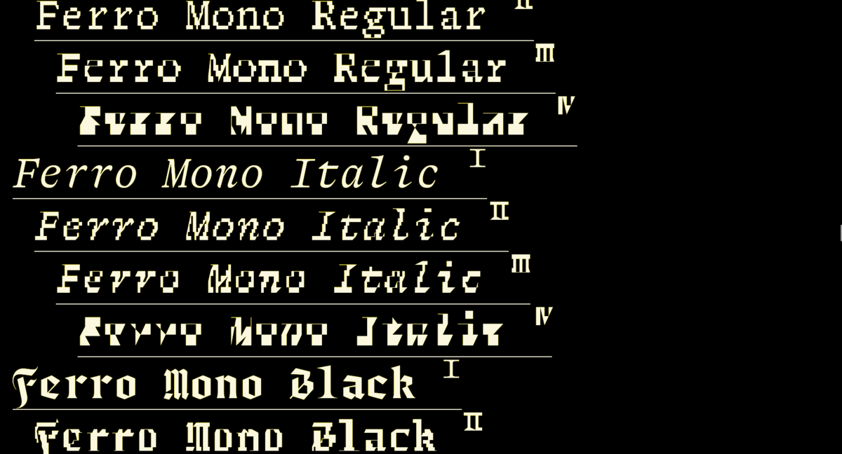
Instead of conventional weights, the family unfolds in four progressive stages of digital decay across Regular, Italic, Black, and monospaced companions. Ferro Black recasts the original Fraktur as a structural, text-friendly layer rather than ornament. Named after ferrofluids, liquids that erupt into spikes under magnetic fields, Ferro shifts from calm, historically grounded structures toward fractured, near-abstract forms. Erosion is treated not as damage but as a productive force: history as unstable material, continuously rewritten through transmission, interpretation, and technical constraint.
Learn More about Plain Form here.
Ferro
Foundry: Plain Form
Design: Lucas Descroix, Bonjour Monde
Team: Benjamin Dumond, Arman Mohtadji
Styles: 24
Release date: 2026
Glyph count: ca. 540 glyphs
Coverage: Latin Extended