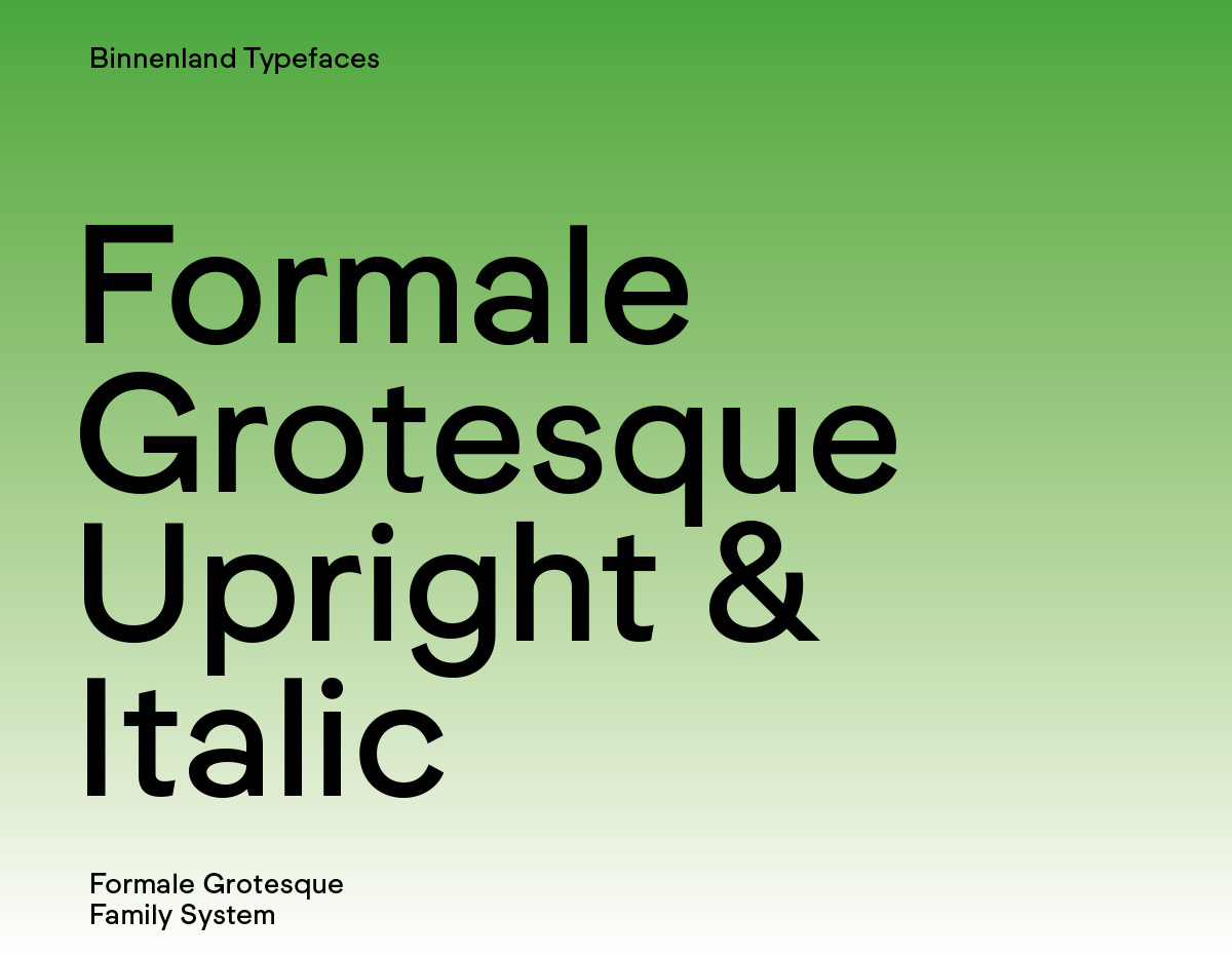
Formale Grotesque
Family System
With the development of Formale Grotesque, Binnenland pursued a strategy that is more variable for a more differentiated use of a type family. Structured in L, N, B (Light, Normal, Bold), and each with 4 different weights (1–4), the Formale Grotesque offers a simple orientation. The font weight and their combinations can thus be adapted in a nuanced way to the design requirements and typographic use and refer to possible combinations. The weight mix, the gradations of the font weights, can follow the numerical sequence but are just as well harmonised in units of 2 or 3.
With several OpenType features and alternative style sets, ligatures, and small caps, the typeface has finesse and characterful typographically appropriate additions.
The Formale Grotesque fits into the typographic tradition of sans serif typefaces dating back to the late 19th century. With its low stroke weight contrast, it pursues a new approach by mixing geometrically constructed and dynamic forms, resulting in a design that is not a response to an existing grotesque or neo-grotesque typeface, but the interpretation of an attitude.
Design by Michael Mischler and Nik Thoenen, 2019
Current Version 2.021 Jan 2024
Formale Grotesque
Foundry: Binnenland
Designer: Michael Mischler, Nik Thoenen
Update Release: January 2024
File Formats: OTF, TTF (variable)
Style: Grotesk
Weights: Thin to Black with Italics
Price: per style: € 70.–; Full family + variable: € 693.–
Take a look at Formale Grotesque here.


