Gaya
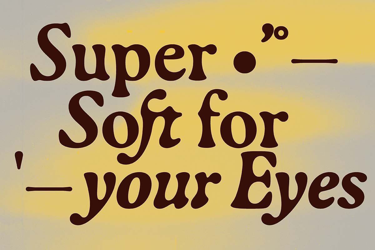
Super Soft for Your Eyes
Get to know the typeface Gaya by Raphaël de La Morinerie with its flowing shapes, available at Out of the Dark type foundry.
Gaya follows the structure of highly legible roman typefaces but takes another turn with its intriguing flowing shapes—pushing it to the limit within the italic. Researches on blurred typefaces formed the starting point for soft vector interpretations. However Raphaël de La Morinerie chose an always precisely controlled digital approach to create a balanced grey value in running text. Letterforms are designed to optimize tight spacing: stems are flared to match round shapes. Discretionary ligatures have been added to reinforce the liquid aesthetic of the font and once again to optimize tight spacing. Gaya was developed from Raphaël de La Morinerie’s diploma project Constellation Typographique at ECAL.
Raphaël de La Morinerie is an independent graphic and type designer living and working in Paris. His work is based on a rigorous and expressive typographic approach to visually transcribe the specificities of each project.
Gaya
Design: Raphaël de La Morinerie
Foundry: Out of the Dark
Spacing and Kerning: Igino Marini
Release: September 2021
Styles and Weights: Two styles uprigt and italic
File Formats: woff, woff2, otf, ttf, eot + Trial fonts
Price Single Style: from € 90.–
Buy


