Lingo
A Serif That Dresses Up Slang
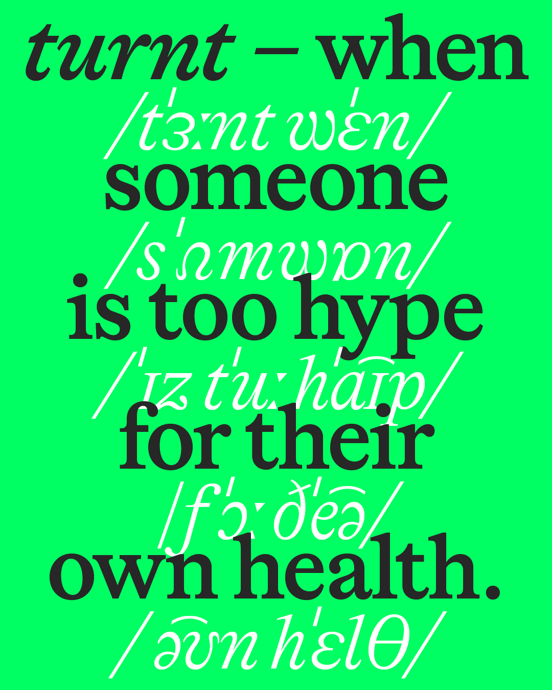
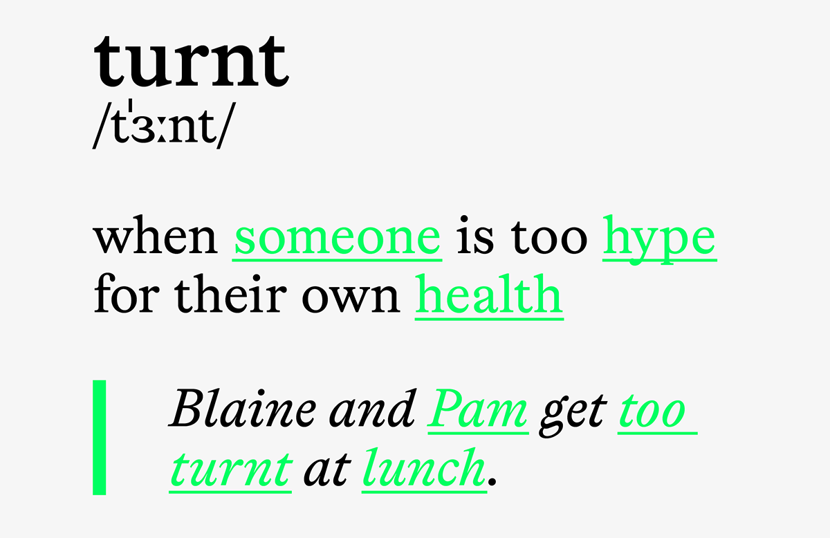
Imagine a library. Sealed-in quiet, walls thick as dictionaries. But that's not why you're here — you're at the computer, navigating to your personal linguistic authority: Urban Dictionary. Feverishly typing in the word on your mind since it left your crush's lips in math class: turnt.
A thrill washes over you. Not just the definition, but the sight of it: turnt, turned from spoken to serif. Dignified. Elevated. To see slang suited up feels almost subversive. And just right.
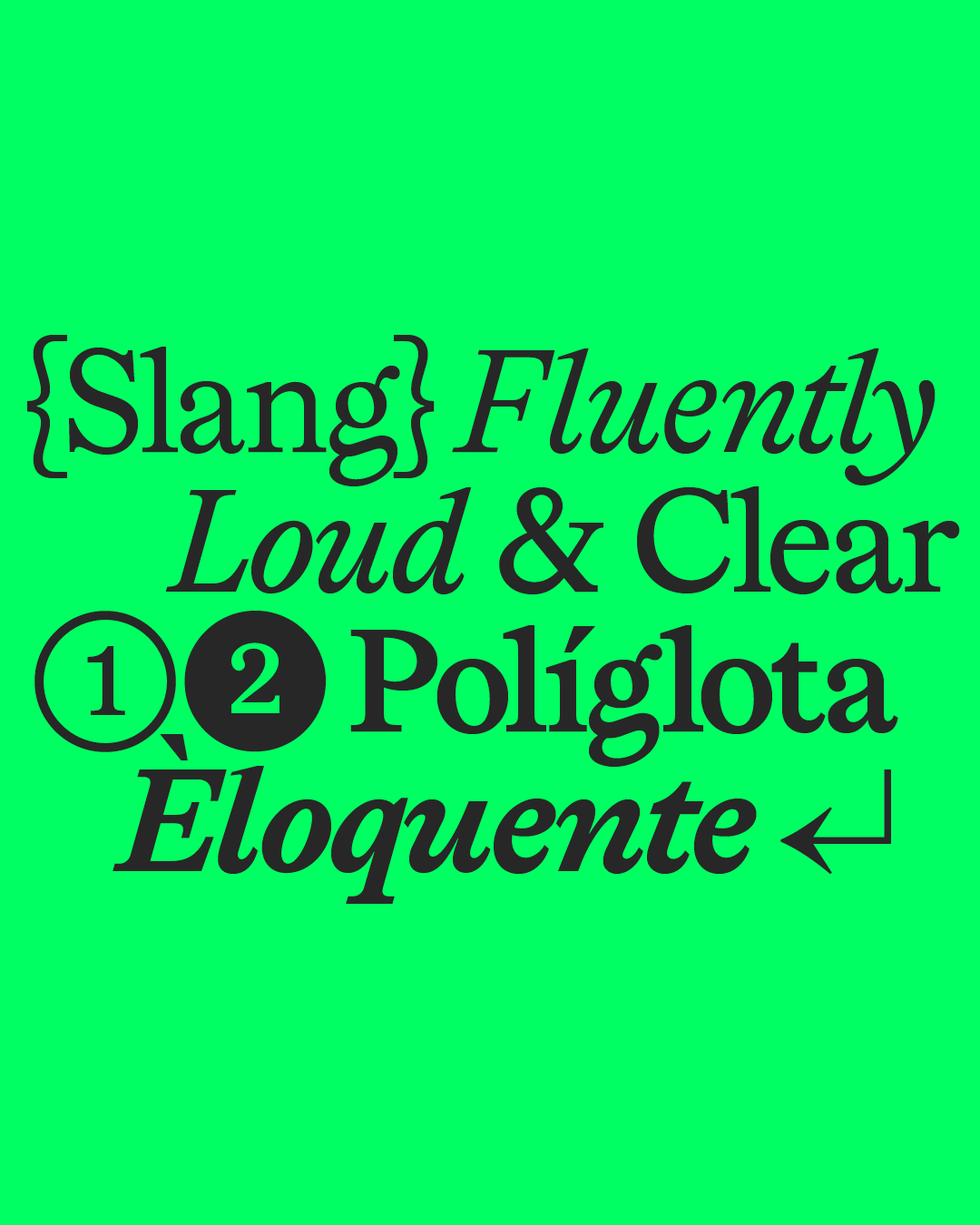
That's where Softdrive's new typeface, Lingo, comes from. Timeless elegance meets current trend, intellectual authority meets the people's slang. Lingo is both a workhorse, trotting along in body copy, and a show pony, shining in display.
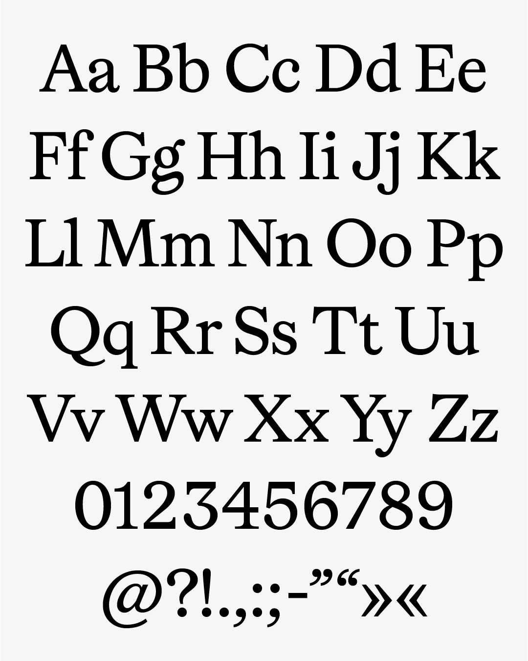
This serif respects classical typographic tradition... until it doesn't. Lingo hails from the 18th century, inspired by the transitional romans of William Caslon, John Baskerville and Louis Simonneau's Romain du Roi — old-world elegance, low stroke contrast, the warmth of letterpress. Check out that little g, the f and a: punchy drops give drama and personality, with alternates on hand when pure legibility is the goal.
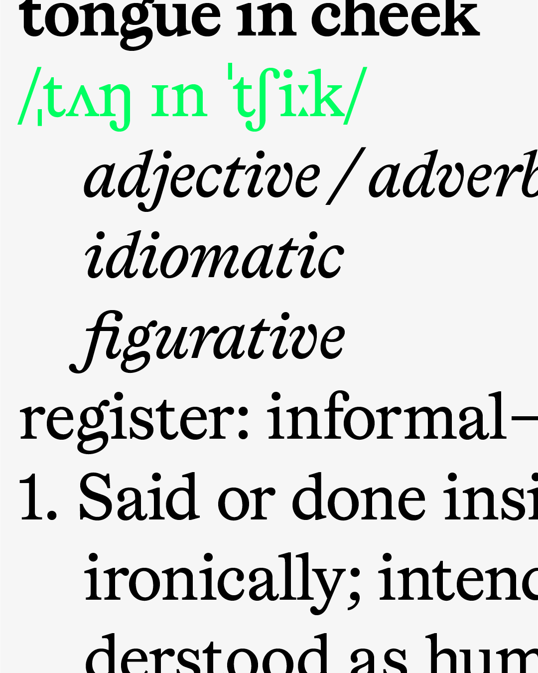
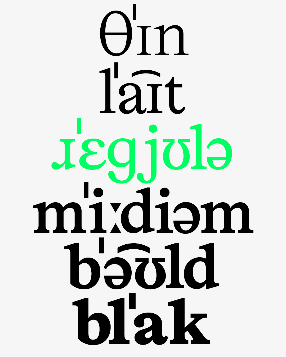
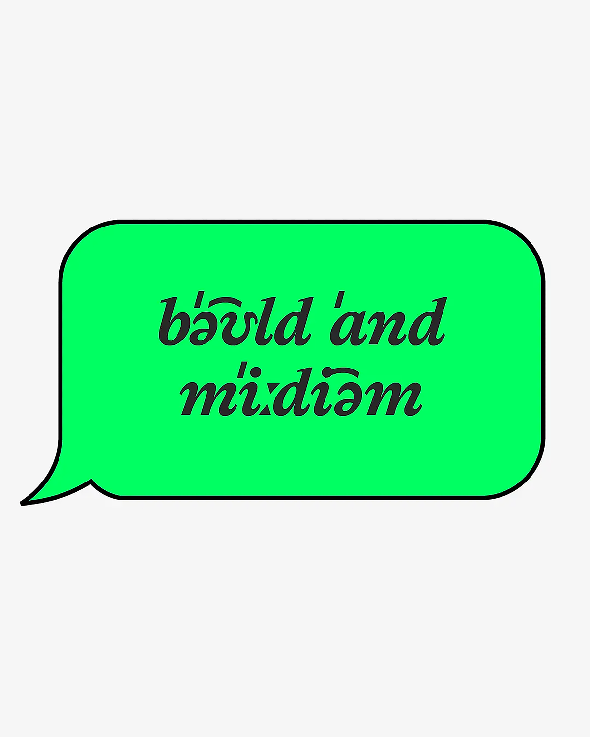
By including letterforms from the International Phonetic Alphabet, offered as ten stylistic sets swapping classic for phonetic characters, Lingo invites writers and designers to get funky. Twelve styles in total, six weights plus true italics, even italicised IPA. A typeface that looks toward the future of language — and invites you to help shape it.
Learn more about Lingo here
Lingo
Foundry: Softdrive Foundry
Designer: Mark Julien Hahn
Website: softdrivefoundry.com
Release Date: 2026
Weights:
Thin, Light, Regular, Medium, Bold, Black
Styles:
Roman and Italic
Total Fonts:
12 static fonts
OpenType Feature Stylistic Alternates: 20
Test Version:
Yes
WHERE TO BUY