Munken Rebranding and Munken Sans
The Paper Company Kicks off the New Munken CoLab
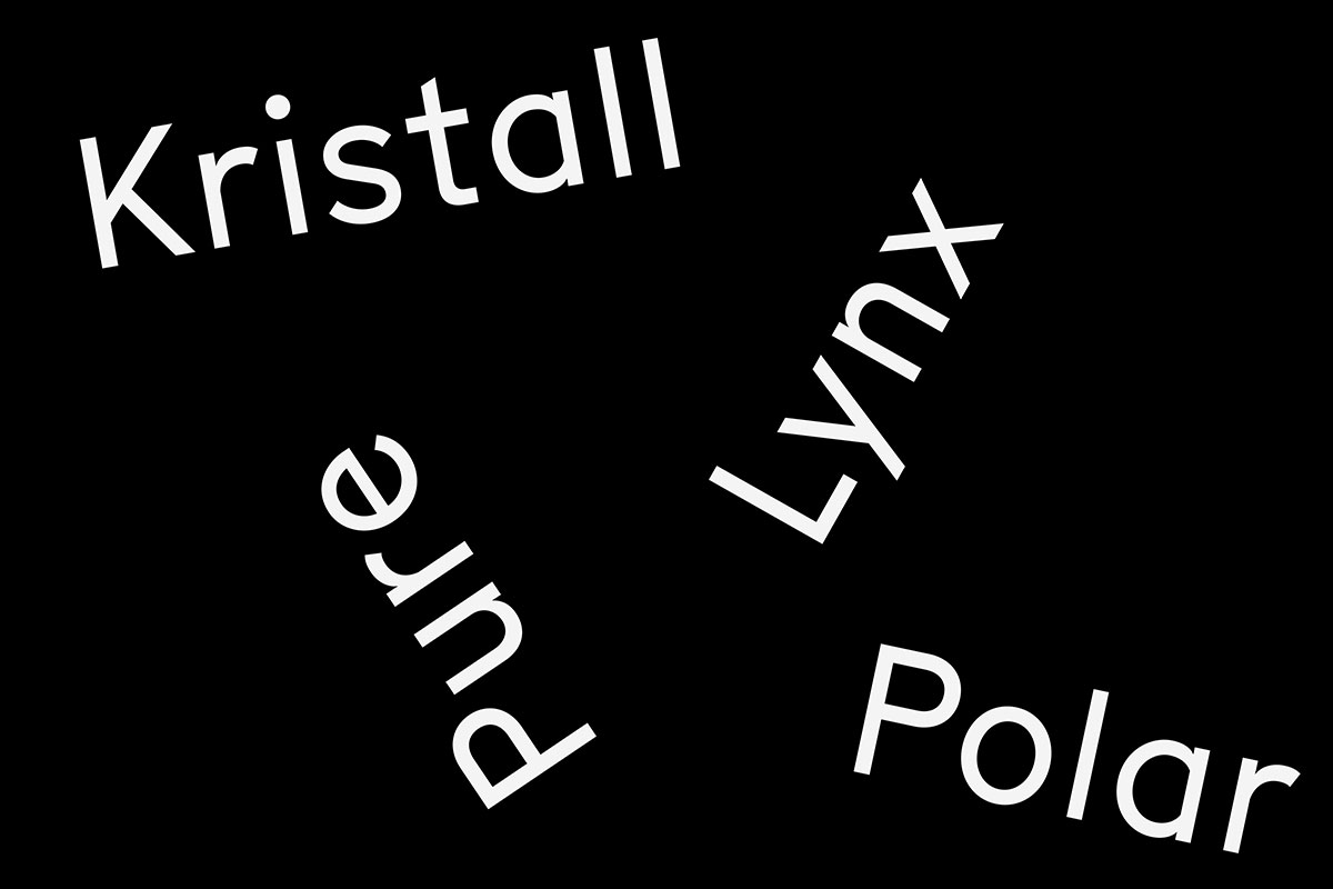
This year Munken amazes with a rebranding that has it all. Collaboration, diversity, and unique experiences formed the roots of the creative concept. Today, the paper company combines these elements to kick off the new Munken CoLab initiative, which is done together with the Swiss Type Foundry, Lineto. The result was the Munken Rebranding and Munken Sans. Inherent to collaboration is the idea of sharing, a concept that is essential to Munken’s cultural identity. The new brand appearance which was designed by JUNO is based on the visionary, nature loving and Swedish personality of the company. Because that was not meant to be enough, Munken Sans was designed in the spirit of collaboration with Laurenz Brunner and Selina Bernet, in dialogue with Jonas Williamsson and Cornel Windlin (Lineto). The elegant and modern sans serif typeface took inspiration from the Swedish traffic font, Tratex, designed by Kåge Gustafson for national road signs in the 1960s.
Munken Sans is the outcome of a collaboration between Munken and with Laurenz Brunner and Selina Bernet, in dialogue with Jonas Williamsson and Cornel Windlin. The Swiss typographers from Lineto have further developed Tratex timelessly beautiful and characteristic design for Munken Sans. Unlike Tratex, which consists of only one weight, the font is available in three weights: regular, medium and bold.
In a 448-page handbook, concepted and designed also by JUNO and printed on paper from the own design range, Munken Sans is displayed for the first time in a varied and playful way. Based on the themes of nature, paper and signposts, the font is shown off in several different applications. The Munken Handbook is an homage to paper as an object in book form. Moreover the Handbook brings together the new typeface and the company’s design range. The characters and the material form a tactile unity, presenting an organic coexistence following in the long tradition of the art of letterpress printing. Click here to find out more about the Munken CoLab, Handbook, and the free typeface.
With the goal of starting an open and creative process with this new font, the company is sharing the Munken Sans font with the design community. Munken Sans is available to download free of charge here.
Munken Rebranding and Munken Sans
Munken Sans
Designer: Laurenz Brunner with Selina Bernet, in dialog with Jonas Williamsson and Cornel Windlin (Lineto)
Type Foundry: Lineto
Release: October 1st, 2020
Weights: Regular, Medium, Bold
Price: free of charge (download here)
Munken Handbook
Volume: 448 pages
Paper: All eight grades of the Munken Design Range
Binding: Otabind
Screen: FM 20μ
Printing: four colors
Ink: Toyo Ink
Printing Press: Komori Lithrone S40P Hybride Print Technology


