New Kansas
100 Year Celebration of Cooper
To celebrate the centennial of Cooper Black, one of the world’s most famous and best loved typefaces, Newlyn releases the first refresh in its 100 year history.
Cooper Black
Cooper Black shows up everywhere: movie and album titles, jewelry, airlines, and a range of shops from doughnuts to salons to tire repair, and everything in between. Cooper Black does not discriminate and this is what makes it an icon of pop-culture.
Oswald Cooper
Oswald Cooper (1879–1940) was a lettering artist who was trained by and enjoyed friendship with some of the top type designers and calligraphers of his day, such as W. A. Dwiggins and Frederic Goudy. He was raised a midwesterner in Coffeyville, Kansas, on the border of Indian Territory and on the edge of the Wild West. Oz, as he was always known, was a very lovable and mild mannered man, who’s wife once wrote of him “Many times have I seen wrens sitting on his shoes, singing, as he sat weeding the flowers … they too must have sensed his gentleness.” In 1899 Oz moved northeast to work in a print shop in Chicago, his midwestern humility and warmth was a part of his personality that transferred into his work, Cooper Black is the most enduring example.
Cooper Black’s Disadvantages
Made in 1920, Cooper Black has an unmistakable tone but was not the product of our modern technology. It is a neglected relic that has now undergone a deep clean and thorough restoration in order to create a fully fledged type family for wide use.
Many classic typefaces and styles have undergone numerous revivals and reinterpretations. But as one of the world’s most famous and most used typefaces of the past century, it is surprising that Cooper’s bulbous, oval serifs had not been modernized. There has been very little professional reappraisal of Cooper as a font family, and even less in that elliptical serif style.
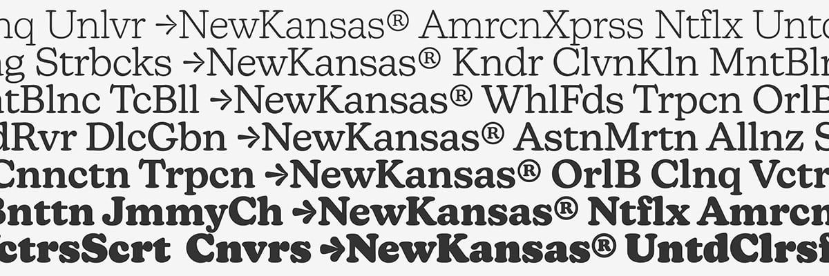
Introducing the New Kansas Typeface
The New Kansas font family takes the idea of this populist, brash, and colorful typeface to a new level. Its seven weights (Thin, Light, Regular, Medium, Semibold, Bold, and Black) were designed to take on headlines, but they can also find their voice in paragraph text. It is far more consistent as a family than Cooper. Its distinct personality is visible throughout the weights, an improvement over the original, whose lighter weights have become dated.
Comfortable Everywhere
New Kansas, like Oswald Cooper himself, doesn’t have a trace of irony or aspiration, but speaks everything as matter-of-factly as possible. What New Kansas is is comfortable with itself. And it invites you to get comfy with it, too.
New Kansas is the type family with a tone for everything. It ignores trends for the greater benefit of being itself, it’s everything that current corporate branding isn’t. I hope you’ll find its advances to your liking—the better balance, sumptuously crafted curves, and extended character set—and use this everyman font family everywhere.
New Kansas
Foundry: Newlyn
Designer: Miles Newlyn
Release: February 2020
Weights: Thin, Light, Regular, Medium, SemiBold, Bold, Black
Price desktop version: £ 40,– per weight
Trial Fonts
Buy


