Olivine
by URW Type Foundry
Recent trends in typography are seeing a shift towards naïve or primitivism from the previous more formal approach of laboring to achieve a clandestine design execution. In art, primitivism is characterized by the works of artist like Wassily Kandinsky of “Der Blaue Reiter” who popularized this type of expression 1912 onwards. However, unlike art, typefaces are used as raw materials to convey messages and it is pertinent to consider the user experience of the recipient. Therefore, true primitivism in typeface design poses challenges for legibility and readability, parameters that are of outmost significance for the reading process.
Olivine is an exploration of form, combining elements of primitivism with rationalism. Ink traps are a legacy of adaptions from founts having been a 3D metal object that had to reproduce in small sizes in demanding print environments such as poor quality paper and uneven inking while printing. Ink traps allowed excess ink to fill on deliberately designed gaps and complete the character, rather than smudging the form of the character. Currently, typeface design is leaning towards a tendency to treat ink traps as bells and whistles, a job that Olivine does with a touch of panache. In Olivine, the nuances of type-design are consistently applied to make the idiosyncrasies of the ink traps disappear in text and become self-conscious in display sizes. Notice the funky uppercase A, and how the ink trap detail disappears as the font becomes smaller, reducing the density of ink where the strokes meet, contributing to an even typographic texture. Overshoots, on the other hand are necessary optical compensations for a round or pointed character where it extends in comparison to a flat letter to achieve the optical effect of being the same size and compensate for the inaccuracies of human visual perception. Olivine exaggerates overshoots to its extremes on the y-axis without compromising the vertical rhythm of the letterforms.
A challenging aspect of typography and type design is finding the sweet spot between the anonymous and the noticeable. It is a fine balance between the self-conscious design elements overwhelming the message versus the lack of defining elements that leave the message unnoticed. The details of the Olivine type family such as its rhythmic proportions of letterforms and it’s well executed spacing against its flamboyant overhangs and ink traps strike that optimum balance between the appealing qualities and the elements necessary to make it a flawless design. Olivine is neither solely experimental nor minimal, striking a balance between formality and friendliness.
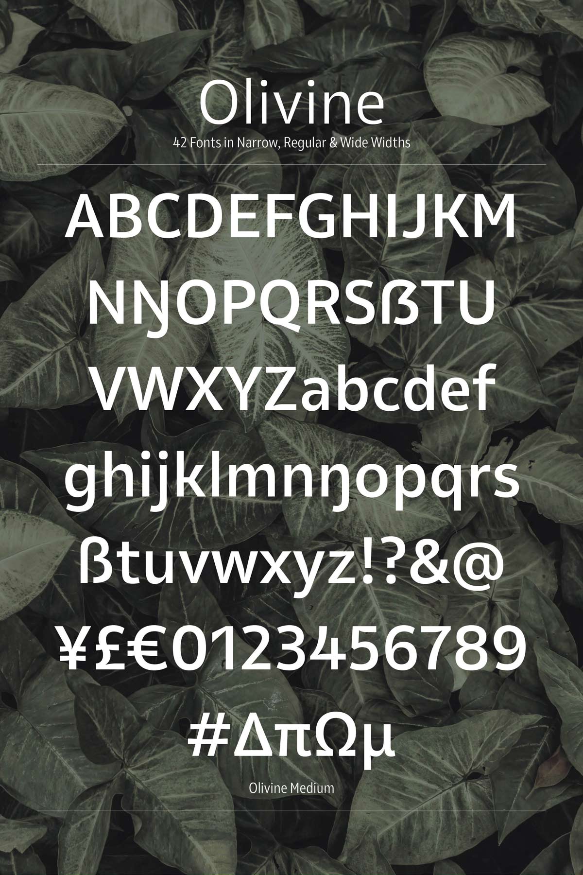
If you are looking to add some flavor into your design, try Olivine. The family comes in 3 widths, narrow, regular and wide, and a total of 42 fonts responding to modern typographic needs. Try before you buy; Olivine Medium and Medium Italic are available free at MyFonts for unlimited commercial usage.
Olivine
Type Foundry: URW Type Foundry
Designer: Pria Ravichandran
Release: July 2019
Format: OTF, TTF, WOFF, WOFF2
Weights: 42
Price: Volume 110.– €, Weight 20.–

