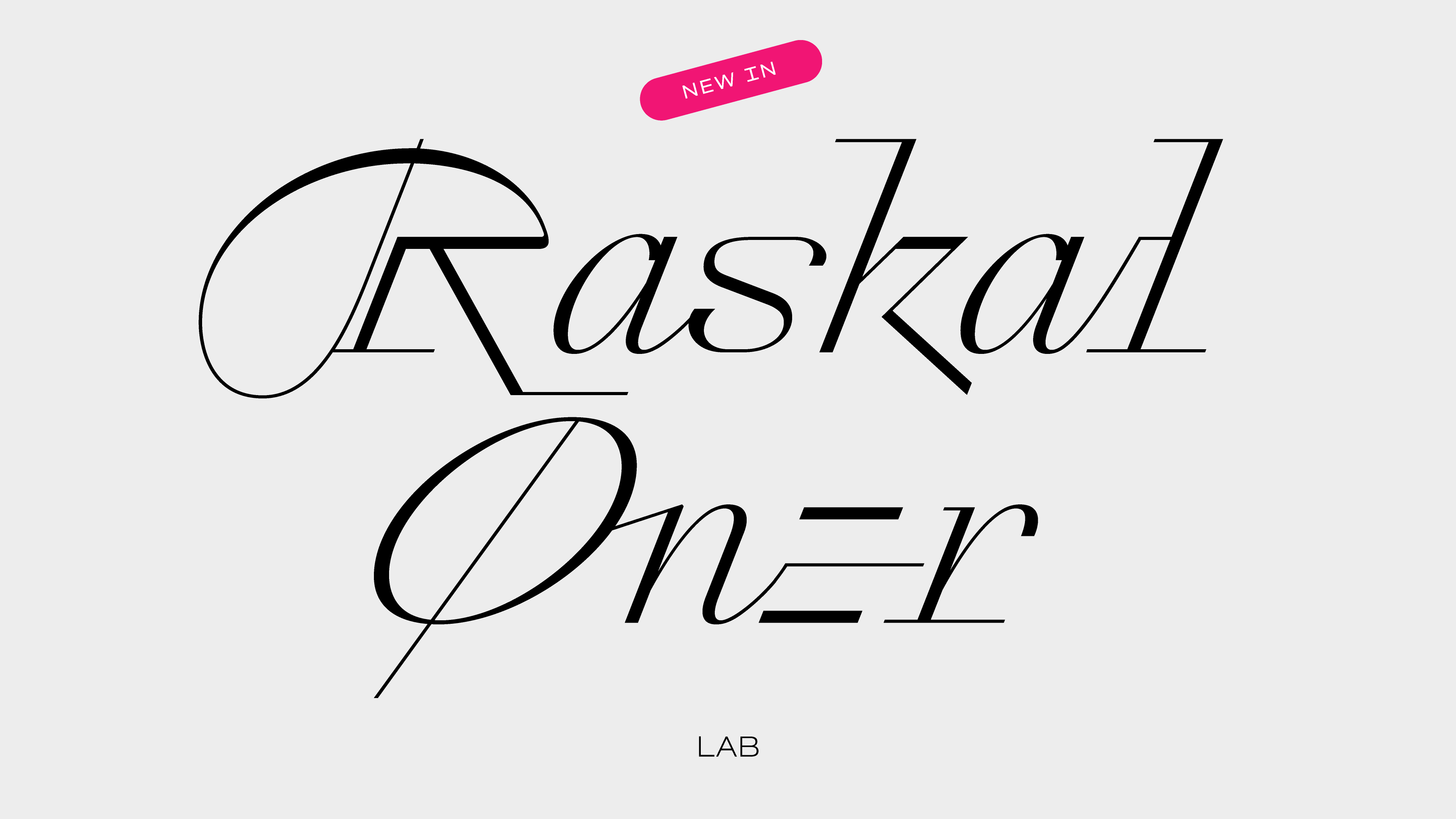
Raskal
By Swiss Typefaces
Raskal is a visual statement. Its design digitally translates and transforms handwriting and hand lettering’s most exciting elements. Although it has a lot in common with “script fonts,” Raskal’s relationship to handwriting or formal script styles is not as close as what you see in revival typefaces or ones based on a famous calligrapher’s oeuvre. The trip Raskal took between its initial concept and the final product was not straightforward. Emmanuel Rey could have arrived at many different kinds of type designs instead. While Raskal doesn’t look like its other typefaces, the way it came about illustrates how the foundry works.
Raskal is a digital typeface. Of course, the font is a digital file for use with digital applications. But the font’s design process was primarily a digital one. For many years, all its design and form-finding experiments were drawn digitally without resorting to sketches made by hand. Which might sound an aberration for a typeface inspired by calligraphy. However, very late in its development, Rey began making quick sketches on paper to help determine how some of its final glyphs might look best.
Raskal started as a script-style extension and accompaniment to the original SangBleu OG typeface. For a while, the design had two weights, one of which featured heavy strokes and a lot of contrast. The idea was to create new styles to add to the SangBleu family, with unexpected appearances and feelings. While going about this, he tested ideas that offered formal complements to the existing SangBleu OG fonts rather than what designers typically expect font families to contain.
One determining point in Raskal’s development was Rey’s decision in 2018 to turn it into a monospace-style font. After working on the script font for four years, he felt like he wasn’t getting anywhere. That sensation forced Rey to reconsider his self-inflicted brief. Aesthetically, the challenge of turning Raskal into a typeface looking like a contemporary script was far from resolved. He was even getting feedback that suggested he should abandon his initial desires and finish the typeface as a simple digital reinterpretation of a historical writing style. But that was not satisfying at all.
To force himself toward new and refreshing visual perspectives and to think outside of the box, Rey applied a tactic he had often been pleased to offer students in workshops if they were ever stuck in a creative rut while working on a piece of design. He told himself to add an irrational parameter to the brief, a challenge that seems impossible to solve, something that doesn’t even make sense if you try to define it with words. For Raskal, that was “to make a script font monospace” and channel handwriting’s freedom into small boxes with identical widths. While the final typeface is not completely monopaced, the monospace-style was a way to integrate the mechanical aspect of typography into calligraphy. That brought a new language to the typeface since each letter would have to occupy the same spacing box. Lowercase letters like e, i, l, and s needed new solutions to fill in their own space without breaking the flow of the script—which is the most important visual aspect of this type of design. The inclusion of the three-story lowercase e, which appears as a natural solution when designed on the computer, gave the new and definitive direction Raskal would finally take. Released from any classical design expectation and totally free of agreed type design or calligraphic rules, Raskal was born again.
Raskal
Art Direction: Swiss Typefaces
Design: Emmanuel Rey / Swiss Typefaces
Font Development & Technology: Benedikt Bramböck / Swiss Typefaces
Text: Dan Reynolds
BUY
Background illustration: Gaël Corboz


