Barrierefrei Sans
A Typeface Optimized for Legibility and Accessibility
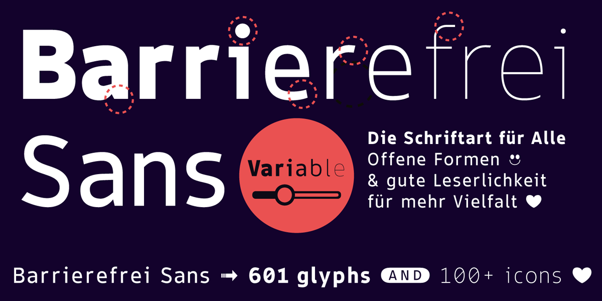
Barrierefrei Sans is a variable typeface designed by Manuel Viergutz between 2020 and 2024 for Typo Graphic Design, built with a focus on accessibility and clean visual impact. Spanning nine styles—Thin, Extra Light, Light, Regular, Medium, SemiBold, Bold, Heavy, Ultra—it offers 601 glyphs (Adobe Latin 2) and includes a range of extras like icons, arrows, catch words, dingbats, emojis, symbols, geometric shapes and stylistic alternates(2 stylistic sets).
Characteristics of the font Barrierefrei Sans are optimized legibility in the form of a large x-Height (easier to read at small sizes), an large apertures (lowercase letter “a” or “e”), a large counter (direct effect on a optimise legibility) and the distinctiveness of individual letter shapes facilitates quick recognition (l ≠ I or O ≠ 0).
Whether you’re designing logos, packaging, posters, magazines, or web content, this font delivers both functionality and personality. Try the free demo version with a reduced glyph set and explore how accessibility can elevate design.
Further information here.
![]()


