Spitzkant
Typeface by Julien Fincker
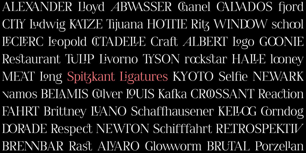
Spitzkant is a serif typeface family that is characterized by strong contrasts. Pointed, sharp serifs and edges contrast with round and fine forms, making it very individual and expressive. This makes it particularly suitable for branding, editorial, packaging, and advertising. The high-contrast display version has been complemented by a lower-contrast text version, making Spitzkant in combination suitable for both strong headlines and extensive body text. An allrounder that can be used for many purposes.
The Spitzkant Head and Text family has a total of two optical sizes, five weights and 20 weights, from Thin to Bold and matching Italics. With over 850 characters, it covers over 200 Latin-based languages. It also has an extended set of currency symbols and a whole range of open type features. For example, there are alternative characters as Stylistic Sets, Small Caps, automatic fractions and many other features.
Especially the extensive selection of ligatures (standard and optional) is a special feature which is worth mentioning. With over 95 different ligatures there are many possibilities to give headlines and logos an individual touch.
After the designer Julien Fincker had spent about a year designing the two Finador families Sans and Slab, he needed an absolute contrast to the round and soft forms for his next typeface. He tells us here something about his design process:
“After a few first sketches the plan was set. It should be pointed, edged and with strong contrasts in the lines. At the beginning still sans serif, I soon noticed that it still lacked distinct markings. Serifs were needed. But what is best suited? Hairlines like a Bodoni? Or modern triangular serifs? After a few quick attempts, I decided to use strong contrasts in the serifs as well. Soft, rounded transitions with a pointed terminal.
Already in the conception phase I sketched the first ligatures. From the beginning I attached great importance to the development of an extensive ligature collection. It offers many possibilities to form very individual headlines. For me, especially as a graphic designer, this is one of the most important features for discovering new things with the font and to just have fun with it.
Originally Spitzkant was intended as a pure display font. As something ‘quick’ after the extensive Finador families. However, the first print in small sizes looked rather promising. So the ‘quick’ was quickly thrown overboard and I decided to add a lower contrast text version to it. And if you already run the extra meter, you run two more—I thought so. So many more languages and features were added. So Spitzkant has become a very well-rounded and extensive family in terms of content, which can be used for many purposes. Extrameters that have definitely paid off.”
Spitzkant
Designer: Julien Fincker
Release: May 2020
Weights: 20 weights, from Thin to Bold and matching Italics
Price per style: from 23,99 Euro. The weight Text Medium is available for free
Buy at MyFonts
Buy at Fontspring


