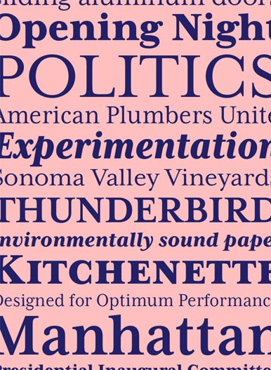
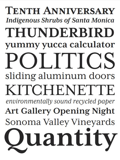
Mrs. Eaves XL
Seit die Schriftfamilie Mrs. Eaves vor ein paar Jahren auf den Markt kam, haben sich nicht nur eingefleischte Emigre-Fans gefreut. Die Schrift tauchte zur richtigen Zeit plötzlich überall auf und ist seitdem eigentlich auch nicht mehr aus der "Antiqua-Szene" wegzudenken. Nun hat Zusana Licko Frau Regenrinne (würde mich mal interessieren, wie es zu diesem Namen kam ...) zu einer XL-Familie ausgebaut.
--
Pressetext:
This latest release from Zuzana Licko expands the popular Mrs Eaves family with the "XL" series, a space economic variant in 3 weights of regular and narrow with accompanying italics and small caps.
The Mrs Eaves XL OpenType fonts include the following features:
Small Caps, All Small Caps, Alternates, Proportional Old Style Numbers, Proportional Lining Numbers, Tabular Old Style Numbers, Tabular Lining Numbers, Superior Numbers and Scientific Inferior Numbers, Numerator and Denominator and Arbitrary Fractions.
Originally designed in 1996, Mrs Eaves was Zuzana Licko’s first attempt at the design of a traditional typeface. It was styled after Baskerville, the famous transitional serif typeface designed in 1757 by John Baskerville in Birmingham, England. Mrs Eaves was named after Baskerville's live in housekeeper, Sarah Eaves, whom he later married.
One of Baskerville's intents was to develop typefaces that pushed the contrast between thick and thin strokes, partially to show off the new printing and paper making techniques of his time. As a result his types were often criticized for being too perfect, stark, and difficult to read.
Licko noticed that subsequent interpretations and revivals of Baskerville had continued along the same path of perfection, using as a model the qualities of the lead type itself, not the printed specimens. Upon studying books printed by Baskerville at the Bancroft Library in Berkeley, Licko decided to base her design on the printed samples which were heavier and had more character due to the imprint of lead type into paper and the resulting ink spread. She reduced the contrast while retaining the overall openness and lightness of Baskerville by giving the lower case characters a wider proportion. She then reduced the x-height relative to the cap height to avoid increasing the set width.
There is something unique about Mrs Eaves and it's difficult to define. Its individual characters are at times awkward looking—the W being narrow, the L uncommonly wide, the flare of the strokes leading into the serifs unusually pronounced. Taken individually, at first sight some of the characters don’t seem to fit together. The spacing is generally too loose for large bodies of text, it sort of rambles along. Yet when used in the right circumstance it imparts a very particular feel that sets it clearly apart from many likeminded types. It has an undefined quality that resonates with people. This paradox (imperfect yet pleasing) is perhaps best illustrated by design critic and historian Robin Kinross who has pointed out the limitation of the "loose" spacing that Licko employed, among other things, yet simultaneously designated the Mrs Eaves type specimen with an honorable mention in the 1999 American Center for Design competition. Proof, perhaps, that type is best judged in the context of its usage.
Even with all its shortcomings, Mrs Eaves has outsold all Emigre fonts by twofold. On MyFonts, one of the largest on-line type sellers, Mrs Eaves has been among the 20 best selling types for years, listed among such classics as Helvetica, Univers, Bodoni and Franklin Gothic. Due to its commercial and popular success it has come to define the Emigre type foundry.
While Licko initially set out to design a traditional text face, we never specified how Mrs Eaves could be best used. Typefaces will find their own way. But if there's one particular common usage that stands out, it must be literary—Mrs Eaves loves to adorn book covers and relishes short blurbs on the flaps and backs of dust covers. Trips to bookstores are always a treat for us as we find our Mrs Eaves staring out at us from dozens of book covers in the most elegant compositions, each time surprising us with her many talents.
--
Mehr Infos unter www.emigre.com