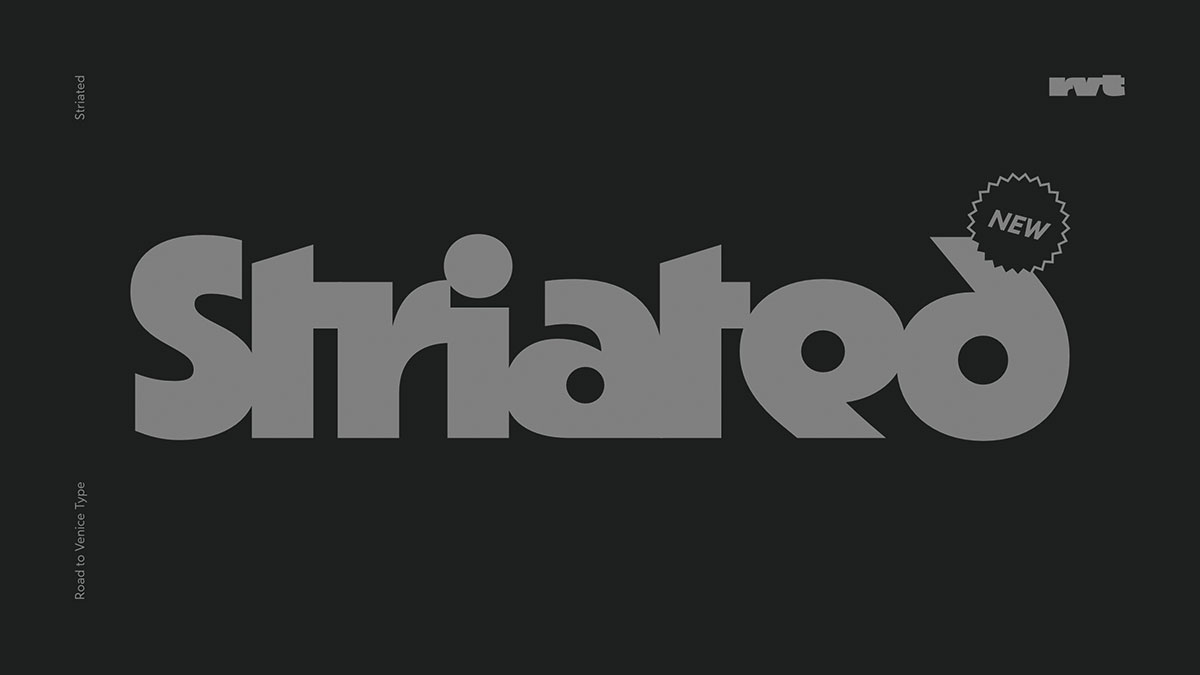
Striated
By Road to Venice Type
Striated was designed with display purposes in mind. Its three weights with their respective Italics cater to a variety of application settings, be it in print or on screen. It can be categorized as a mixture between a Grotesque and Geometric typeface with a pinch of heavily formalized elements.
Striated uses letterforms that are often seen—and more or less registered—since the beginning of the 19th century as a basis. Nevertheless, it is also clearly rooted in the experiments of the Bauhaus school of design and their pursuit to reduce letterforms to the utmost essential. These principals keep permeating design practice today, but however futuristic the resulting shapes then may be, due to the heavy exposure to minimal shapes in the second half of the 20th century, carried by aspirations to conquer space, they often seem a bit dusty from todays perspective.
Striated tries to find a balance in negotiating the past and future by evoking a feeling of being a well known old companion and being forward oriented at the same time.
Striated
Foundry: Road to Venice Type
Release: April 2022
Styles and Weights: three weights from Medium to Heavy with their respective Italics
File Formats: otf, woff2 + Trial fonts
Price Single Style: € 55.–
Price Combination Roman + Italic: € 80.–
Price Family: € 195.–
BUY


