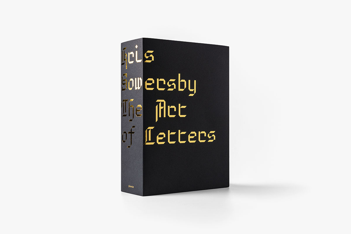
Kris Sowersby: The Art of Letters
A Publication for Typography Detail Lovers
Printed one per page in black on cream paper, the publication Kris Sowersby: The Art of Letters features over 750 large character illustrations selected from Klim typefaces including Calibre, Domaine, Founders Grotesk, Heldane, National, Signifier, Söhne, and Untitled. The volume features a fascinating essay titled What We See When We Read by graphic designer, writer, and educator Paul McNeil and a foreword by Formist publisher and designer Mark Gowing. A real experience for all detail lovers of type design. Beautifully crafted and in a nice format to look at a few swoony curves in the evening in bed.
“When is a letter not a letter? Or perhaps, when does an abstract form become part of a greater language system? Dave Foster and I conceived of this book while discussing the iconic, yet abstract, nature of letterforms. In particular, we were talking about Kris Sowersby, and began formulating the idea that viewing a large, disorganized group of Sowersby’s glyphs might exhibit both his vast output and the relative absurdity of these timeless and ubiquitous forms.
In order to turn this idea into a reality for Kris Sowersby: The Art of Letters, Foster and I considered Sowersby’s body of work as a collection of stand-alone drawings. This set of drawings is enormous and difficult to take in, but it is, of course, still made up of letterforms. Viewed here without their functional intention of scale, alignment, spacing, style or language, they transform into something else—something other, without their usual meaning, or perhaps just a different meaning.
Typography and meaning have been intrinsically entwined for hundreds of years, a relationship that constantly shifts and changes with the course of history. Sowersby understands this history better than most. As a master type designer, he is an astute practitioner with one eye on typography’s diverse history, even as the rest of him remains firmly fixed in the present. As a result, Sowersby’s typefaces pay homage to those that have come before, and yet they are beautifully inventive. This inventiveness creates new cultural contexts for our pre-existing forms, helping us to plot a forward path with the knowledge of our past.
Kris Sowersby: The Art of Letters is a small representation of the greater whole of Sowersby’s collected works. The diversity and artistry represented here is a snapshot of multiple expressions of predetermined alphabets through the application of nuance, instinct and theory. Sowersby spends much of his time immersed in the relationships of form and the minutiae involved in every drawing of every letter. There is a wonderful absurdity in this practice. As such, Sowersby creates elegant forms and details that are sometimes overlooked in favor of reading the words they carve out. But much like a chair or a teacup, we can find beauty in the infinite variability and artistry of these everyday items by simply abstracting their meaning, and hopefully offering a more intimate understanding of what is often right in front of us.” — Mark Gowing
Kris Sowersby: The Art of Letters
Publisher: Formist
Editors: Mark Gowing and Dave Foster
Essay: Paul McNeil
Design: Formist
Workmanship: Paperback, foiled cover with black page edges
Format (w × h): 150 × 210 mm
Volume: 800 pages
ISBN: 978-0-6485963-4-9
Buy


