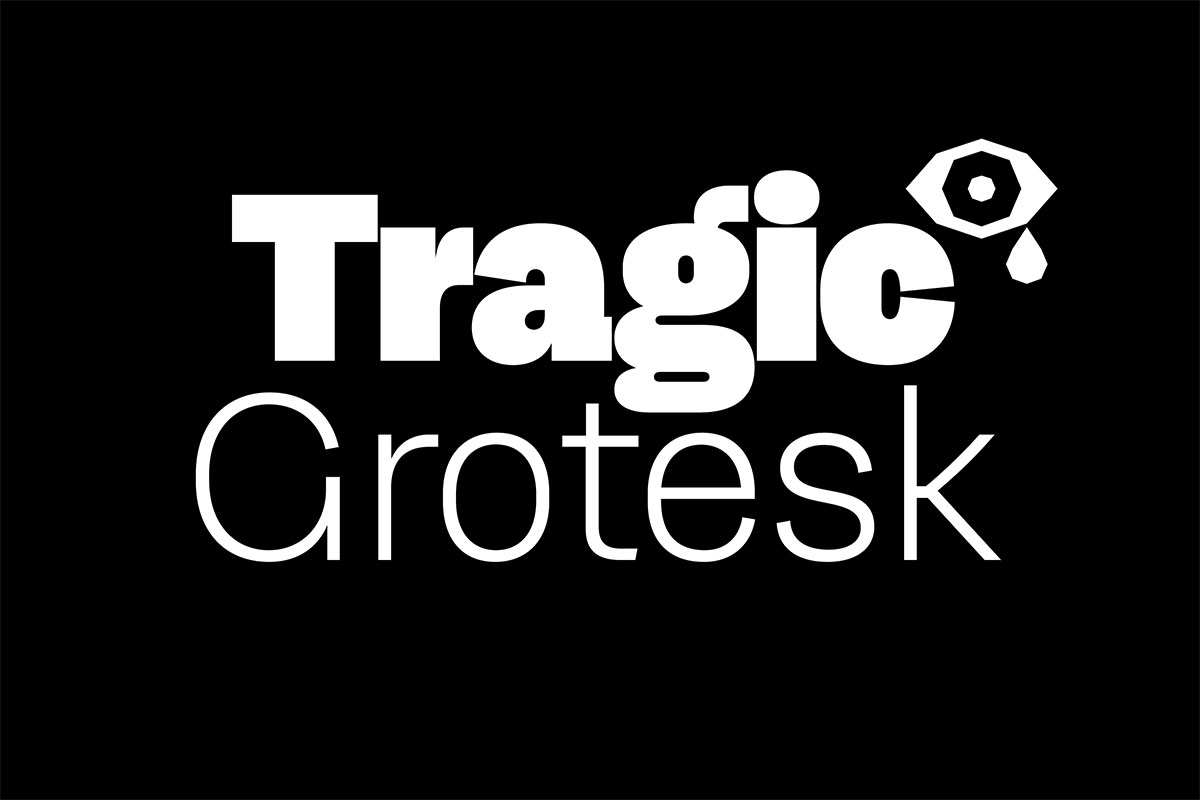
Tragic Grotesk
By Character Type
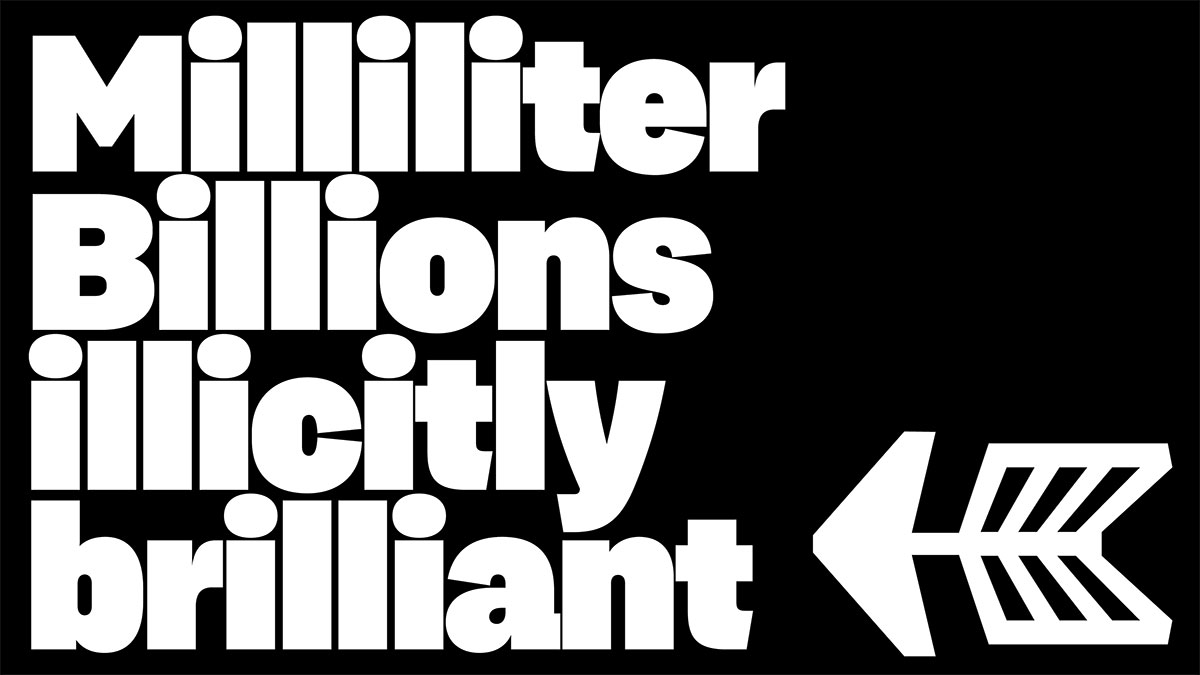
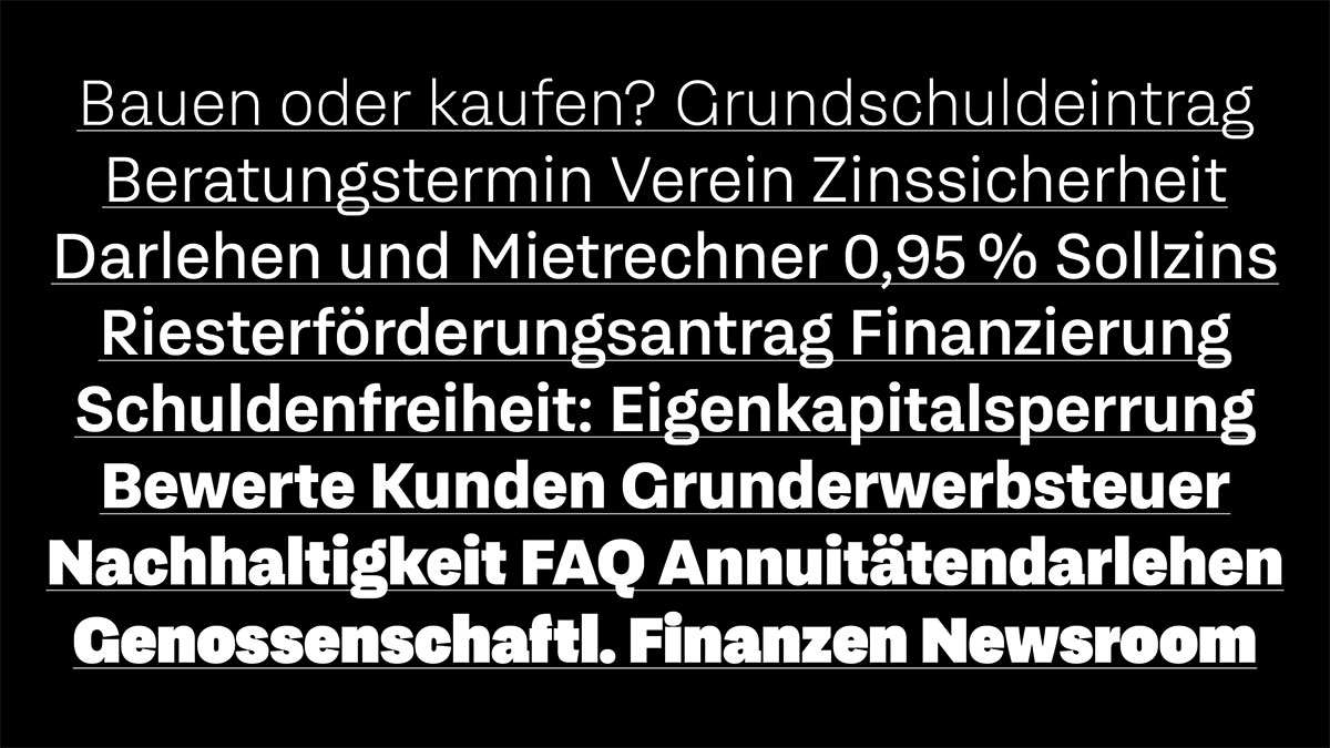
Tragic Grotesk is not neutral: On the contrary, it attempts to negotiate a mediating act between warmth and humanity on the one hand and technical directness on the other. The shapes and proportions of Tragic Grotesk were designed with the aim of balance and harmony.
The openings such as a, c, e, and s are semi-open and the stroke endings of these letters are slightly slanted. Furthermore elements from pre-Helvetica times were mixed in: references to the design of grotesque typefaces from the late 19th century.
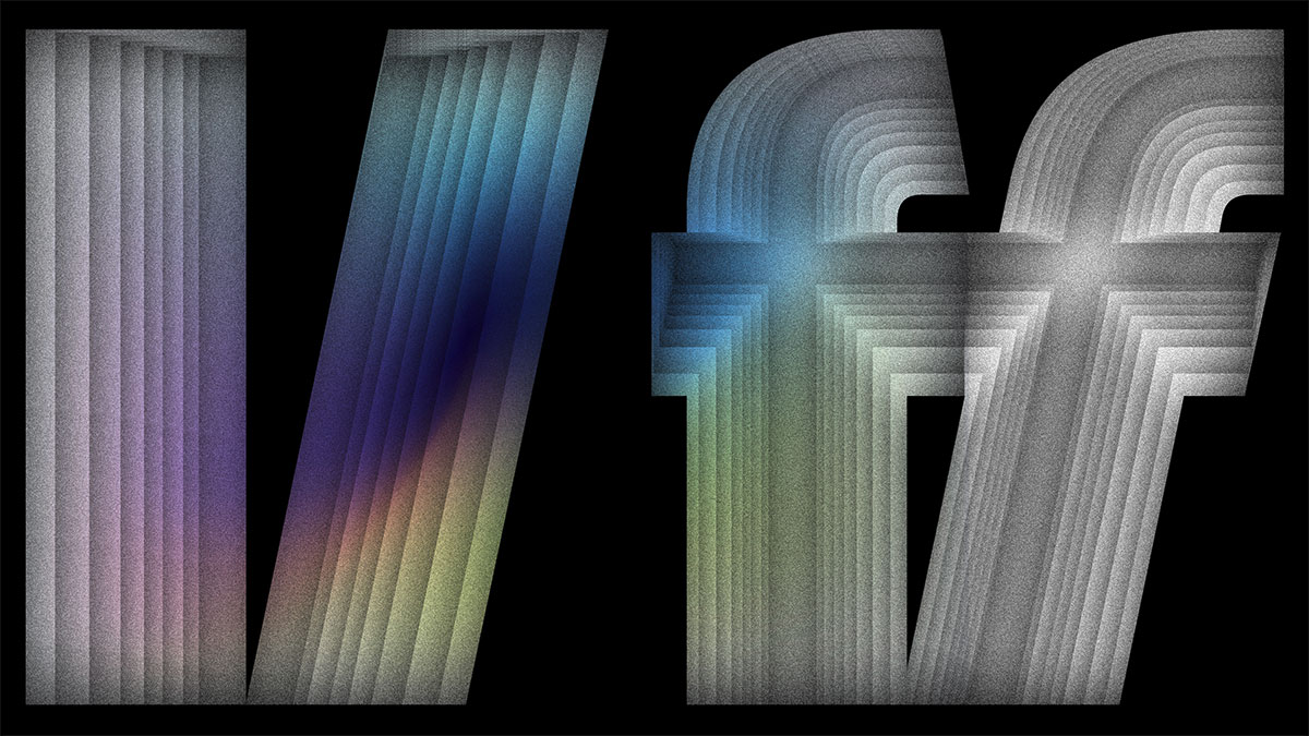
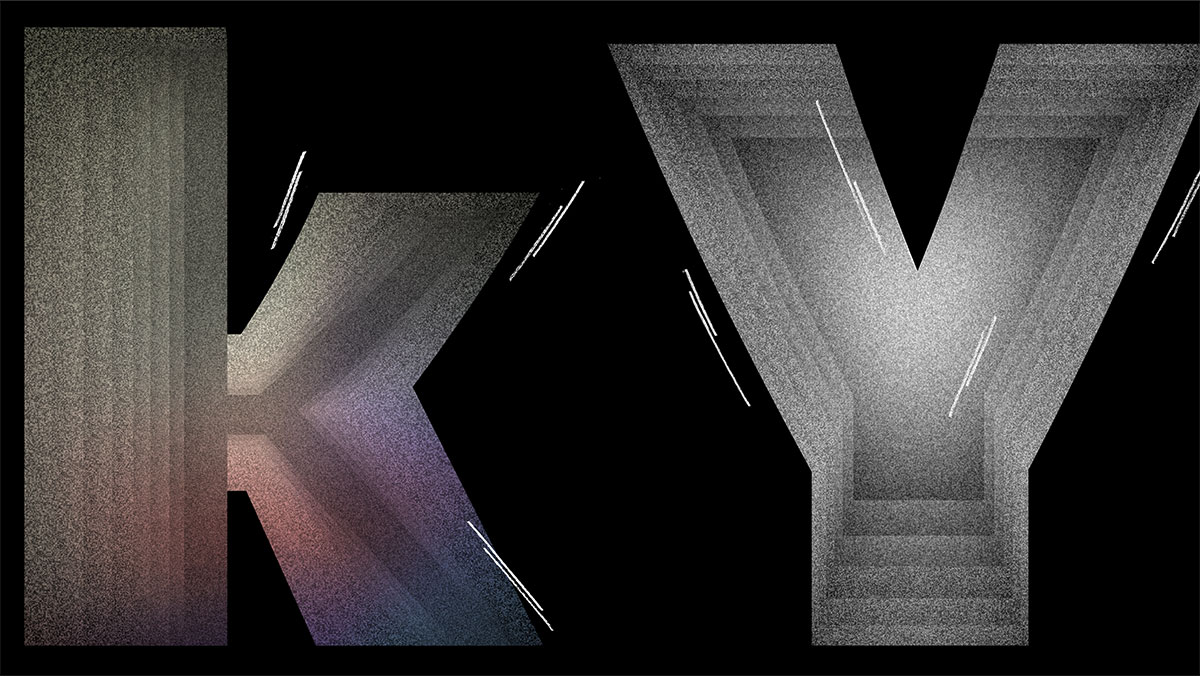
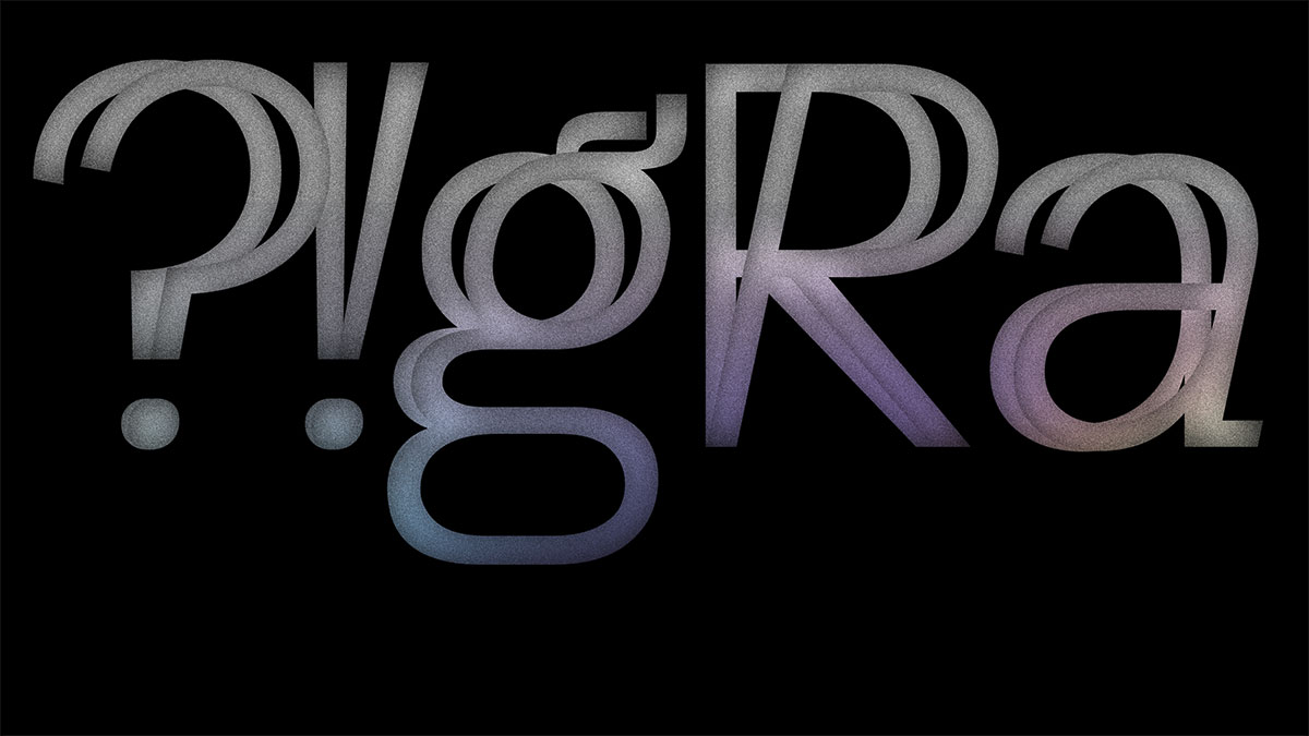
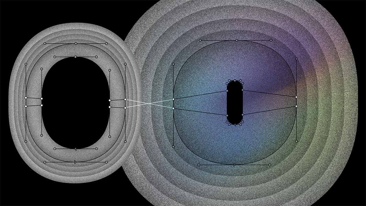
Further design properties: Technical, DIN-related straight lines have been injected into the round shapes. And finally to accentuate the human aspect of the typefaces the diagonals of Tragic Grotesk are curved ever so slightly. This adds a bit of a calligraphic and thereby a warm touch to letters such as A, K, k, V, v, X, x, Y, and y.
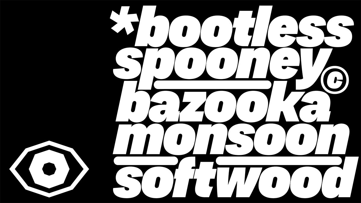
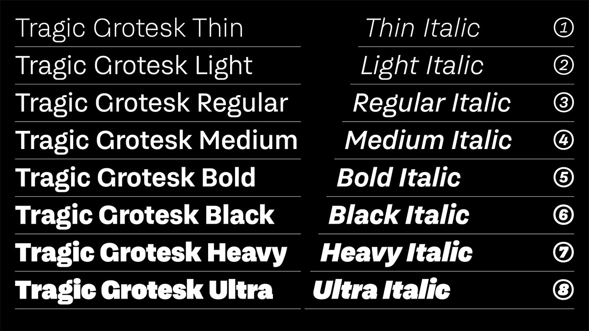
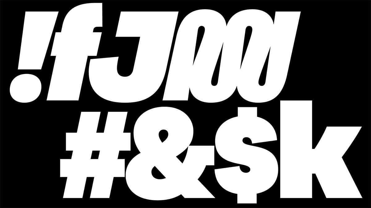
The italic styles of Tragic Grotesk aren’t actually italic—they are only slanted. Historically this is the lazy approach. And yet these slanted forms have a charming aesthetic and if done correctly they are just as tedious to draw as the italic forms. If you are into those latter forms you can find them in the glyphs palette or in the stylistic set through the OpenType features.
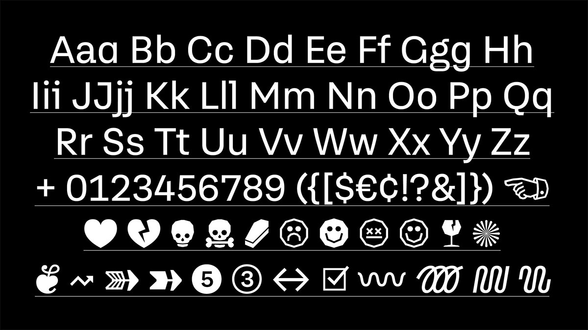
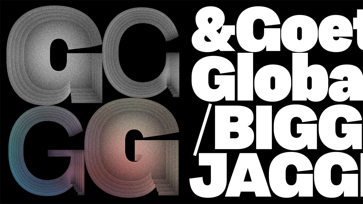
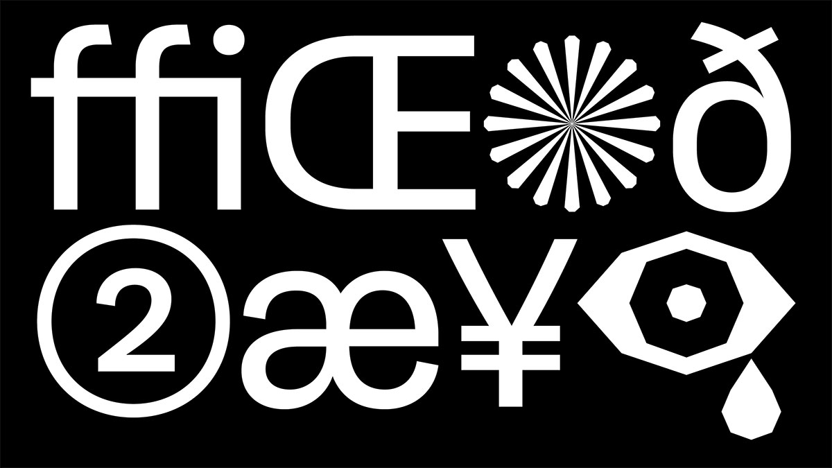
Some characters (I, i, J, j, G, a, and l) have alternate forms. They may be used to change the feel of the typeface slightly. OpenType features make it possible to globally access and change these forms across a text or document.
In total Tragic Grotesk is not neutral: It conveys warmth and digital clarity. It is best used for: Brand, Editorial, Poster, and Book Design. Since it was optimized for screen use its also a great fit for user interfaces.
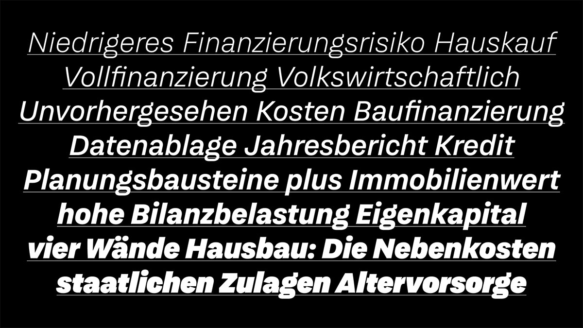
Tragic Grotesk was originally commissioned by the German savings and loan association Bausparkasse Schwäbisch Hall. As part of their brand redesign (headed by the German branding agency Strichpunkt) a custom typeface family pertinent to their brand strategy and positioning was created. This type family (named Fuchs (German for fox) was later extended and is now being released as a retail typeface under the name Tragic Grotesk.
Tragic Grotesk
Foundry: Character Type
Designer: Henning Skibbe
Release: 2022
Styles / widths / weights: Thin, Thin Italic, Light, Light Italic, Regular, Regular Italic, Medium, Medium Italic, Bold, Bold Italic, Black, Black Italic, Heavy, Heavy Italic, Ultra, Ultra Italic, 700+ glyphs per style
Price: 45.– Euro, 360.– Euro
BUY
Find more info here!
