True Colors of Finland
World’s First Color Palette for a Country
What colors come to mind when you think of Finland? OnePlus mobile created the world’s first color palette for a country, together with Pantone to unveil True Colors of Finland, a story emblematic of this nordic utopia.
What colors come to mind when you think of Finland? Sky blue, maybe? Snow white, perhaps? Forest green? OnePlus mobile, an international mobile technology company that challenges traditional concepts of technology, tackled this question with its True Colors of Finland campaign. The result was the world’s first color palette for a country, which was unveiled today by OnePlus in collaboration with the Pantone Color Institute.
The True Colors of Finland palette orchestrates a blended harmony of calming pastels, warm and cool grays, peaceful blues, nature’s greens, a potent mineral black, and a soft rose peach that adds a humanizing and nurturing note. It is a palette of quietly soothing colors whose minimalist style and reverence for nature captures the very essence of the Nordic spirit.
The campaign, a brainchild of OnePlus and creative agency, hasan & partners, encouraged Finnish citizens to capture the true beauty of Finland through photos. Citizens were asked to snap unedited pictures of their daily adventures and upload them to Instagram with the hashtag #TrueColorsFinland.
Using the same Hasselblad technology found in OnePlus’ new 9-series, Google Cloud Vision displayed the more than 4,000 images collected in a website gallery for the world to view.
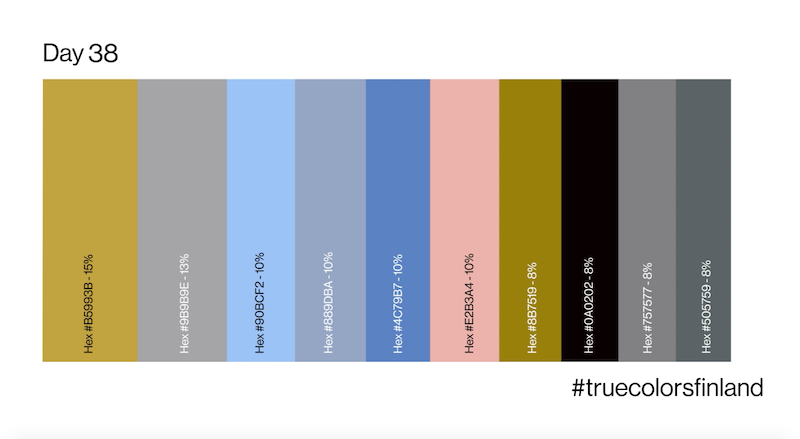
The artificial intelligence of Google Cloud Vision performed a color analysis for each image, identifying Finland’s own ten-tone True Colors of Finland color palette. The images streamed on the website, and with it the ten most popular colors, were updated. They then used PANTONE Connect, a powerful platform that lets designers access Pantone Color Libraries, color values, and navigation tools from anywhere, to convert the True Colors of Finland palette to the PANTONE MATCHING System for graphic and multimedia design and PANTONE FASHION, HOME + INTERIORS for product design. As Pantone is known for their universal color language, cross-referencing the True Colors of Finland palette to PANTONE Colors helped to bring their color and design vision to life.
“The True Colors of Finland palette brings to life the unique beauty of Finland’s natural surroundings and wellness-oriented lifestyle,” says Laurie Pressman, Vice-President, Pantone Color Institute at Pantone LLC. “With simplicity as its hallmark, the True Colors of Finland palette tells the story of a country known for its happiness quotient, unspoiled natural environment, and clean air. It is a palette of non-confrontational colors that come together to convey a message of steadfast resilience as well as unity and sustainability. We cannot wait to see how designers and artists integrate these colors into their designs along with future collaborations through Pantone Connect.”
The photo sharing portal closed on May 16th, 2021, and Pantone unveiled the True Colors of Finland palette now, making the country the first ever to have its own color palette.
Pantone will make the palette available via Pantone Connect for designers and brands to bring the colors of Finland to life.
“We wanted the color palette to truly reflect the lives of Finns and their perceptions of its beauty. It was fun to check out the website gallery and see which direction the color world was tilting, for example, on the eve of a colorful Easter. On the other hand, the review period also included weekdays of almost a month, so the right balance between everyday life and celebration was reflected in the final color palette,” notes Tuomas Lampén, OnePlus’ European Strategy Director.
Visit the website here.


