TypeCon 2023
A New Beginning
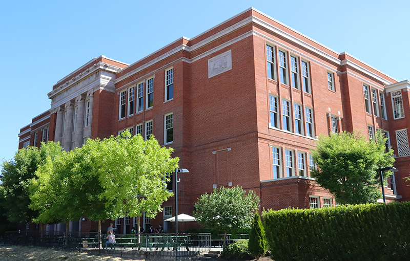
After four long years, TypeCon 2023 made a measured return to an in-person event in Portland, Oregon, this August. Sure, the axes of scope and attendance had been reduced a bit, but after three years of either non-existent or online gatherings, it was such a joy to reconvene with my fellow type nerds to share, learn, and most importantly, connect. First-time attendee Jamie Johnstone put it this way: “I’ve been part of a lot of design communities before, but here I’m surrounded by students, educators, and legends—and there’s just no ego. Every conversation I have, I feel like I’m learning something new.”
TypeCon began, as usual, with the Type & Design Education Forum on Thursday. As a design educator, I have always enjoyed participating in this more intimate setting, full of boundary-pushing pedagogical approaches, before the larger crowd turns up for the main program. And this year’s Ed Forum did not disappoint—with enthralling talks from JP Dowling, who challenged us to “decolonize” and “defuture” type education, and Craig Eliason, who showed the crowd how he ventured beyond just teaching Latin types in his intro-level courses. Jan Ballard and Erica Holeman spoke about various mental health issues that our students are facing in the post-pandemic classroom, and Leo Vicenti’s talk on teaching indigenous type design through student-driven community engagement was one of several presentations throughout the day that had a strong multicultural focus.
Friday’s program began with a keynote presentation from the very tall, and very funny, James Edmondson (Ohno Type Co.). He spoke about the survival tactics explored by smaller foundries and why he loves making typefaces more than anything else! Full of passion, James’ talk struck the right tone for those in the audience who were excited to be back, and for those who may have been experiencing their first TypeCon. First-timer David Cabassa said, “I think a lot of us resist wrestling with social media content, but I think James’ talk brought a fresh perspective on how to have fun with it, which was cool.”
The thematic grouping of talks is something I’ve always appreciated about TypeCon. It reveals additional facets as you listen to a whole block of speakers—stringing together the different metanarratives within the type world. Friday’s program centered on the theme of technology. Highlights included Dave Crossland’s unpacking on Google Fonts’ process for registering variable font axes, and Andrea Leksen’s case study for creating digital fonts based on the handwriting found in the Monotype Index of Typefaces.
The tech-speak was interrupted a few times with lively presentations such as Grace Spee’s enthusiastic survey of video game typography from the 1970s to today, and Lucas Czarnecki laid out his own Doomsday Clock for the type design industry by waxing prophetic on generative AI’s ability to create accurate, usable letterforms. (It’s only a matter of time…) Friday’s talks were capped off with the SOTA Catalyst Award presentation, which was given to 23-year-old ESAD graduate, Anagha Narayanan. She shared “Ilai”—a display typeface for the Tamil script based on 1960s psychedelia, and “Garnish”—a Latin and Tamil family made for editorial design that imposed traits from the Tamil onto the Latin (rather than the opposite).
The final day of TypeCon 2023 began with one tradition that could never be left out—the annual type crit! Glenda Bellarosa, Roger Black, and John Downer were on deck to offer their expertise to young type designers, several of whom were still trying to finish their very first typeface. One noticeable difference from past type crits was that, while it used to be tough to elbow your way into the crowd surrounding the critique, there seemed to be a lingering air of social distancing present in the basement of Revolution Hall, as onlookers gawked from rather awkward distances.
After a special presentation from Neville Brody (who offered this gem: “If you remove the idea of words, type becomes visual music.”), Saturday’s agenda set out on a multicultural journey that showed just how diverse the world of type actually is. In the first block of talks alone, we learned about designing type for the Cherokee Nation syllabary (Chris Skillern), the hurdles of designing Arabic type for Sub-Saharan Africa (Mark Jamra & Neil Patel), and the intriguing development of the Korean typewriter (Alice J. Lee).
Kourosh Beigpour stole the emotional center of the afternoon with his impassioned coverage of Farsi type throughout Los Angeles, and Raven Mo showed us (through biting critique) how the “Chop Suey” font became the face of Chinese food in America. Finally, Joshua Unikel and Kyle Letendre reminded us that type is not just black and white, but infinite shades of gray. The former gave a fascinating talk on the queer nature of the type in John Cage’s “Plexigrams”, and the latter joyfully capped off the afternoon performing as Tomboy—sharing a myriad of ways that drag has influenced their type and lettering career. If Friday showed us that type is indeed technologically complex, Saturday showed us that type is also undeniably human.
As the main program ended, Raquel Rodriguez, another first-time attendee, observed, “The range of talks was pretty impressive. [This conference] was very nourishing for a designer.” The SOTA Board wrapped things up by first presenting the annual Typography Award, which acknowledges outstanding members of the type community and their creative achievements, to longtime show runner, JP Porter. Following this, we heard a few highly-anticipated announcements about what we can expect for next year.
First, TypeCon 2024 will (once again) return to East Portland! While the conference will still rotate through both East and West Coast locations, the Board is taking their time to make sure the next city provides the perfect setting for what TypeCon has become. Second, the SOTA Gallery will make its return next year, fueled by the launch of the inaugural Typography and Lettering Competition. “We needed to curate our own show and not rely on outside groups,” said Neil Summerour. “[It] makes sense—our principal drive is to elevate, promote, and champion those in within our creative community, so this is the next logical step.”
As the sun set on East Portland, while hanging out at the patio bar of Revolution Hall, I asked Lucas Czarnecki (Type Network) for his take on the conference. He said, “It’s hard to regain momentum after taking time away from anything, but I think they’ve done an excellent re-introduction here. I think next year will be even bigger and better—closer to its true form.” Yet the question remains, does TypeCon even have a true form? The last few years have proven that adaptation is key to survival; TypeCon has done that. And I believe it will continue to succeed in its aim to disseminate typographic knowledge to all who will listen. (That is, until the robot overlords completely decimate the profession.)
Photo Credit: Patrick Gosnell


