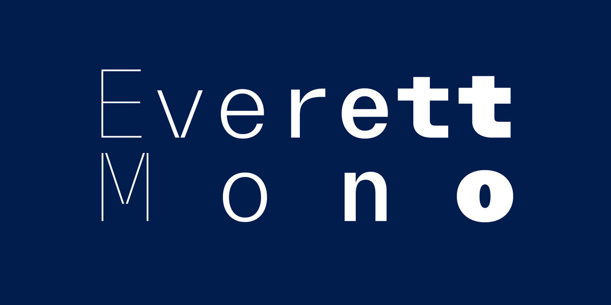
Typeface of the Month: Everett Mono
By TYPE.WELTKERN®
With the month of November, we want to introduce you to our new Typeface of the Month: Everett Mono. The monospace version of the already very well developed Everett from the Swiss type foundry TYPE.WELTKERN®.
A monospace version of Everett has always been part of the project, since its very beginning in 2015. At this point, only the Mono Regular cut existed and grew over time alongside its normal, proportional siblings. The typographic program became then more ambitious: translating 20 styles of Everett—its wide proportions and distinctive cuts—into single fixed-size blocks proved to be really challenging. The design had to find creative ways to compress and carefully fine-tune the letterforms in order to keep a high level of legibility as well as the original Everett flavor.
All weights are designed to be used together; each glyph across the complete family shares the exact same width. A graphic peculiarity of Everett Mono is its ligatures, which occupies sometimes two, or even three blocks, resulting in a mechanical touch. Ultimately, Everett Mono is an independent subfamily on its own but at the same time also the perfect companion of Everett, which can be played together, like brothers and sisters.
Typeface of the Month: Everett Mono
Foundry: TYPE.WELTKERN®
Designer: Nolan Paparelli
Release: October 2021
File Formats: OTF, TTF, WOFF, WOFF2
Styles / widths / weights: 20 styles: 10 weights + 10 Italics
Base price: 99.– CHF / cut
Buy


