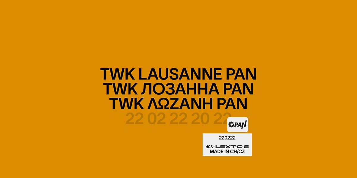
Typeface of the Month: Lausanne Pan
By TYPE.WELTKERN
You can almost smell the spring already. March is here and with it a new inspiring Typeface of the Month: Lausanne Pan.
Lausanne is an extraordinarily sophisticated sans serif font with an ultra-organic aesthetic, very legible in small sizes, and full of refined details in display sizes. The typeface was proudly designed in Switzerland by Nizar Kazan and his team for their platform TYPE.WELTKERN.
Lausanne Pan is the first extension of a series. Indeed, Lausanne has as vocation to become a global font which will eventually cover as many languages as possible.
Lausanne was first of all designed with the intention of responding to the historical sans-serif like Helvetica. Lausanne brings to this intention the particularities of digital typography. Such as, for example, the duality and versatility of a “Text” character and a “Display” character. In addition, the ascending and descending lines are very short and give a compact appearance to this character. To date, the Lausanne has been a great success around the world. It has been used by many designers for (among others); MoMA (USA), mono GmbH (Germany), Naomi Osaka, Dan Carter, Landesmuseum Zürich, Museo Tamayo, Liste Art Fair Basel, or Universal Music.
Typeface of the Month: Lausanne Pan
Foundry: TYPE.WELTKERN
Designer: Nizar Kazan with Jan Charvát and Filip Blažek
Release: February 22nd, 2022
File Formats: OTF, TTF, WOFF, WOFF2 + trial fonts
Styles and Weights: 40 styles: 20 weights + 20 Italics
Test Version: Trial font
Base price: CHF 149.– per cut
Buy


