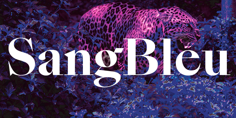
Typeface of the Month: SangBleu
Swiss Typefaces
Guided by their vision of future graphic and editorial design, the Swiss type design company has developed SangBleu into an elaborate supercollection of unprecedented structure and versatility. The typeface consists of five full-featured collections: Empire, Kingdom, Republic, Versailles, and Sunrise, each in a range of weights with matching italics, spanning 45 styles in total.
SangBleu is informed by history, but it’s not a revival. The typeface collection appropriates the best from the past and transforms it into an effective tool set for the aesthetic and technical environment of our day and age. All five collections can be used separately or in combination. Thanks to their consanguinity, they perfectly complement each other.
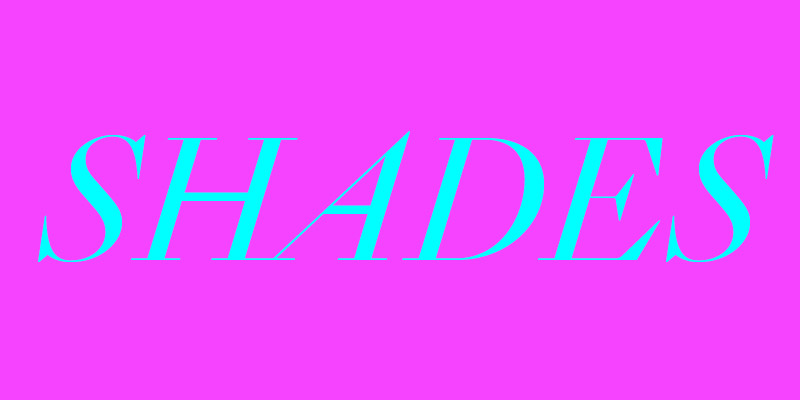
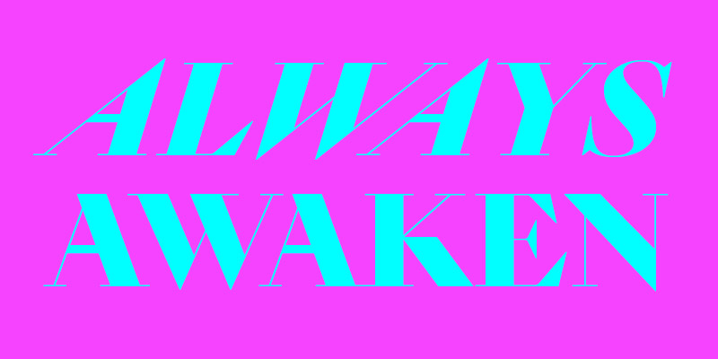
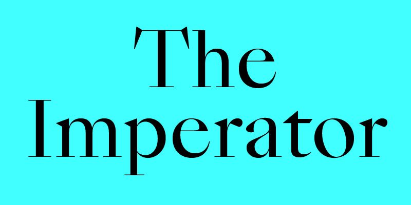
SangBleu Empire loves to be big. Serifs are lineal and contrast is high, like in a Didot. In the Black styles, its thick & thin delicacy is taken to the max. Fat curvy letters like the grinning ‘e’ or the spiraling italic ‘w’ may evoke Caslon burlesques from the 1970s. But then you encounter the crude bar in ‘G’, devoid of any smooth transition, or the leg of ‘K’ that has been synthesized into a pure rhomboid – and you’ll realize this diva is headed for the future.
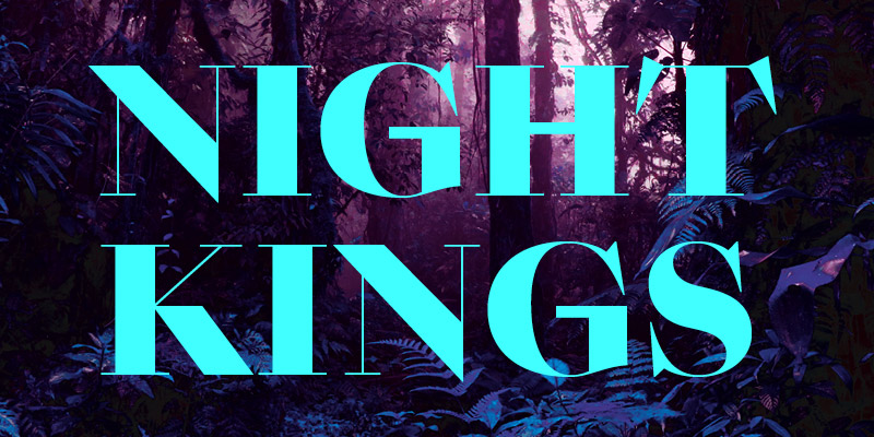
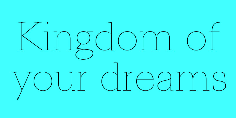
SangBleu Kingdom stands between Empire and Republic, in terms of shaping, contrast amount, and application range. Sturdy bracketed base serifs are paired with pointy triangular terminals. At the same time, Kingdom forms a pair with Sunrise: Both collections come with Light and Air styles. These slender members demand a certain size to thrive, while the other weights work fine down to medium-sized text.
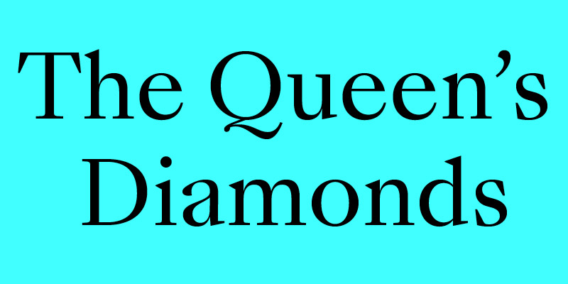
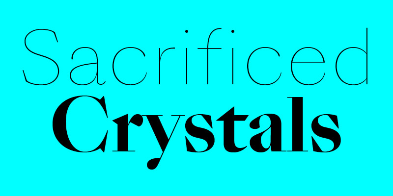
With its modest contrast, economical horizontal proportions and larger serifs, SangBleu Republic is designed for unobtrusive text and continuous reading. It is the only collection not to flaunt the crescent shapes in ‘bdpq’. In letters like ‘m’, the arcs don’t flow smoothly into the stems, but form an angle. The collection still shares much of the design DNA, and can serve as a demure text companion to Empire or Kingdom.
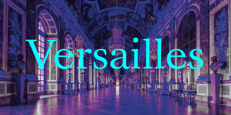
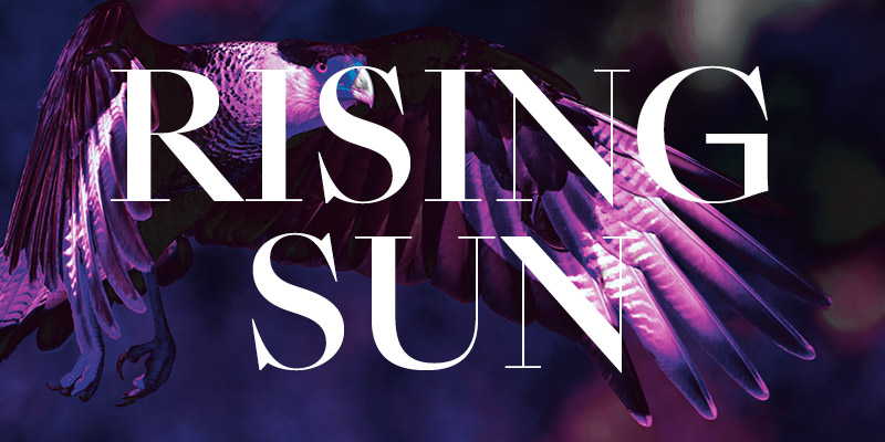
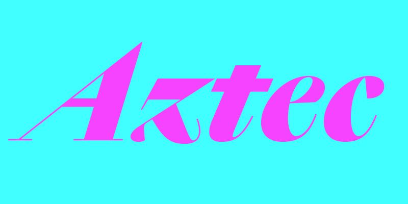
SangBleu Versailles is a softer, rounder sibling to Republic, with wider capitals and a gracefully curved leg for ‘R’. It is distinguished by flatter top serifs, and introduces lachrymal terminals for ‘acfry’. Although many of the other glyphs are virtually identical in both collections, the difference in rhythm and feel is immense. Just like with Republic, the weight span of Versailles includes a Book, indicating that these two collections are made with text sizes in mind.
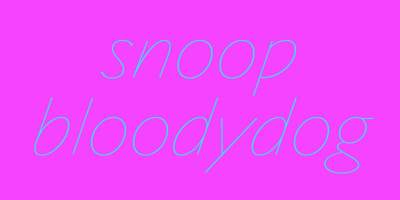
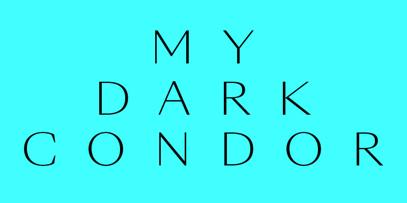
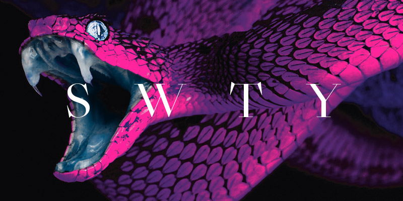
SangBleu Sunrise stands out as the only member without serifs. It is not a grotesque, though, rather a serifless roman. With the round ‘a’ and ‘g’, it seems derivative of Versailles. Traits like the stylized ‘Q’ tail can only be found back in Empire, while details like the straight-stemmed ‘M’ suggest close ties to Kingdom. Sunrise doesn’t have a single seriffed counterpart, but several. Stripped to the bone, it embodies the essence of the SangBleu concept.
SangBleu
Foundry: Swiss Typefaces
Designer: Ian Party, Swiss Typefaces
Release: September 2017
Format: otf, ttf, woff, woff2
Weights: From Air to Bold
Price: 400,– CHF
Buy