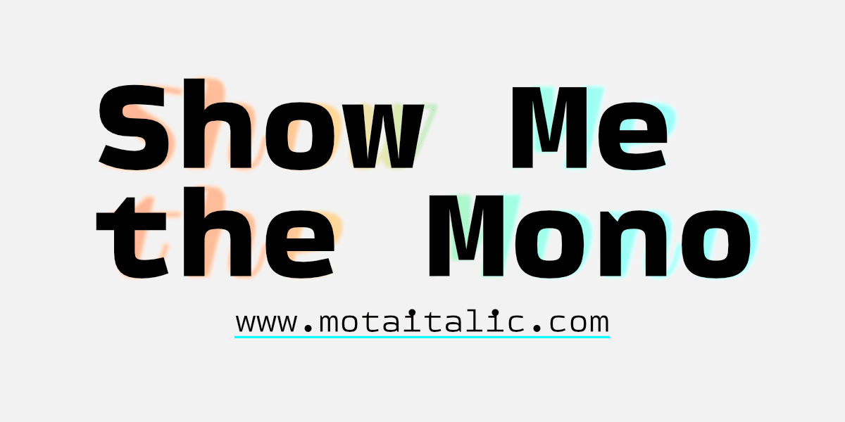
Typeface of the Month: Show Me the Mono
By Mota Italic
The new year has begun and it is time to present you our first Typeface of the Month: Show Me the Mono. It is a monospace typeface from the Berlin-based type foundry Mota Italic.
Show Me the Mono began in Mumbai, India, in 2020 at the start of the pandemic. It was initially intended to be a fun distraction from the hard lockdown (“hard” as in not leaving a tiny studio apartment for almost six months). After a few months of focused work, the fonts were well underway, but nowhere near complete. To help get the newest fonts onto designer’s computers quicker, Mota Italic began their Beta Fonts Program in May 2020. This allows customers early access to WIP designs at lower prices; and, of course, early licenses also include all future updates for free. By its final release on December 31st, 2021, Show Me the Mono had five rounds of beta font updates.
Monospaced fonts are often assumed to be intended for coding. However, there are already enough other great fonts for this purpose, and Show me the Mono is not ideal for the programming category. Even though it is quite clear, simple, and legible, there are many idiosyncrasies (and an extra offbeat italic companion) that make it more fitting for quirkier tasks than for coding. It’s best suited for general design purposes like texts in magazines, catalogs, posters, or websites. It would be right at home working for a wide range of cultural institutions, art galleries, or funky startups. The first beta version was unexpectedly used for the branding of a food nutritionist. There will be no shortage of imaginative uses you will surely find for these fonts.
Contrary to most of Mota Italic’s other font families, this design has “only” the Latin script—yet it is still super extensive and supports more than 400 languages. And while the family is compact with six individual weights, the two additional variable fonts let you also access every other weight between the Extra Light and Extra Black. Further customizations can be accessed via eleven stylistic sets, as well as many other OpenType features to help create flexible and advanced typography.
Beyond the cornucopia of letters, there are also heaps of useful and funny emojis, arrows, symbols, shapes, and misc extras. There’s so much to discover inside these fonts, it’s difficult to concisely cover everything. We’ve not yet even mentioned the four sets of enclosed letters and their simplified diacritics that can typeset all the supported languages. This is truly a fun typeface to use and will inspire your creativity while hopefully also distracting you from the never-ending pandemic.
Typeface of the Month: Show Me the Mono
Foundry: Mota Italic
Designer: Rob Keller
Release: 2021
File Formats: .OTF, .WOFF2, Variable .TTF + WOFF2
Weights: 6 + Italics
Price 2 Packs: € 60.–
Price 4 Packs: € 99.–
Price Full Family: € 199.–
Light + Light Italic are free
Buy


