Typeface of the Month: Slandic
By Vibrant Types
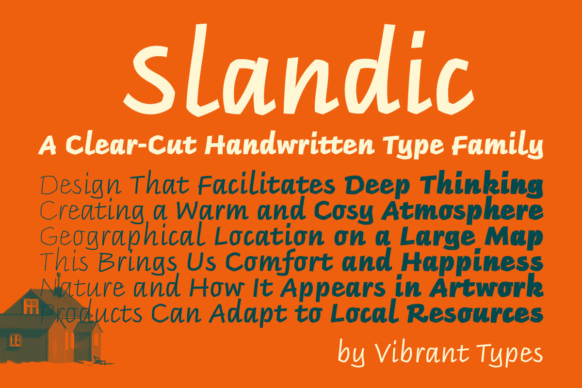
We are presenting our Typeface of the Month: Slandic by the German typeface designer Philip Lammert and published by his recently founded type foundry Vibrant Types.
Headlines are transformed into clear-cut messages with the handwriting type family Slandic. Its robust appeal combines the elegance of script typefaces with the lightness of handwritten notes. Therefore it might rather be the italic of a humanist sans, which perfectly suits for exciting contrasting typography. It offers a wide range of six weights and also a variable font.
What makes the Slandic so playful is the synergy between the quite narrow lowercase letters and the wide uppercase letters. It testifies humanist style to the core, what you can tell from the geometric H and O, the sweeping legs of K and R, the extending crossbar of the e and the oldstyle default numerals. Now, if that doesn’t make beautiful words! This very distinct aesthetic is a reference to the 1980s script handwriting “The Icelandic Method” by calligrapher Briem that originates in 16th-century chancery cursive. You can see it very clearly in Slandic’s sharp upward angles and its long-limbed ascenders.
Slandic’s visual appeal sets a reliable tone. It makes anything but a softened brush impression. Vertical characters vary quite balanced to define metrics, always minding precision. Curves confidently shape angles. Contours define clear rather than decorative characters. Strokes end straight like in a sans-serif. The low stroke contrast forms solid words. The almost upright italic angle gives it its sincerity. Thus it easily combines with any sans-serif or serif, adding a personal note to your design without giving it a comic spin.
The fonts of the Slandic allow you to design straight to the point. Most handwritten and script typefaces offer one single weight for a limited purpose, whereas Slandic’s font family is broadly applicable. Between Thin and Black you will find the style that matches your design. OpenType features let you choose from various sets of figures. The all caps feature activates alternative characters for a more harmonious rhythm. A stylistic set makes these characters accessible for a more compact body text.
Slandic is the third typeface of Philip Lammert who designed the sans-serif Peter and the serif DIN Neue Roman, which is also featured in the Yearbook of Type 2019/20. Under the foundry name Vibrant Types, he now publishes this expressive handwritten style typeface. It is one of the first Latin handwritten and script variable fonts.
Typeface of the Month: Slandic
Foundry: Vibrant Types
Designer: Philip Lammert
Release: June 2020
Format: OTF, TTF, WOFF, WOFF2
Weights: Thin, Light, Regular, Medium, Bold, Black, Variable
Price: from 38.– Euro (net)
Buy


