20+1
Vergleich von ausgewählten serifenlosen Schriften der letzten zwanzig Jahre
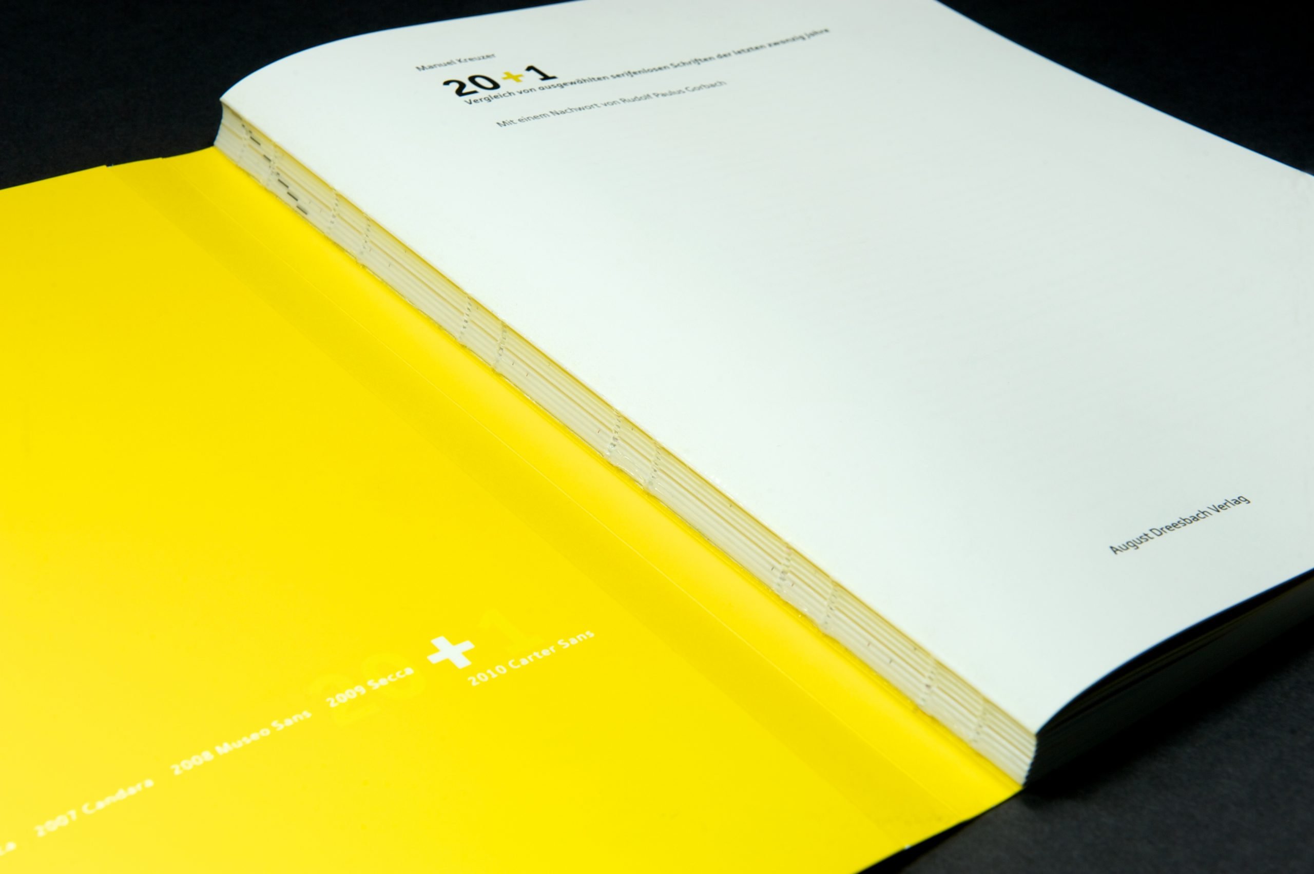
“20+1. Ein Vergleich von ausgewählten serifenlosen Schriften der letzten zwanzig Jahre.” is a study that was produced as part of the “Jahreskurs Typografie” (tgm Munich), led by Rudolf Paulus Gorbach, that captivates both with its content and its careful and aesthetic design: a comparative investigation of sans serif typefaces from the last twenty years.
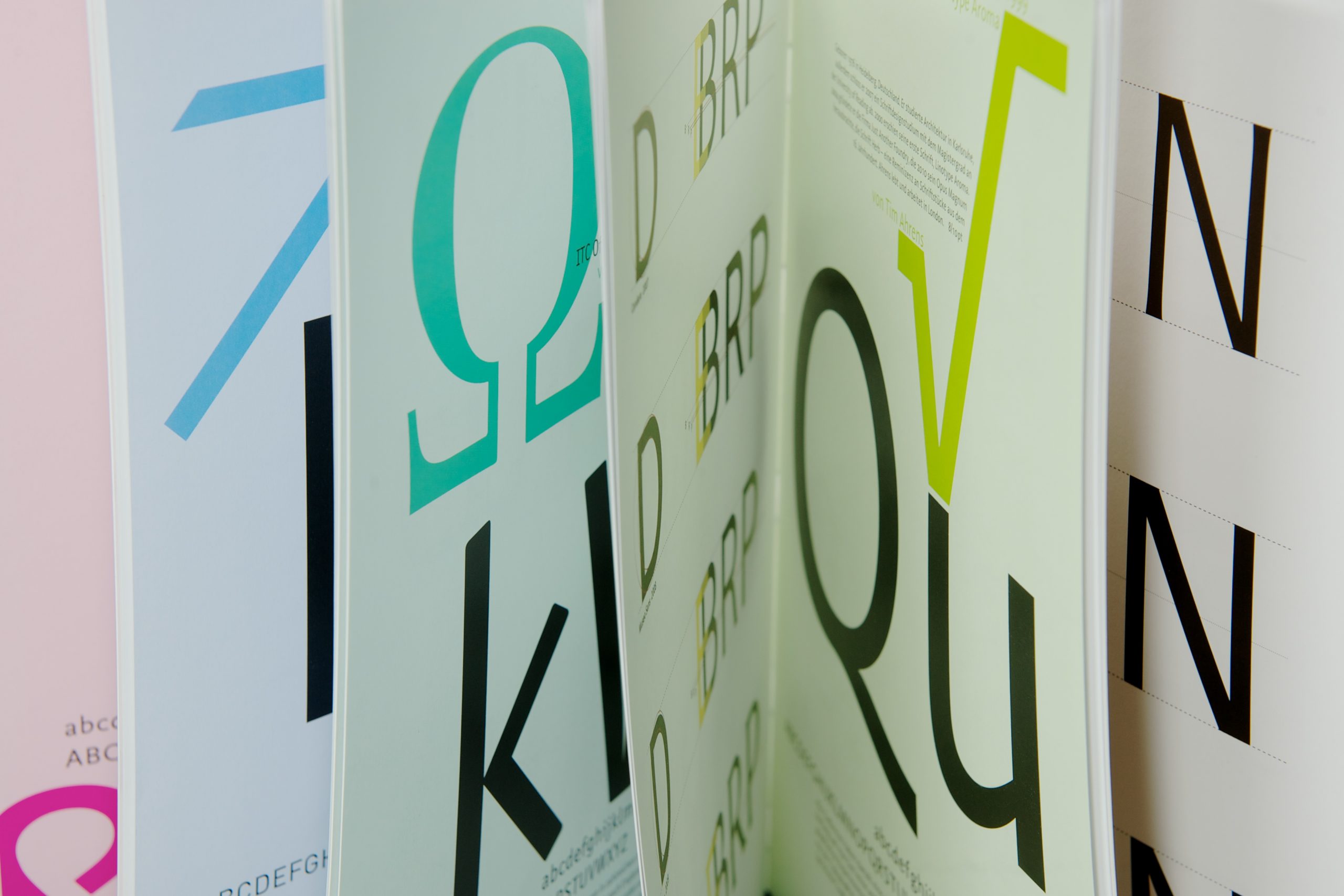
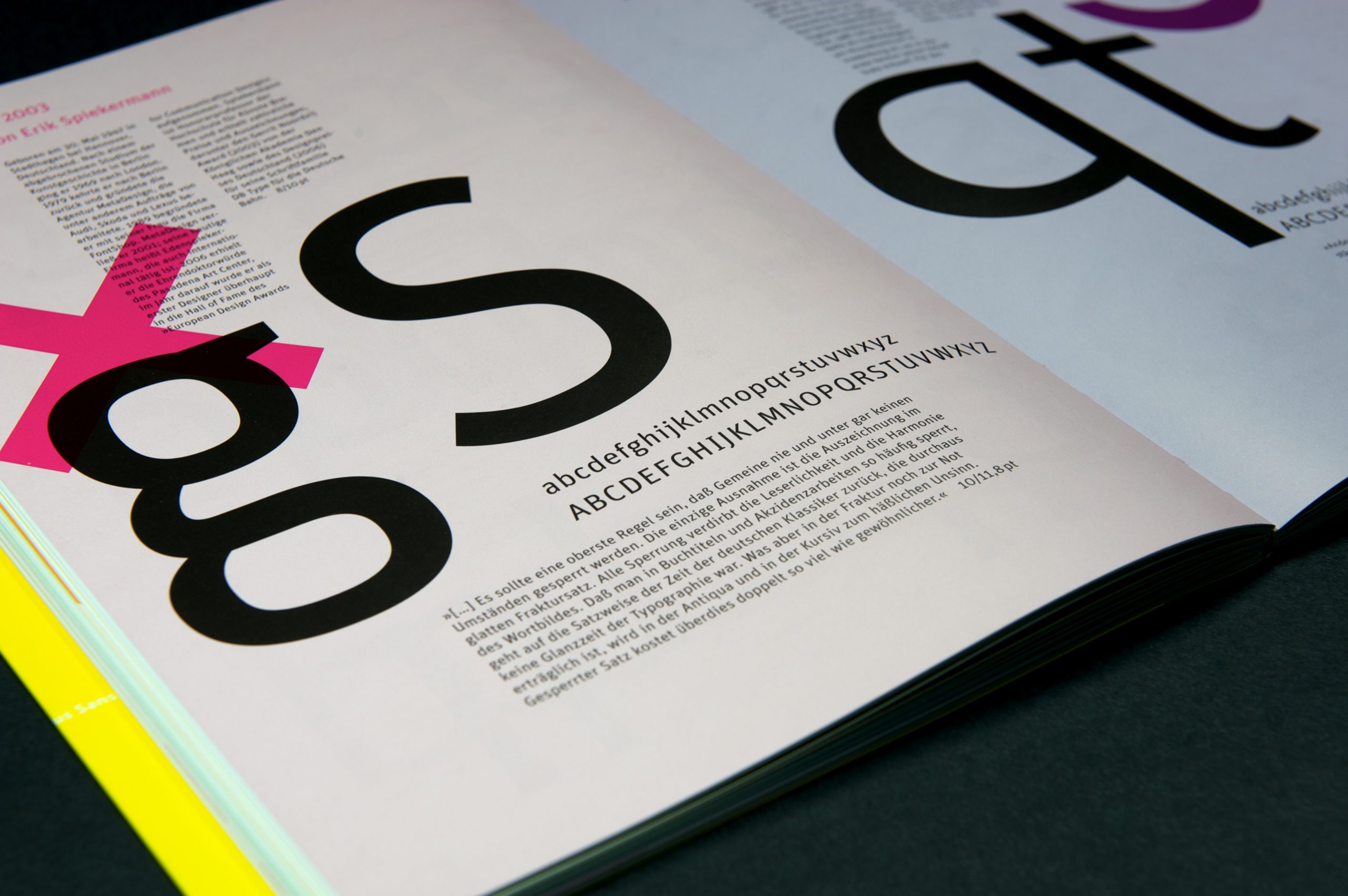
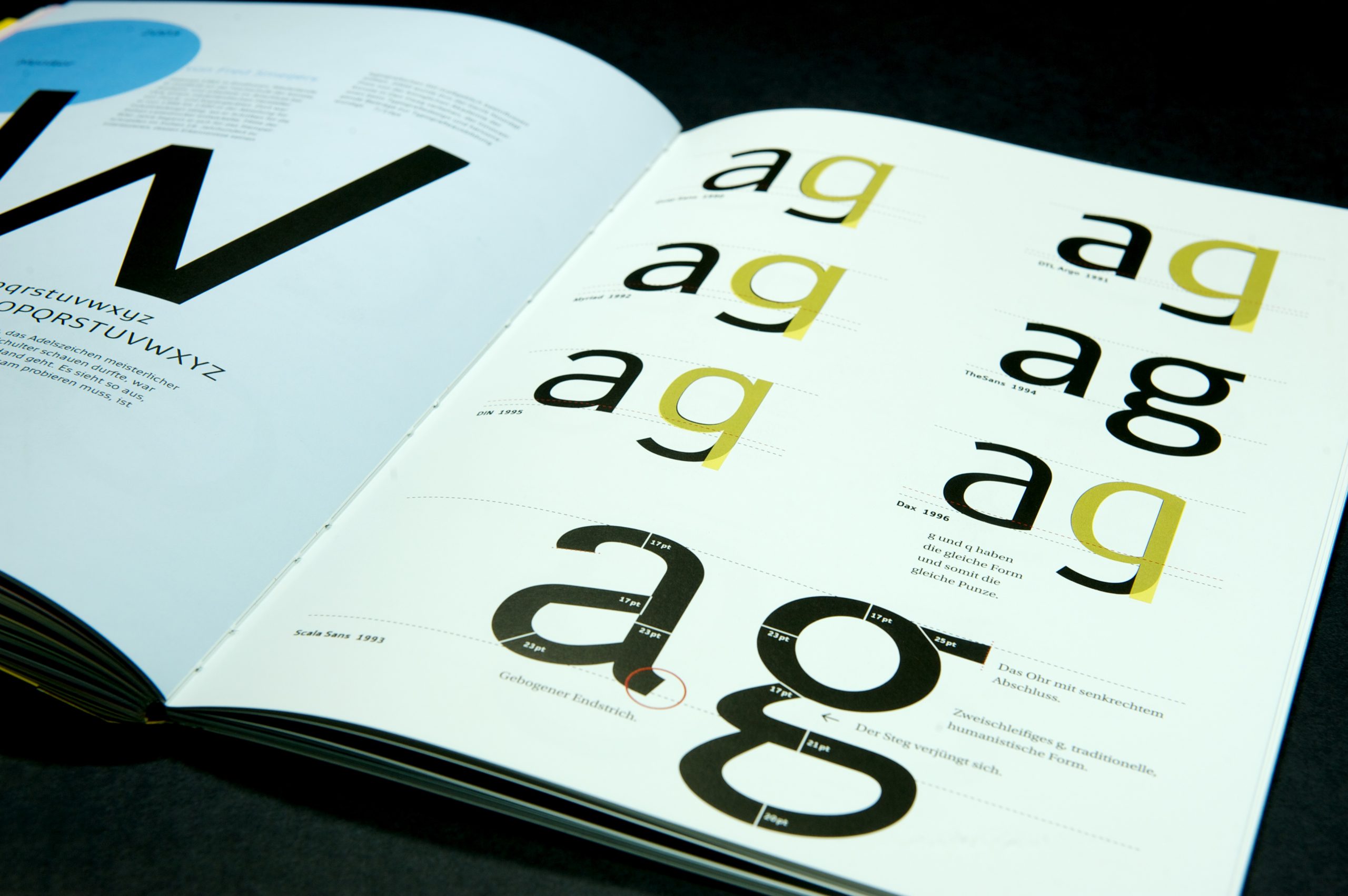
In the first chapter the proportions of upper and lower case letters are shown. Chapter Two deals with the capitals of the twenty-one scriptures and Chapter Three with the common ones.
Twenty-one (20+1) fonts for one sans serif font each year! A book for all those who daily use sans serif fonts, who are perhaps still searching for the right one and who have always lost themselves in the small, fine but decisive differences, but also wanted to find them again.
Including: Quay Sans 1990, DTL Argo 1991, Myriad 1992, Scala Sans 1993, TheSans 1994, DIN 1995, Dax 1996, Corpid 1997, ITC Officina Sans 1998, Linotype Aroma 1999, FF Fago 2000, Compatil Fact 2001, PTL Manual Sans 2002, FF Unit 2003, FF Nexus Sans 2004, Monitor 2005, Phoenica 2006, Candara 2007, Museo Sans 2008, Secca 2009 und Carter Sans 2010
20+1
Publisher: August Dreesbach Verlag
Author: Manuel Kreuzer
Format: 21 × 30 cm
Volume: 144 pages
Workmanship: Swiss brochure
Price: € 18.–
Buy


