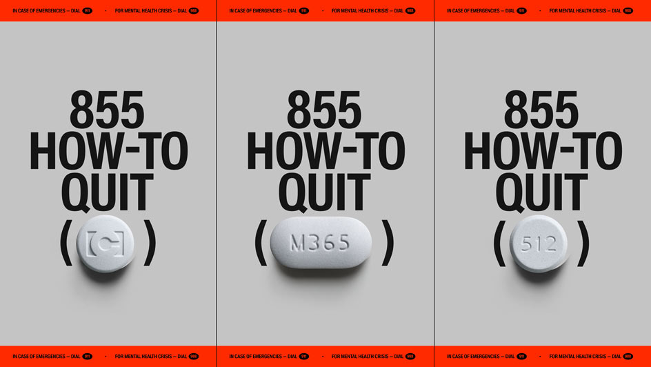
855-HOW-TO-QUIT-(OPIOIDS)
To be honest, it’s always easier to create beautiful design for beautiful things. It becomes much more difficult when it comes to bringing forward topics that society doesn’t want to deal with. Every 6 minutes, someone in the United States dies from opioids and today, there’s more than 2.1 million people suffering from opioid use disorder. It’s the result of an ongoing three-decade man-made plague known as the Opioid Epidemic.
A coalition of NGOs, healthcare professionals, activists, media partners, and professional photographers just launched an innovative approach to tackle the opioid epidemic: A toll-free helpline that uses the imprint codes on popular opioid pills as phone extensions, where people who struggle with addiction can get advice from those who managed to quit: 855-HOW-TO-QUIT-(OPIOIDS)
The helpline features 30 people, reflecting the diverse demographics of opioid use disorder. They share their experiences with one of the 30 most common opioid pills, from how they became addicted to how they managed to quit. Each testimony was curated by trained addiction specialists to include important medical information. The helpline also provides information for each pill, it connects to 988 for emergencies, and to the SAMHSA National Helpline for concrete treatment options. The toll-free helpline is available in all 50 states and will be functioning 24/7, initially live and later as interactive recordings. “I’m Emily, and this is how I quit Oxy. (…) Every week I took some milligrams
I think that’s a great approach, coupled with a very appealing design. Therefore, we spoke with Wojciech Zalot, Creative Director at Raw Materials, to learn a bit more about the project.
Please tell us how the project came about?
The Serviceplan Innovation team is focused on developing creative projects that align with the UN Sustainable Development Goals and the number one topic in this list is Health. Since two of the team members are from the US, the opioid crisis was a topic close to their hearts and fortunately the creative approach enabled it to become both innovative and effective. It was at this moment that they asked us to collaborate with the design and visual identity and after that, we reached out to several of the partners that made this project possible. The project is the result of the partnership and collaboration of Service Plan Innovation, Raw Materials, PAIN, We Are Those People, Upstate Foundation, Anzen Health, Kimera, DaHouse, JOJX, Media Plus, and Talon.
What idea lies behind the design concept?
We aimed to fully immerse the audience in the world of pharmaceuticals. This led us to adopt a design direction inspired by prescription pill packaging, where our main visual inspiration centered around simplicity and core information. We avoided cluttering the messaging and focused on maintaining the simplicity of form. Central to this approach was the structured layout of information, reminiscent of the organization found in medical documentation.
A crucial aspect of our branding strategy was the color scheme. Rather than using vibrant hues to portray the pills in a positive light, we chose a subdued, monochromatic palette. Drawing from prescription packaging, we primarily utilized the color orange sparingly, while each pill was associated with desaturated dark and light shades. Dark tones were specifically reserved for certain narrative sections to uphold a solemn atmosphere, reflecting the gravity of opioid addiction.
Typography plays an important role in the overall design—can you tell us a little bit about it?
Given the importance of numbers in our design, particularly 855-HOW-TO-QUIT as the primary campaign lockup, as well as the presence of lengthy pharmaceutical terms and a vast amount of information, we devoted a considerable amount of time to exploring typography choices for the project and how they would harmonize.
Through this process, it became evident that we required a narrow typeface to ensure readability and cohesiveness, without excessively condensing the text, to maintain a pharmaceutical and serious look and feel.
To achieve this, we collaborated with Kimera and customized their Waldenburg font, which possessed the ideal balance of simplicity, appropriate weight, and medical aesthetic. We made minor adjustments to a few glyphs, with the 'Q' being the most significant due to its prominence as a campaign name. In addition to HTQ Waldenburg, we incorporated Grilli Type Pressura Mono for numerical elements and finer details, striking a balance between humanist and serious tones.
Which challenges did the project bring with it, and which surprising moments did you encounter during the design process?
The primary challenge was to develop the focal point of the campaign: the pills themselves. There were few if any, good-quality images of opioid pills available, so we had to craft them ourselves with the assistance of CGI artist Roman Tikhonov. We worked with very sparse visual references available on the internet; in some instances, we could barely discern the texture or define the final color of the pill. However, the final result achieved the exact realism and intricate detailing we were aiming for.
Creating all the pills in 3D also provided us with a broader range of opportunities in terms of usage. We could plan the lighting, placement, and motion more precisely, which ultimately enhanced the overall work.
Thanks a lot for the insights!


