The DFB-Pokal Reimagined
Interview
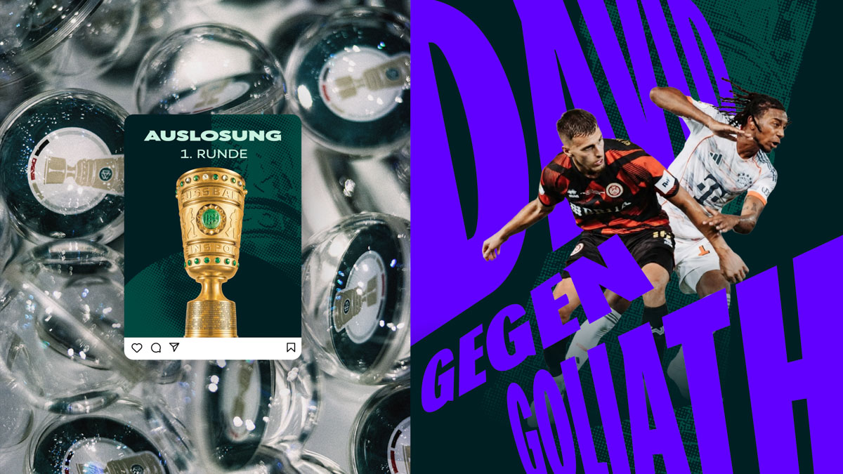
The DFB-Pokal thrives on contrast: professional clubs facing semi-professional sides, favourites meeting underdogs, and decades of tradition colliding with stories that can unfold in a single night. Its new visual identity seeks to make that tension visible. Introduced for the 2026/27 season, the rebrand brings the men’s, women’s and junior competitions into a shared design system while giving each its own character and expression. At the heart of the new approach is a fundamental question: how can a brand built on consistency capture a competition defined by unpredictability? In this interview, Holger Merk, Head of Brand Department, discusses the thinking behind the new identity, the role of contrast, the balance between tradition and digital culture, and how design can create a framework flexible enough to let the drama of the Pokal take centre stage.
The DFB-Pokal is Germany's oldest football cup competition, spanning professional clubs down to semi-professional teams. This August, the Pokal received a completely new visual identity for the first time in a decade. Was the broader DFB rebrand from December 2025 the primary catalyst, or did the Pokal need its own distinct strategy? And what qualities of the competition ultimately drove the design direction?
We didn't start with the question of how the DFB-Pokal should look. We started by asking what the competition means to people. The broader DFB rebrand created a shared framework, but the need for change came from the competition itself. The Pokal has a unique cultural role within German football. It creates stories, rituals and memories that connect generations. Our challenge was to translate that identity into a contemporary visual language while keeping it firmly connected to the wider DFB brand system. The result is a brand that feels unmistakably like the Pokal, while contributing to a larger DFB design language.
The new Pokal brand keeps emphasizing contrasts: tradition against modernity, grassroots against professional… This isn't only a brand or marketing language, but seems to be structurally embedded in the design itself. Can you walk us through how visual contrast operates in the new system? How does a designer translate the character of the competition itself into typography, color, or form?
Contrast is part of the DNA of the DFB-Pokal. Professional clubs meet amateurs. Favourites meet underdogs. Long-standing tradition meets entirely new stories. Rather than resolving those tensions, the design system makes them visible. We use typography, colour, motion and composition as tools to express the competition's inherent contrasts. At the same time, shared DFB elements ensure that the Pokal remains part of a consistent umbrella brand. The goal wasn't visual consistency for its own sake. It was creating a system capable of expressing the many different realities of cup football.
The rebrand explicitly aims to reach "younger fans" through digital channels and social media, where they experience the Pokal differently than stadium audiences do. What assumptions are you making about how younger people consume football, and how do those assumptions change the design?
We don't think the challenge is that younger people love football less. They simply build relationships differently. Today, football culture is experienced across many touchpoints: matches, creators, gaming, fashion, music and social media. The question therefore isn't how to make the Pokal younger. The question is how the Pokal can remain meaningful within those environments. Design helps by making the competition more visible, more understandable and more adaptable to the places where football culture happens today.
Also how did you balance preserving what cannot change against the pressure to feel "more urgent" and "louder" for younger audiences? How did you manage this change, and avoid alienating either the legacy audience or the institutions within the DFB itself? What were the non-negotiables in the new design?
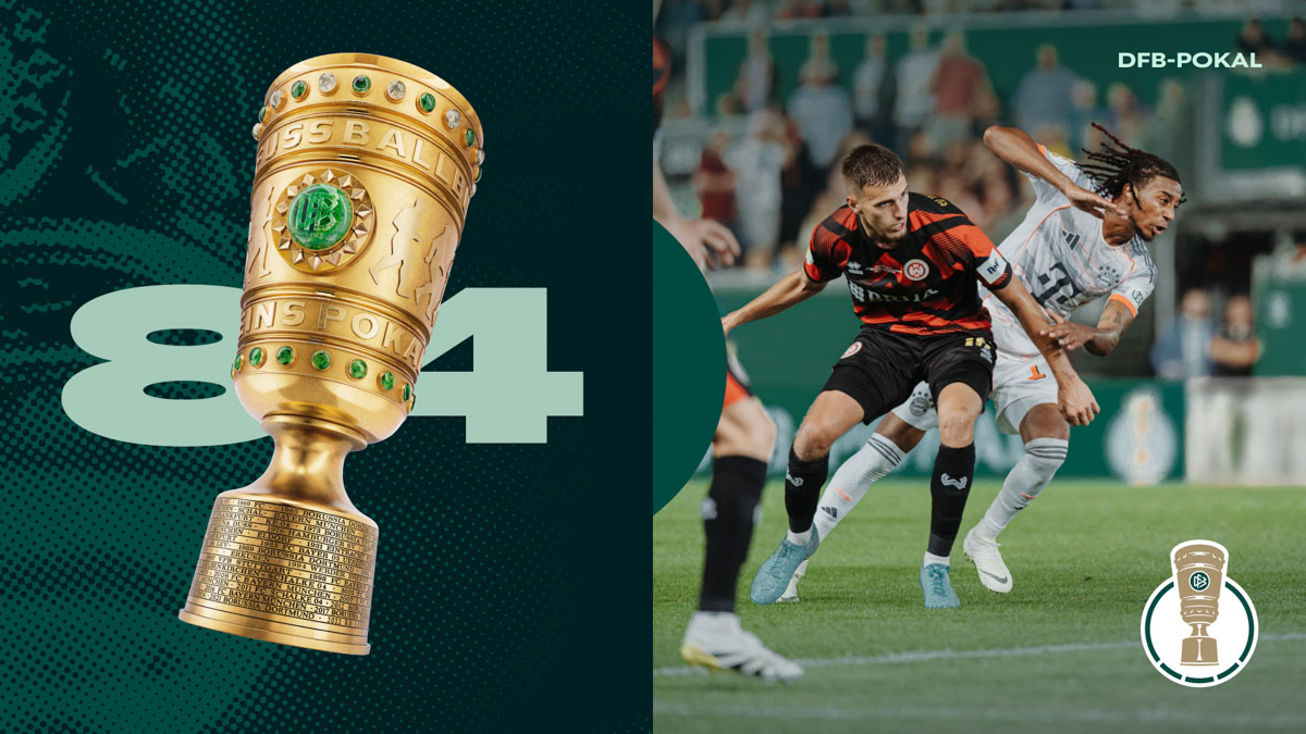
Before changing anything, we identified what gives the competition its meaning. The trophy, the traditions, the idea of the unexpected and the emotional intensity of knockout football were all non-negotiable. Modernisation didn't mean replacing those assets. Pokal green and the established stadium experience for example remain important anchors. What we changed is the range of expression around those elements. The brand can now become much louder, faster and more disruptive where the context allows it, especially digitally. We often say that our task isn't to change the tradition of the Pokal. Our task is to enable more people to participate in it.
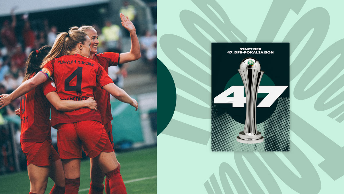
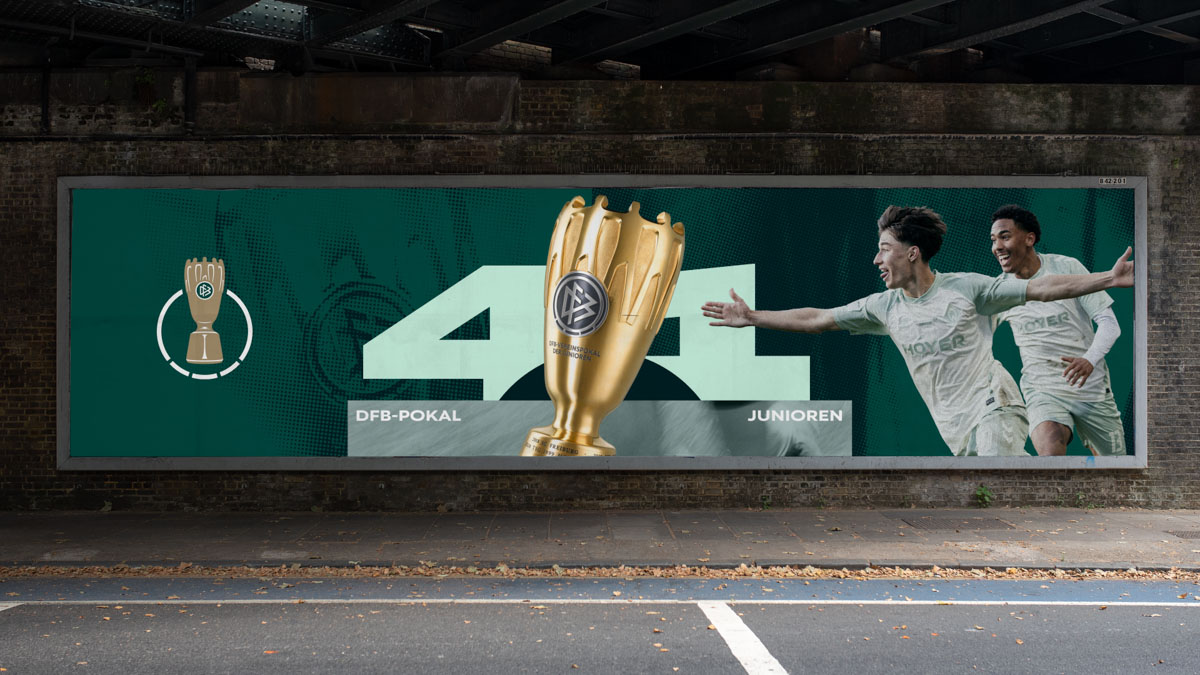
The rebrand brings the men's, women's and junior Pokal competitions together under a shared design system, while still giving each its own identity. What's the core balance you're trying to strike between visual unity and differentiation? And how does each competition remain recognizable within that shared language?
The principle was simple: one culture, multiple expressions. All three competitions share the same strategic foundation and belong to the same DFB-Pokal world. At the same time, each competition has its own history, communities and symbols. We wanted equality rather than uniformity. The shared system creates recognition, while the individual trophy marks ensure that every competition retains its own identity and character.
How will you measure whether the rebrand has actually worked after the 2026/27 season? Will it be reach, recognition and engagement, or are you looking for something harder to quantify, such as a changed perception or feeling around the Pokal brand?
Metrics matter, of course. But the more interesting question is whether the rebrand helps the Pokal remain culturally relevant. The competition already enjoys extraordinary awareness. The challenge is maintaining meaning across generations. Success therefore means that people recognise the competition, understand what makes it unique and feel invited to become part of its stories, rituals and traditions. If more people can build their own relationship with the Pokal, the rebrand has done its job.
The DFB-Pokal rebrand leans heavily on the idea that the competition is fundamentally about moments – a single goal that changes everything, an underdog team nobody expected to win – it is tension and, above all, pure surprise. But design systems are built on consistency and repetition. How do you create a system that feels surprising and emotionally charged when it must function reliably across broadcasters, clubs, social platforms, and merchandise?
Design systems are often associated with consistency, but the DFB-Pokal is defined by unpredictability. We approached this tension by creating clear codes rather than rigid layouts. The trophy, typography, colours and motion language provide recognition, while scale, pace and storytelling remain flexible. In that sense, the system behaves less like a template and more like a framework for participation. It creates enough structure to build a brand, while leaving enough freedom for the competition's drama, surprise and emotion to unfold.