A Place of Daring
University of Arts Linz
A Place of Daring, a house with charisma—the University of Arts Linz sees itself as an open space dedicated to critical thinking and shaping social processes. The new visual identity reflects this idea by using a fluid framework which never stands still. Embedded in a mindful layout, it provides flexible space for the various content of the students, teachers, employees, and researchers.
“As a young university that drives social change with art and cultural studies, with technologies and ideas for more sustainability, we need a corporate design that corresponds to this attitude. This has been achieved with Bleed’s open, flexible concept. I am convinced that now we will be able to show the open mind which we have always practiced to the world.” Brigitte Hütter, Rector of the University of Arts Linz.
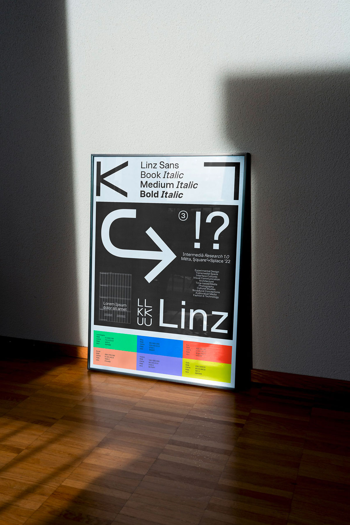
Interactivity, digitalization, and motion define the core principles of the visual language. The mirrored logotype allows to integrate two languages at once—referring to the international mindset of the institution. The customized font Linz Sans unifies all written communication. From now on, the new corporate identity provides maximum freedom for individuality and expression of the arts.
“With the new visual orientation, the University of Arts Linz shows itself as an open, progressive house that shapes the future itself. The diversity of the university is reflected in a hybrid dialog between analog and digital applications.” says Astrid Feldner, Creative Director of Bleed Vienna. Bleed is an international branding and design agency with studios in Vienna and Oslo. More about the project here.


