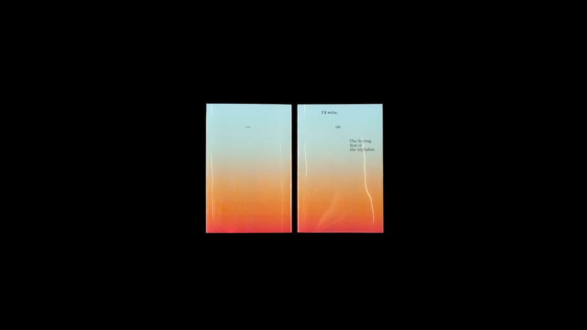
I’d write OR The Setting Sun of the Alphabet
Does writing has a future?
The question “Does writing has a future?” is the starting point for contemporary archaeological and experimental research on the subject of writing and its visual appearance. Berenice Gaß, a graduate of the Stuttgart State Academy of Art and Design, examines this important question of the future with her diploma thesis “I’d write OR The Setting Sun of the Alphabet,” which consists of different media.
How will the current writing systems—after their development to the present day—develop in the future? What answers does the chatbot of a so-called “AI”-App give to questions about the future of writing? What influence do time, technology, materiality and scaling have on maintaining legibility? What will remain of today’s digital writing culture in several thousand years? How does translate.google.de interpret the gesture of hand writing inspired by Cy Twombly and detached from content? And what happens if the font developed from it continues to generate “characters” from a font design program beyond a defined point, i. e. into the unknown?
Berenice Gaß’s diploma thesis comprises a dialogue in paperback form (I’d write OR The Setting Sun of the Alphabet), two 3D-printed objects and a silkscreen (Rosetta Stone 2019), a booklet (font relicts), two headline fonts and a corresponding website, as well as a variable font with the parameters readable—unreadable (Cy) and a video (Lost in Interpretation).
I’d write OR The Setting Sun of the Alphabet
Paperback
Design: Berenice Gaß
Volume: 144 pages
Format: 12,5 × 19 cm
Language: English
Material: dust jacket: plastic foil; cover: Caribic 250 g/sqm; paper inside: Holmen TRND 80 g/sqm 2.0;
Print: digital print
Rosetta Stone 2019
Material study on the transitoriness of legibility, comprising two 3D-printed objects and a screen print in 140 × 97 cm format.
Schriftrelikte
Magazine, two headline fonts, and website.
Design: Berenice Gaß
Volume: 32 pages
Format: 31 × 22 cm
Material: cover: Ispira Mistero (black) 250 g/sqm; paper inside: Ispira Mistero (black) 150 g/sqm and metaphor Extrarough Coldwhite 150 g/sqm; print: opaque white in digital print and digital print black + riso print red.
Lost in Interpretation
Variable font and corresponding video.


