LL Heymland
By Yevgeniy Anfalov and Lineto
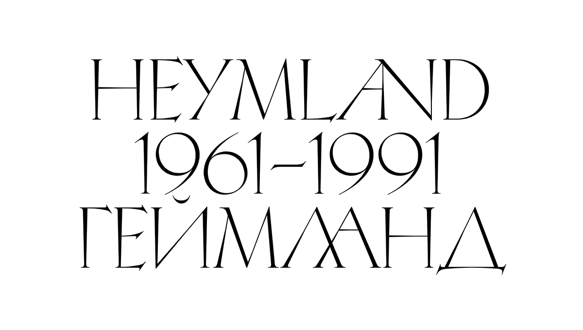
LL Heymland expands on an archive discovery attributed to Solomon Telingater (1903–1969), a legendary Soviet graphic artist who, with Aleksandr Rodchenko, Sergey Eisenstein, El Lissitzky, and others, initiated the constructivist October Group. The undated, unsigned, single-page calligraphic study found in his estate refers to Rudolf Koch’s exceptional Koch Antiqua (ca. 1922) and most likely originated in the early 1960s. In 2018, it caught the attention of Yevgeniy Anfalov, who eventually adapted the minimal character set into a full titling font for both the Latin and Cyrillic scripts.
Koch Antiqua was a typical, if rather quirky decorative typeface family of the early 1920s, heavily promoted by the Klingspor foundry even throughout the 1930s. In the USSR, the upper case Latin alphabet of the titling weight made a surprise appearance in a 1960 calligraphy book edited by Estonian designer Villu Toots. The layout of the study found in Telingater’s estate is identical with the visual in the book, but the lettershapes appear somewhat simplified, geometrically more pronounced, and less mannered. While some specialists question Telingater’s authorship, the piece aligns with other typographic work from the last phase of his career: After the dire years of Stalinism, the comparably liberal climate of the Khrushchev Thaw allowed Telingater to release acclaimed printing types such as Titulnaya (1955–62) and Akzidentnaya (1959), win a Silver Medal at the International Book Fair in Leipzig (1959), and design the first issue of Sovetish Heymland (סאָוועטיש היימלאַנד), a Yiddish-language literary magazine published by poet Aron Vergelis in Moscow (1961).
Although clearly fascinated by the personal hand-lettering style of the source, Yevgeniy Anfalov chose a distinctly digital approach to achieve a formal reappraisal. He stripped the drawings of any details that he perceived as superfluous, and he systematically unified the shapes, before re-considering each letter under optical criteria to avoid an all too mechanical feel. He designed a large number of entirely new glyphs in order to create a typeface suited for contemporary design projects. For LL Heymland’s first public appearance in TATE ETC. magazine (Summer 2020, designed by Studio Ard), Yevgeniy also drew a whole set of custom ligatures which have since been added to the font.
From the start, LL Heymland is published containing full character sets for both Latin and Cyrillic, a first for Lineto. Some of these shapes are rooted in a Cyrillic adaptation of Koch Antiqua found in a Russian manual book on type design from 1970, as well as in a few other sources from that time. Both the Latin and Cyrillic versions result from a process similar to Chinese whispers, connecting the German 1920s via the Soviet 1960s and 70s with the present day, making LL Heymland a playful exercise in post-modernism. It provides a contemporary option for anyone interested in the multi-faceted legacy of Roman capitals.
About the Designer
Born in Kyiv (Ukraine) in 1986, Yevgeniy Anfalov moved to Germany in 2003. He studied Visual Communication at Hannover University of Applied Sciences and Arts, and he launched his own design practice in 2010, two years before graduation. LL Heymland is Yevgeniy’s first typeface on Lineto. He is currently completing a redraw of Stephan Müller’s LL Chernobyl (1998), to which he added a Cyrillic counterpart.
LL Heymland
Type Foundry: Lineto
Designer: Yevgeniy Anfalov
Font Engineering and Mastering: Alphabet, Berlin
Release: September 2020
Weight: Character sets for Latin and Cyrillic in Regular
Test Version: Yes, login for Lineto Trialfonts
Price: CHF 120.– (≈ € 110.–)
Buy

