OmoType
Font System for a Legible and Fluent Text
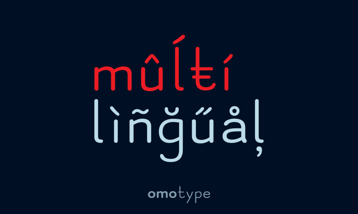
OmoType offers handmade fonts designed for better letter recognition and legibility. There are several typefaces: Sans, Sans Variable, Serif, and Mono. These typefaces are designed by Marko Hrastovec. He was awarded with the certificate Typographic Excellence by the Type Directors Club New York in 2016 and 2019.
Nino Brodač is a typographer and graphic designer focused on developing typographic solutions. He contributed to OmoType in 2020 with the OT Carta and OT Carta Straight fonts. With 240 different styles, five extender sizes, four letter spacings, and six font weights it is a truly variable font. It is designed for better letter recognition and legibility with all the features that facilitate reading like uniquely recognizable letters, similar letters, and shapes are easily distinguished, and letters clearly define the text line, letter, and word spacing.
OmoType design stems from relevant scientific research about font readability and dyslexia. The reason to start there was to create the most readable typeface. During the development, a couple of research with dyslexic children was done to verify its effectiveness. Results show children read faster, made fewer mistakes, and had shorter fixation times when reading texts with the OmoType.
OmoType Sans is free for personal non-commercial use.

