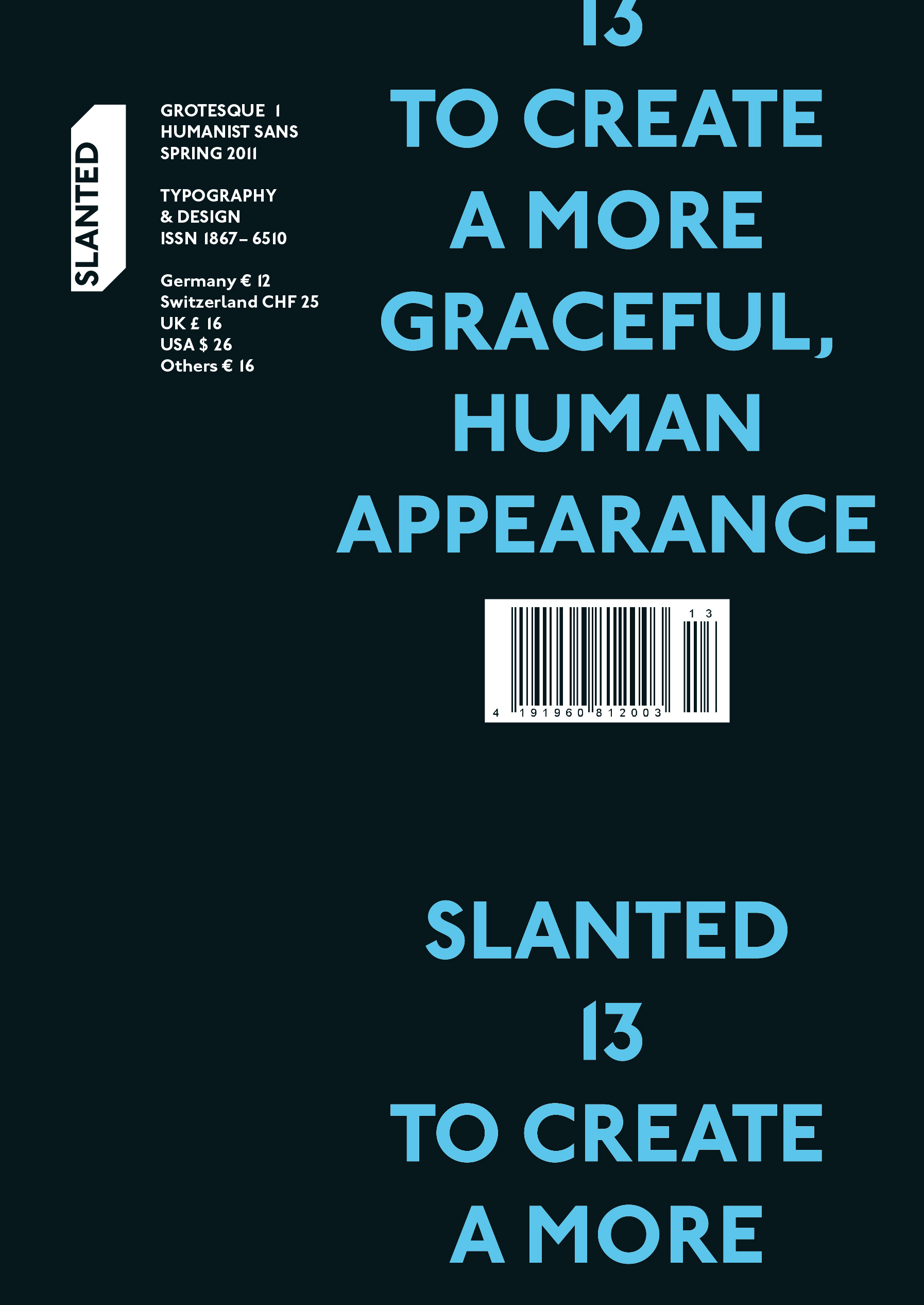
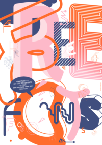
Slanted Magazine #13 – Grotesque 1
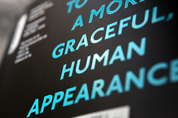
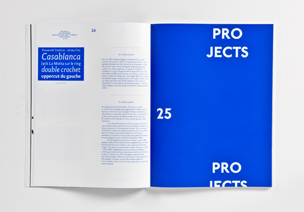
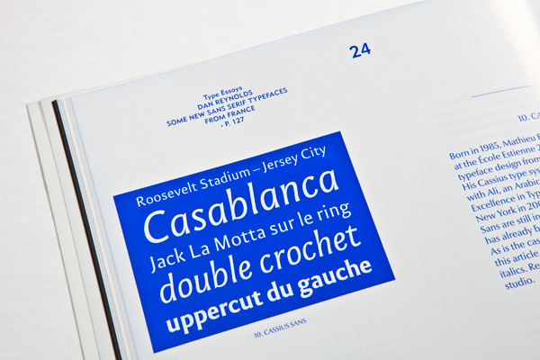
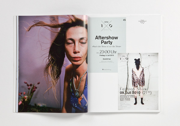
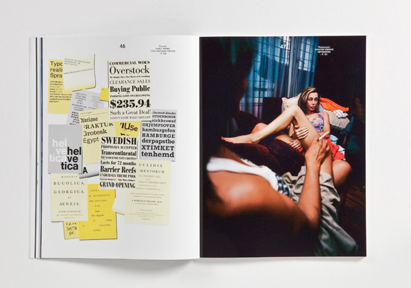
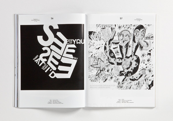
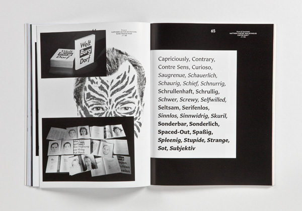
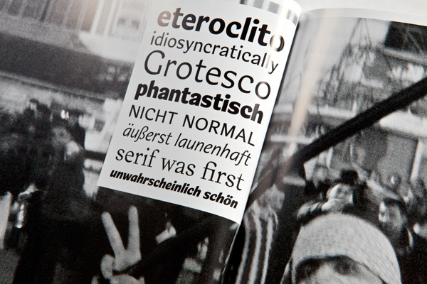
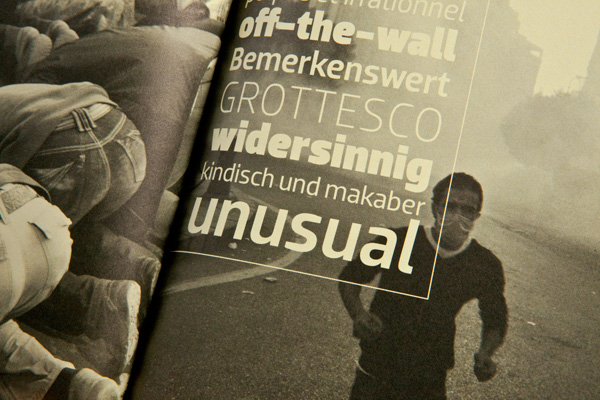
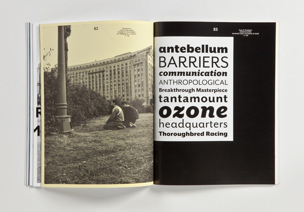
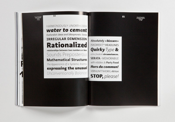
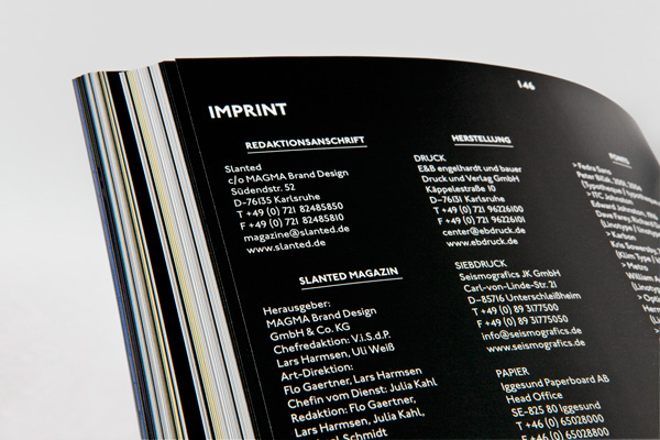
Slanted #13 – Grotesque 1 (To Create A More Graceful, Human Appearance) deals with contemporary and historic humanist grotesque fonts. Their origin goes back to the typeface for the signage system of London Underground in the early 20th century England, and to Gill Sans that followed London Underground. Depending on the cultural sphere or classification, the typeface is also called humanist sans, lineal humanist, semi-grotesque, younger grotesque, lineal sans-serif typefaces with dynamic form principle.
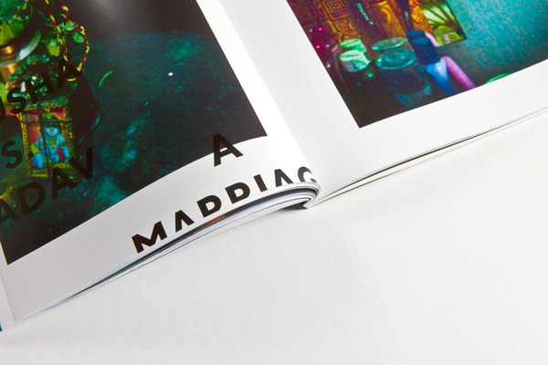
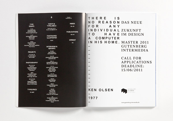
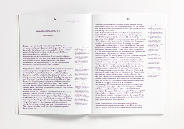
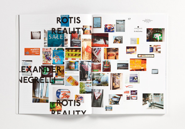
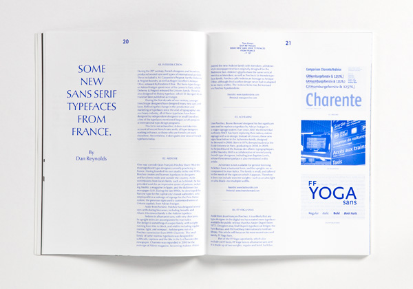
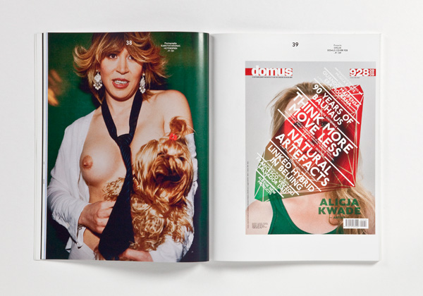
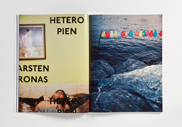
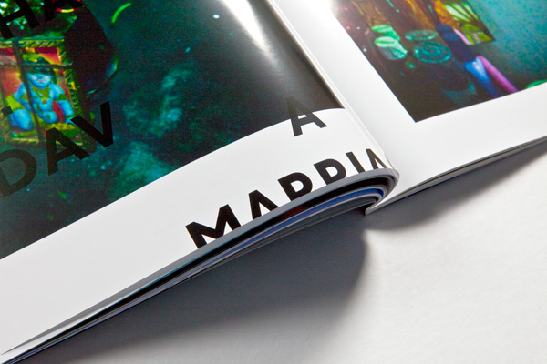
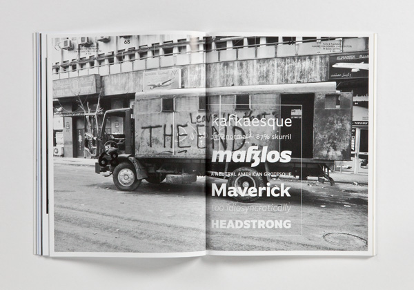
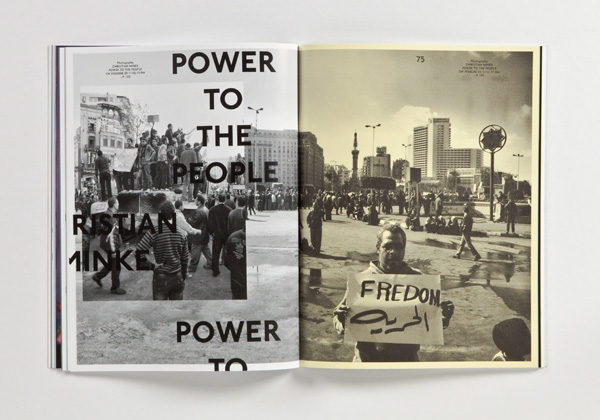
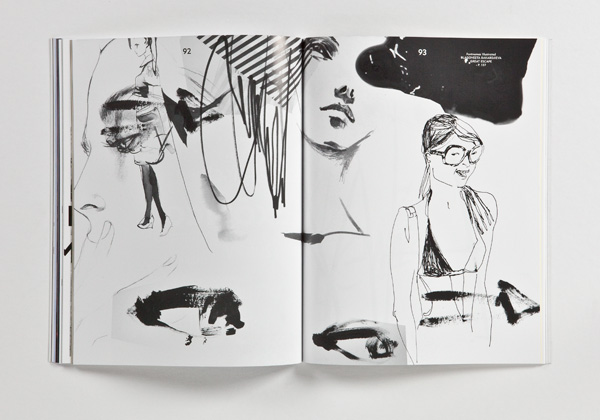
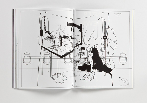
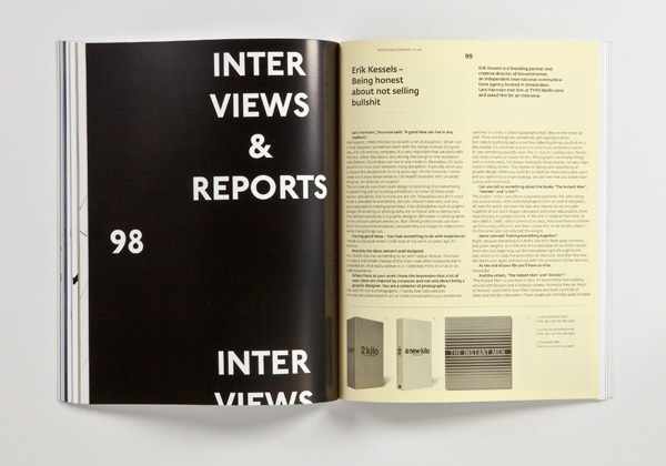
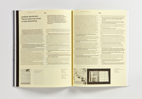
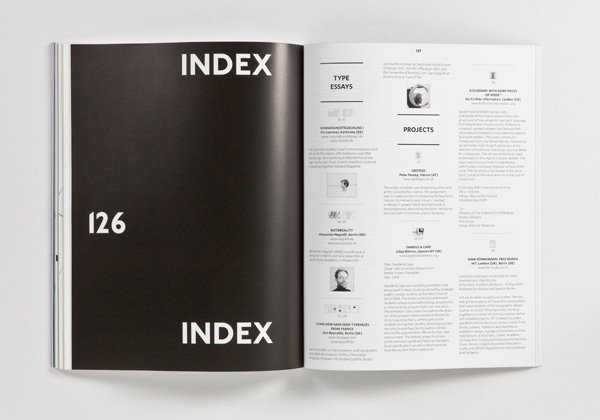
With great pleasure we present a huge number of corresponding and related grotesque fonts, illustrations and projects. Worth seeing photo stories are »Heterotopien« by Karsten Kronas (Bielefeld), “A Marriage With God” by Anusha S. Yadav (London) and “Power To The People” by Christian Minke (Hüttenberg), who was on the way in Egypt recently during the revolution. The type essays by Flo Gaertner (Karlsruhe, Alexander Negrelli (Berlin) and Dan Reynolds (Berlin) deal with humanist sans typefaces. Numerous interviews with Erik Kessels (Amsterdam), Jonathan Barnbrook (London), Don Karl aka Stone (Berlin) and Pascal Zoghbi (Beirut), Christian Minke (Hüttenberg), Eiko Nagase (Tokyo), Yosuke Yamaguchi (Tokyo) as well as the third part of the Tokyo report by Ian Lynam (Tokyo) and a musical travelogue by Frank Wiedemann (Berlin) round up the stuff to read.
By the way: Slanted #13 and #14 are conceived as a double-issue featuring the wide field of grotesque fonts. Issue #14 will explore newer font-concepts in the tradition of American, neo- or geometric grotesques.
MAGMA Brand Design
March 2011
148 pages
21 × 27 cm
English, German
